TL;DR
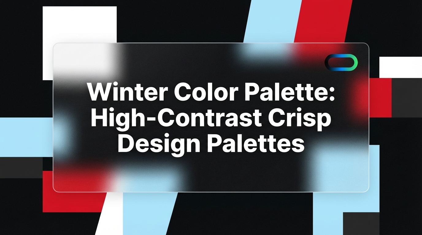
- The winter color palette centers on cool, saturated, high-contrast tones drawn from seasonal color analysis theory.
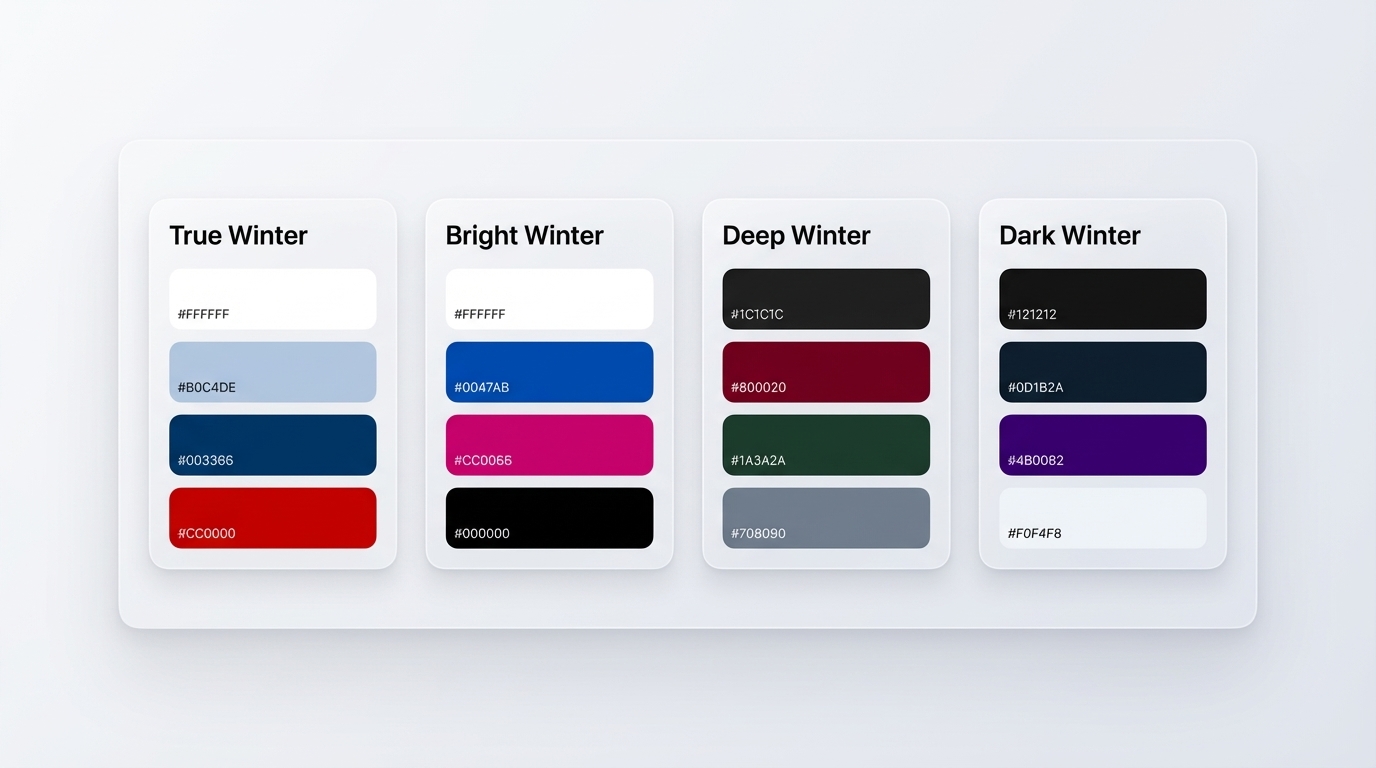
- It contains four distinct sub-types: True/Cool Winter (pure and icy), Bright Winter (vivid and electric), Deep Winter (dark with cool undertones), and Dark Winter (the deepest, near-black luxury tones).
- Core anchor colors include pure white
#FFFFFF, true black#000000, icy blue#B0C4DE, true red#CC0000, and deep navy#003153.- UI designers and brand teams apply winter palettes to communicate authority, precision, and premium positioning in any medium.
Introduction
The winter color palette is one of the most commanding and recognizable systems in design. Rooted in seasonal color analysis theory — which Suzanne Caygill originally developed and Carole Jackson later popularized in Color Me Beautiful — the winter palette groups colors that are cool, sharp, fully saturated, and built for maximum contrast.
In the four-season color model, winter sits at the cool-and-deep end of the spectrum. Its defining characteristics are a consistent blue undertone, high color saturation, and a natural affinity for pure blacks, crisp whites, and bold jewel tones. Warm, earthy, or muted tones actively clash with winter hues and drain energy from any composition that includes them.

For designers, brand strategists, and UI/UX professionals, the winter color palette translates directly into visual systems that communicate confidence, authority, and precision. Whether you work in SaaS, fintech, luxury fashion, or editorial media, understanding how to use a winter palette gives your work a crisp, premium edge that generic palettes rarely achieve. Tools like Inspo AI make it easy to search, curate, and test winter-inspired design references in one centralized place.
1. What Defines a Winter Color Palette?
The winter color palette carries three core defining characteristics: coolness, depth, and clarity. Every color in the winter family holds a blue undertone, placing it firmly on the cool side of the color wheel. Warm hues with golden, orange, or amber undertones simply do not belong in this family. When placed next to true winter colors, warm tones appear muddy or discordant.
Seasonal color analysis divides all colors into four seasonal families: spring, summer, autumn, and winter. Winter sits at the intersection of cool and high-contrast. The Concept Wardrobe describes True Winter as containing "cool, highly-contrasting colours which play at the extremes of light, dark and bright."

Key traits that define winter palette colors:
- Undertone: Blue-based or cool-neutral, never warm or golden
- Value range: From pure white to near-black, with bold mid-tones
- Saturation: High-chroma and clear, not muted or dusty
- Contrast: Maximum difference between light and dark values within the same composition
The classic winter neutrals are pure white #FFFFFF, true black #000000, and cool navy #001C33. These anchor the palette and pair naturally with jewel-tone accents such as sapphire blue #0047AB, emerald green #00703C, and ruby red #CC0000. The result is a palette that communicates clarity, precision, and authority in any application from a mobile app to a brand identity system.
Your Color Guru summarizes it well: "A true Winter color palette is full of cool-based jewel-tones like ruby red, sapphire blue, and emerald green... colors that lean crisp, cool, and highly saturated."
2. What Are the Four Winter Sub-Types?
The winter family contains four distinct sub-types, each with a different primary emphasis within the cool-contrast-depth framework. Knowing the differences allows designers to pick the right variation for a specific brand personality or interface goal.
True/Cool Winter represents winter at its purest. Coolness is the dominant trait here. Colors are crisp, icy, and fully saturated, with stark black-and-white contrast driving the overall composition. Soul of Color describes True Winter as "cool, bright, medium to medium-deep," making it the most balanced and archetypal winter expression. Think of pure black-and-white editorial photography with a single jewel-tone accent.
Bright Winter sits at the junction of Winter and Spring. Brightness is the primary emphasis, so colors tip toward vivid, electric, and luminous. Contrast remains high, but there is a clear, almost neon quality to the palette's brighter hues. Electric blue, true magenta, and sharp white are signature Bright Winter colors.
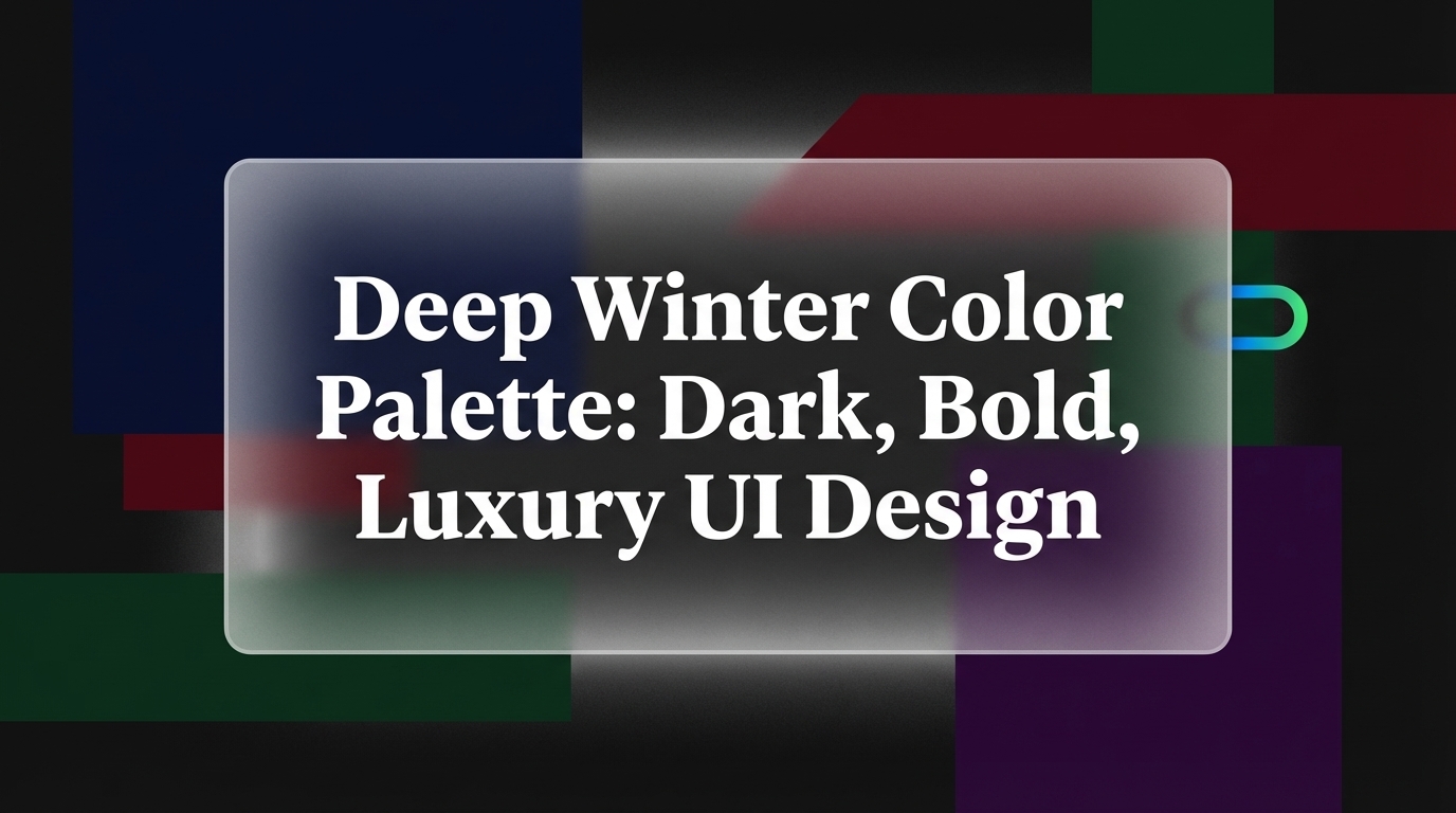
Deep Winter bridges Winter and Autumn. Depth is primary here, so colors run darker and richer than True Winter while remaining cool-leaning rather than warm. Deep burgundy, forest green, and charcoal replace the pure icy tones of True Winter.
Dark Winter is the deepest sub-type, also bridging Winter and Autumn but with even greater intensity. The palette leans into near-black neutrals, deep plum, and dark navy. GoPlay Cosmetics notes that Dark Winter coloring features "a much higher level of contrast," requiring colors at the very darkest end of the winter range. For designers, this sub-type produces quiet luxury aesthetics favored by premium fintech and high-fashion brands.
3. What Hex Codes Define Each Winter Sub-Type?
Designers working with winter palettes need specific, reproducible color codes. Below is a full hex breakdown for each of the four winter sub-types.
True/Cool Winter
| Color Name | Hex Code |
|---|---|
| Pure White | #FFFFFF |
| Icy Blue | #B0C4DE |
| Cool Navy | #003366 |
| True Red | #CC0000 |
| Icy Pink | #E6B4C8 |
| True Black | #000000 |
Bright Winter
| Color Name | Hex Code |
|---|---|
| Bright White | #FFFFFF |
| Electric Blue | #0047AB |
| True Magenta | #CC0066 |
| Bright Navy | #002FA7 |
| Vivid Emerald | #00703C |
| Pure Black | #000000 |
Deep Winter
| Color Name | Hex Code |
|---|---|
| Cool Charcoal | #1C1C1C |
| Deep Burgundy | #800020 |
| Dark Forest Green | #1A3A2A |
| Cool Steel Grey | #708090 |
| Deep Sapphire | #082567 |
| Cool Off-White | #E8E8F0 |
Dark Winter
| Color Name | Hex Code |
|---|---|
| Near-Black | #121212 |
| Dark Navy | #0D1B2A |
| Deep Plum | #4B0082 |
| Cool Charcoal Blue | #2C3E50 |
| Icy Off-White | #F0F4F8 |
| Dark Berry | #6B2243 |
Sources: The Concept Wardrobe, Soul of Color, Palette Hunt. These hex values give designers a concrete, reproducible foundation rather than a vague directional concept that shifts every time someone references it.
4. What Makes Winter Palettes Naturally High-Contrast?
High contrast is the defining functional property of winter color palettes, and it operates on multiple axes simultaneously.
In color theory, contrast works across three dimensions: value (light versus dark), hue (warm versus cool), and saturation (vivid versus muted). Winter palettes dominate on the value axis, pairing pure whites #FFFFFF and near-blacks #000000 that sit at opposite extremes of the lightness scale. They also carry high saturation, which amplifies perceived contrast further. Your Color Guru explains this directly: "High contrast means the colors are more different from each other than they are similar."
For UI and brand designers, this high-contrast nature has direct practical benefits:
- Readability: Combinations like white on deep navy
#003153or black on pure white#FFFFFFexceed WCAG AA accessibility standards with ease, making winter palettes naturally inclusive. - Visual hierarchy: Large dark backgrounds with bright jewel-tone accents create clear focal points without complex layout gymnastics.
- Brand authority: High-contrast palettes read as confident and decisive. They associate with premium, luxury, and professional contexts because they communicate without visual noise.
Winter palettes also refuse the soft middle-ground of muted tones. Where summer palettes blend gently into each other and autumn palettes warm gradually across a range, winter palettes snap between extremes. Typogram describes this quality as giving design work "a sense of clarity, serenity, and a touch of luxury" that designers in SaaS, fintech, and editorial media consistently reach for when they want their work to feel authoritative.
5. How Do You Apply a Winter Color Palette in UI and Brand Design?
Winter color palettes translate into UI and brand design as systems built on maximum contrast, minimal visual noise, and intentional color accents. Each sub-type suits specific contexts.
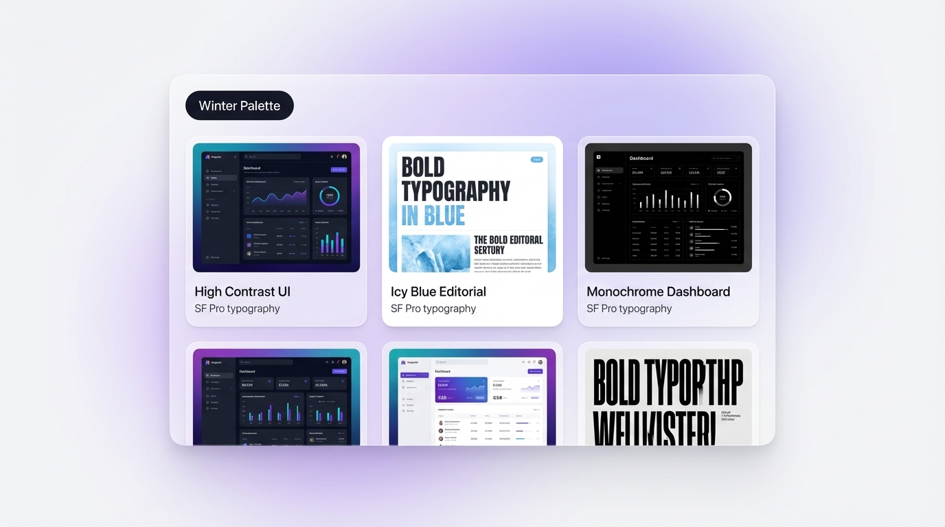
True Winter in UI: Use pure white #FFFFFF backgrounds with true black #000000 headlines, icy blue #B0C4DE as a secondary UI element or hover state color, and true red #CC0000 for primary CTAs and error states. This combination appears frequently in premium SaaS dashboards, fintech platforms, and editorial news sites where scanability and speed are primary values.
Bright Winter in UI: Use pure black #000000 as the dominant background, electric blue #0047AB for interactive states and primary actions, and bright magenta #CC0066 for notification badges or accent highlights. This sub-type suits B2C apps targeting design-forward audiences who respond to energy and visual boldness.
Deep Winter in Branding: Pair cool charcoal #1C1C1C with deep sapphire #082567 and a restrained off-white #E8E8F0 for typographic elements. This combination achieves a quiet luxury result that works for premium financial services, legal firms, and high-end product brands.
Dark Winter in Branding: Use near-black #121212 as the base, deep plum #4B0082 as the brand accent, and icy off-white #F0F4F8 for headlines. This palette mirrors luxury fashion labels and boutique creative agency identities.
Inspo AI lets design teams search curated references filtered by palette type, making it straightforward to pull winter-specific UI examples, typography pairings, and brand identity work directly into a moodboard before committing to a design direction. The AI-powered search engine curates results by visual style, color range, and contrast level so teams can build a winter reference library in minutes rather than hours.
6. How Does the Winter Palette Differ from the Summer Palette?
Winter and summer are the only two purely cool seasons in the seasonal color analysis system, which causes consistent confusion between the two. Both families carry a blue undertone and actively reject warm, earthy colors. The key difference lies in depth and saturation.
Soul of Color makes the distinction clear: "True Summer is softer and lighter, while True Winter is sharper and more intense. True Summer's palette feels calming and soft, like a misty morning, while True Winter's colours feel striking and crisp, like a snowy winter night."
Here is a side-by-side comparison in design terms:
| Property | Summer Palette | Winter Palette |
|---|---|---|
| Value | Light to medium | Medium to very dark |
| Saturation | Muted and softened | Clear and fully saturated |
| Contrast | Low to medium | High to very high |
| Overall feel | Soft, hazy, gentle | Crisp, sharp, intense |
| Key hex examples | Dusty rose #C4A3A3, powder blue #AEC6CF |
True red #CC0000, navy #003366 |
In practical terms: summer palettes suit wellness brands, lifestyle products, and soft consumer applications where approachability and warmth are primary brand signals. Winter palettes suit finance, technology, luxury, and editorial brands where authority and precision come first.
The Concept Wardrobe confirms: "True Summer and True Winter are the coolest seasons of the 12 colour seasons. And even though they share their dominant characteristic (cool) and may appear similar, they are not the same." For designers, choosing the wrong one means a brand identity that looks technically correct but feels slightly off-key to its audience.
7. What Are the Most Popular Winter Color Combinations?
The most effective winter color combinations respect the palette's core principle: pair colors that differ sharply in value, saturation, or both. Below are the standout combinations that designers reach for most frequently.
1. Pure White + True Black + True Red
#FFFFFF / #000000 / #CC0000
The most classical winter combination. Maximum contrast with a bold accent that reads urgency and confidence. Common in premium editorial design, finance app interfaces, and luxury fashion brand identities.
2. Deep Navy + Icy Blue + White
#003153 / #B0C4DE / #FFFFFF
A cool, crisp three-tone combination. The navy provides depth and authority, the icy blue adds dimensional layering, and white gives the composition room to breathe. A strong choice for SaaS dashboards and professional service brands.
3. Near-Black + Deep Plum + Icy Off-White
#121212 / #4B0082 / #F0F4F8
A Dark Winter signature. The plum accent adds personality within a highly restrained palette without breaking the cool, dark mood. Works well for luxury creative agencies and premium app UIs.
4. Electric Blue + Black + Bright White
#0047AB / #000000 / #FFFFFF
A Bright Winter combination with maximum visual energy. The electric blue immediately draws the eye against pure black and white. Effective for B2C tech products, bold startup brand identities, and high-impact marketing campaigns.
5. Cool Charcoal + Deep Burgundy + Steel Grey
#1C1C1C / #800020 / #708090
A Deep Winter combination with more restraint than True Winter. Still cool and authoritative, but with richer mid-tones. This trio suits legal, financial, and consulting brands that want professionalism without clinical starkness.
Typogram notes that winter-inspired design palettes consistently "bring a sense of clarity, serenity, and a touch of luxury" to visual work, making these combinations versatile across print, digital, and product design applications. Inspo AI's free tools let you test any of these combinations in real moodboards and design audits instantly.
Conclusion: Build with Winter Confidence
The winter color palette gives designers one of the most powerful foundations in the entire color system: high contrast, cool clarity, and bold jewel-tone accents that communicate authority across every medium and format. Whether you choose True Winter's crisp black-and-white precision, Bright Winter's electric energy, Deep Winter's jewel-rich depth, or Dark Winter's near-black luxury, each sub-type provides a distinct design language worth mastering.
For UI/UX designers, brand teams, and freelancers building premium visual systems, having a curated reference library turns palette decisions from guesswork into strategy. Inspo AI gives you AI-powered design search, moodboard creation, and brand scanning tools to find, organize, and apply winter color inspiration faster than ever.
Start your winter palette research today at inspoai.io/free-tools.