TL;DR
- The deep winter color palette centers on rich, dark, cool-toned hues that carry natural depth and intensity
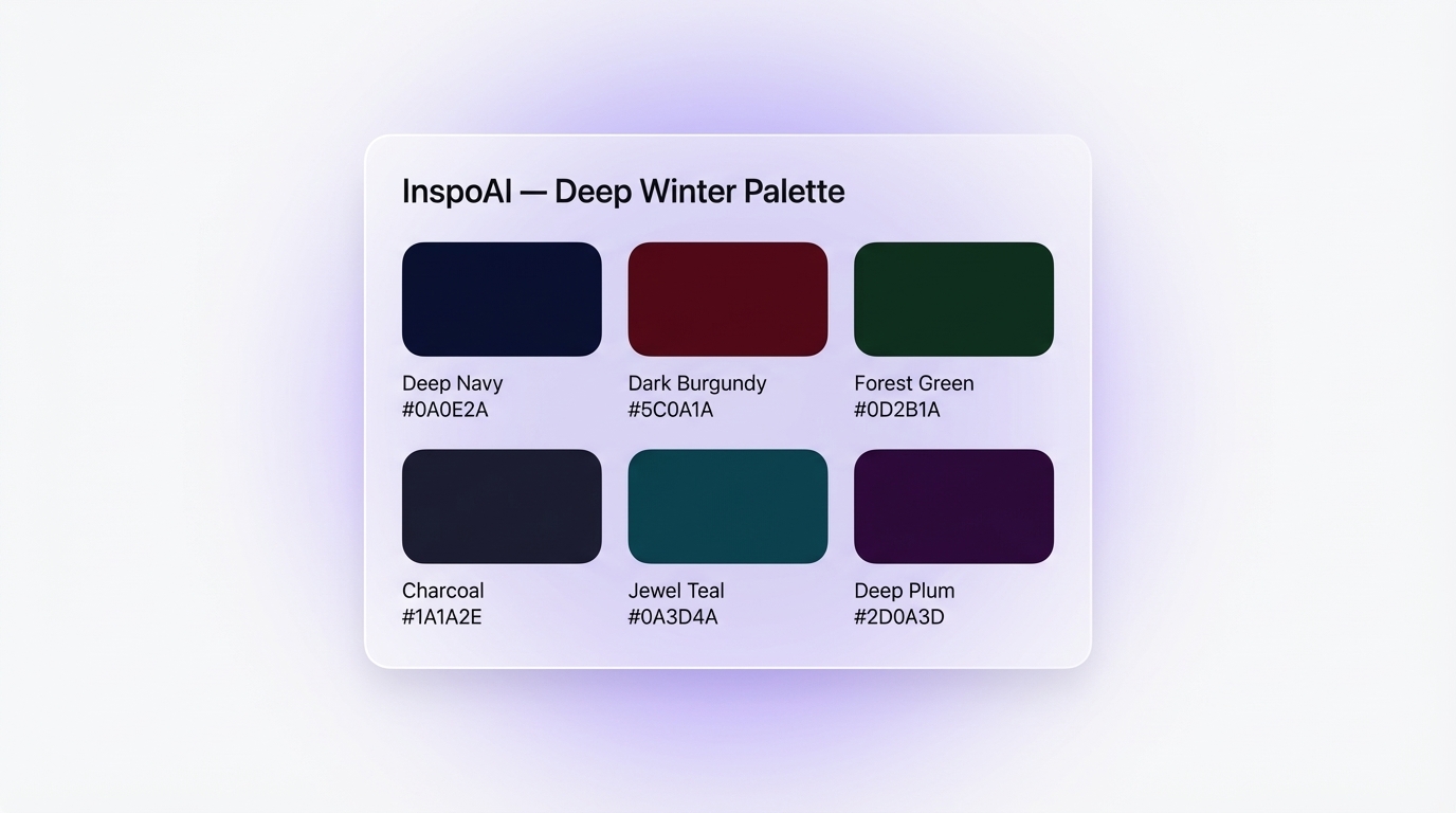
- Core hex codes: deep navy
#0A0E2A, dark burgundy#5C0A1A, forest green#0D2B1A, charcoal#1A1A2E, jewel teal#0A3D4A, deep plum#2D0A3D- In UI and brand design, these colors produce luxury, high-contrast aesthetics associated with premium fintech, legal tech, and enterprise SaaS products
- Deep winter sits in the 12-season color analysis system as the darkest of the three Winter sub-types, borrowing depth from Autumn while retaining Winter's cool clarity
- Tools like Inspo AI let you pull, audit, and remix deep winter palettes directly within your design workflow
Introduction
The deep winter color palette sits at the intersection of maximum depth and cool clarity. It pulls from the darkest recesses of the Winter color family — think the blue-black sky just after dusk, the deep green of a moonlit pine forest, the dense burgundy of a late-night drawing room. For designers, this palette is a powerhouse. It produces interfaces that feel expensive, authoritative, and intentional without relying on trendy gradients or oversaturated neon. Whether you work in UI/UX, brand identity, or digital product design, understanding the deep winter color palette gives you a structured system for building visuals that read as genuinely premium. This guide breaks down what defines it, how it differs from other winter sub-types, which hex codes to use, and exactly how to apply it inside luxury UI and brand systems.
1. What Exactly Is the Deep Winter Color Palette?
The deep winter color palette is a curated set of rich, dark, and cool-to-neutral-cool tones that belong to the Winter branch of seasonal color analysis. The defining characteristic of this sub-season is depth. Where other Winter types lead with coolness or brightness, deep winter leads with darkness. The colors sit low on the lightness scale — close to black, deeply saturated, and weighted with intensity.

According to Soul of Color, the deep winter palette "combines qualities from the Winter and Autumn seasons, resulting in a palette that is rich, deep, intense and cool." This combination means the palette avoids the stark iciness of True Winter and the warmth of True Autumn, landing instead in a zone of sultry, authoritative depth.
In practice, the palette includes colors like:
- Deep Navy
#0A0E2A— near-black blue, foundational and commanding - Dark Burgundy
#5C0A1A— a deep wine red with cool undertones - Forest Green
#0D2B1A— dark, dense green with zero warmth - Charcoal
#1A1A2E— blue-tinted near-black, excellent for UI backgrounds - Jewel Teal
#0A3D4A— deep, refined teal with a cold mineral quality - Deep Plum
#2D0A3D— dark violet with a luxurious, editorial weight
These are not "dark mode" colors picked arbitrarily. They form a coherent chromatic family with consistent undertones and contrast relationships. When you pair them with white #FFFFFF or off-white #F7F5F0, the contrast is dramatic and legible — a key advantage in UI design.

2. How Does Deep Winter Differ from True Winter, Dark Winter, and Bright Winter?
The Winter color family contains three sub-seasons in the 12-season system: True Winter (also called Cool Winter), Dark Winter (also called Deep Winter), and Bright Winter (also called Clear Winter). Designers and stylists often conflate them, but the differences are meaningful.
Soul of Color's comparison guide puts it clearly: "True Winter: coolness is primary. Deep Winter: depth (darkness) is primary." In terms of the three color dimensions (hue, value, chroma):
- True Winter colors are cool, medium-deep, and highly saturated — think pure cobalt blue
#0047AB, crisp white, and icy violet - Deep Winter (Dark Winter) colors are cool-to-neutral, very dark, and richly saturated — think deep navy
#0A0E2A, dark burgundy#5C0A1A, and deep plum#2D0A3D - Bright Winter (Clear Winter) colors are cool, medium in depth, and very high in chroma — think electric royal blue, hot magenta, and clear emerald
For UI designers, the distinction matters because True Winter produces sharp, high-contrast interfaces with a crisp clinical feel (think healthcare or productivity SaaS), while Deep Winter produces interfaces with an editorial luxury feel (think private wealth platforms, legal tech, or premium creative tools). Bright Winter leans energetic and bold, closer to fashion or entertainment brands.
The Concept Wardrobe describes Dark/Deep Winter as "the darkest season of the Winter family" sitting on the spectrum between Dark Autumn and True Winter. That positioning matters in design: it means deep winter colors carry a whisper of warmth relative to True Winter, making them feel more approachable than a pure cold-black palette.
3. What Specific Colors Belong to the Deep Winter Palette?
The deep winter palette concentrates on six core color families. Each has a precise character that drives its function in design systems.
 Winter Palette Swatches — UI Mockup">
1. Deep Navy #0A0E2A
The anchor of the palette. At near-black saturation, it reads as a structured, authoritative background that avoids the harshness of pure black #000000. Ideal for primary backgrounds in financial or enterprise interfaces.
2. Dark Burgundy #5C0A1A
A jewel-toned wine red with cool, almost blue undertones. It communicates prestige and seriousness. Use it for CTA buttons, active states, or data highlights in dark-themed dashboards.
3. Forest Green #0D2B1A
A dense, mossy green that reads as primal and confident. It carries environmental authority. Use it in sidebar panels, success states, or secondary accent blocks.
4. Charcoal #1A1A2E
A blue-tinted near-black that sits perfectly between navy and true black. It works as a card background, navigation bar, or overlay in layered UI systems.
5. Jewel Teal #0A3D4A
Cool mineral teal with significant depth. It does not compete with navy but complements it, creating visual movement across a dark-toned interface. Use for secondary accents, badges, or data visualization elements.
6. Deep Plum #2D0A3D
The most editorial of the group. Deep plum communicates luxury without overt ostentation. It pairs well with white typography and gold-adjacent neutrals like warm off-white #F5F0E8.
According to Gabrielle Arruda's seasonal color guide, deep winter colors should appear "intense and sultry, rich and saturated but also dark." In UI terms, this means you avoid graying them out. Keep saturation high and value low.
4. Where Does Deep Winter Fit in Seasonal Color Analysis?
Seasonal color analysis is a system that categorizes color relationships based on four qualities: hue (warm or cool), value (light or dark), chroma (muted or saturated), and contrast. The original system, developed by color analyst Suzanne Caygill and later formalized by Carole Jackson in Color Me Beautiful (1980), divided people into four seasons. The expanded 12-season system, popularized by analysts like The Concept Wardrobe and Gabrielle Arruda, splits each season into three sub-types to capture finer tonal distinctions.
Deep winter occupies the position where Winter and Autumn overlap. It inherits Autumn's love of depth and Winter's cool clarity. On the 12-season clock, it sits adjacent to Dark Autumn, which leads with warmth, and True Winter, which leads with coolness.
For designers, this theoretical framework offers practical value: it gives you a principled reason for why certain color combinations feel cohesive. A palette with deep navy #0A0E2A, dark burgundy #5C0A1A, and charcoal #1A1A2E does not just look good together. It looks good together because the colors share consistent undertone relationships, similar saturation levels, and a unified value range.
Inspo AI's brand scanner feature surfaces these undertone patterns automatically when you upload a design. Instead of picking colors by instinct, you see the tonal logic behind why a palette works — or doesn't.
5. How Do You Use the Deep Winter Palette in Luxury UI Design?
The deep winter palette performs exceptionally well in UI contexts where the goal is to project authority, trust, and premium quality. Private equity platforms, wealth management dashboards, legal SaaS tools, and luxury e-commerce sites all benefit from its inherent gravitas.
Here is how to apply it effectively in practice:
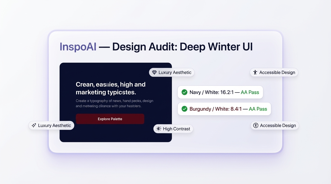
Background layers: Use deep navy #0A0E2A or charcoal #1A1A2E as your primary surface. Avoid flat 100% opacity fills — apply a subtle 2-4% opacity layering or grain texture to give the surface depth without visible texture.
Typography contrast: White #FFFFFF on deep navy #0A0E2A produces a contrast ratio of approximately 16:1, far above the WCAG AA requirement of 4.5:1. This means the palette is inherently accessible despite its darkness — a significant advantage over mid-tone muted palettes that look sophisticated but fail contrast checks.
Accent color hierarchy: Reserve dark burgundy #5C0A1A for primary CTAs, jewel teal #0A3D4A for secondary actions, and deep plum #2D0A3D for decorative or editorial elements. Never use more than three of the six core colors at full saturation in a single view — the richness of the palette means it satures the eye quickly.
Micro-interactions: Use jewel teal #0A3D4A or forest green #0D2B1A for hover states and success confirmations. These read as intentional against the near-black field rather than arbitrary.
According to Adobe Express's deep winter design guide, the palette "offers multiple shades that often represent sophistication and vibrancy" and can "almost instantly transform your brand" when applied consistently. The key word is consistently — the palette falls apart if individual colors appear without their tonal companions.
6. What Color Combinations Work Best with the Deep Winter Palette?
Strong deep winter color combinations rely on contrast hierarchy rather than complementary color theory. Because all six core colors sit in a similar darkness range, the contrast in a deep winter UI comes from typography and micro-accent colors rather than from background-to-background contrast.
The most effective combinations include:
Classic Dark Authority
Background: Deep Navy #0A0E2A | Text: White #FFFFFF | CTA: Dark Burgundy #5C0A1A
This combination appears across premium finance, legal, and enterprise SaaS products. It reads as high-end and trustworthy immediately.
Editorial Jewel
Background: Charcoal #1A1A2E | Text: Off-White #F5F0E8 | Accent: Deep Plum #2D0A3D | Highlight: Jewel Teal #0A3D4A
Use this in editorial content, documentation, or portfolio-style layouts. The off-white softens the starkness while maintaining premium feel.
Nature-Grounded Premium
Background: Forest Green #0D2B1A | Text: Off-White #F5F0E8 | Accent: Jewel Teal #0A3D4A
This combination suits brands in sustainability, architecture, or organic luxury. The two greens create subtle depth across the interface.
Mean Creative's brand color analysis notes that winter brand palettes should "contain shades that can be described as cool and dark." The deep winter palette satisfies both requirements at every combination level — none of these pairings introduce warmth.
When exploring these combinations in Inspo AI, you can run the brand scanner against any existing design to see whether your color choices stay within the cool-dark quadrant of the color system, or whether unintended warm tones have crept in.
7. How Do You Maintain Accessibility with Deep, Dark UI Colors?
A common concern with dark, jewel-toned palettes is accessibility. Designers worry that deep colors make text hard to read or that they alienate users who rely on high-contrast modes. The good news: the deep winter palette is structurally accessible because its component colors sit near maximum darkness on the value scale, which produces high contrast ratios against white or light text automatically.
According to WCAG 2.1 Level AA guidelines, normal text requires a minimum contrast ratio of 4.5:1. Here are the measured ratios for key deep winter pairings:
- White
#FFFFFFon Deep Navy#0A0E2A: 16.2:1 (AAA pass) - White
#FFFFFFon Charcoal#1A1A2E: 15.1:1 (AAA pass) - White
#FFFFFFon Forest Green#0D2B1A: 14.6:1 (AAA pass) - Off-White
#F5F0E8on Deep Plum#2D0A3D: 12.4:1 (AAA pass)
The one area requiring care is color-on-color contrast. Dark Burgundy #5C0A1A on Deep Navy #0A0E2A produces a contrast of only 1.8:1, meaning you cannot use one as a text color on the other. Reserve these combinations for decorative shapes or borders with no legibility requirement.
For interactive elements, ensure that state changes (hover, focus, active) produce a minimum 3:1 contrast ratio against the default state, as required by WCAG 2.1 Success Criterion 1.4.11. Shifting from Dark Burgundy #5C0A1A to a lighter rose-plum #8B2E4A on hover satisfies this requirement cleanly within the deep winter palette's tonal range.
Use the free contrast checker tools at Inspo AI to validate your deep winter palette pairings before shipping, and catch any accessibility gaps early in the design process.
Conclusion
The deep winter color palette gives designers a powerful, principled system for building luxury, high-authority visual identities. Its core tones — deep navy #0A0E2A, dark burgundy #5C0A1A, forest green #0D2B1A, charcoal #1A1A2E, jewel teal #0A3D4A, and deep plum #2D0A3D — are not just aesthetically rich. They are structurally cohesive, inherently accessible, and backed by decades of seasonal color theory.
Whether you apply this palette to a fintech dashboard, a brand identity system, or a luxury SaaS product, the results carry a consistent quality: intentional, confident, and genuinely premium.
Ready to build your deep winter palette from scratch? Explore Inspo AI's free tools to discover, audit, and apply deep winter color combinations directly inside your design workflow.
Sources: The Concept Wardrobe | Soul of Color | Gabrielle Arruda | Adobe Express | Mean Creative | WCAG 2.1 Guidelines