TLDR
- A free color palette generator takes a seed color, image, or keyword and produces harmonious multi-color sets ready for design work.
- Tools range from algorithmic generators like Coolors to AI-powered platforms like Khroma and Huemint, each with different strengths.
- Good palette work goes beyond aesthetics: WCAG accessibility, color psychology, and brand rules all shape which colors belong in a system.
- Inspo AI's free tools tie palette generation directly into a moodboard and design inspiration workflow, so you can find colors and see them in real creative context at the same time.
Color Matters More Than Most Designers Realize
The first time a user lands on your site, opens your app, or sees your brand in the wild, color registers before any word is read. Research from the Webflow Blog on color meanings shows color shapes emotional response within milliseconds, long before conscious reasoning kicks in. Yet despite its importance, choosing a color palette is one of the tasks designers spend the most time on — and most of that time is friction, not creativity.
That friction is exactly what a color palette generator free of cost (and complexity) solves. These tools apply color theory math automatically, so you get harmonious, export-ready palettes in seconds instead of hours. Whether you are a UI/UX designer building a design system, a freelancer branding a new client, or a brand team locking in a visual identity, a good free color palette generator sits at the center of your workflow. This guide answers seven of the most common questions designers ask about palette generators, with real-tool comparisons and practical guidance at every step.

1. What Is a Color Palette Generator and How Does It Work?
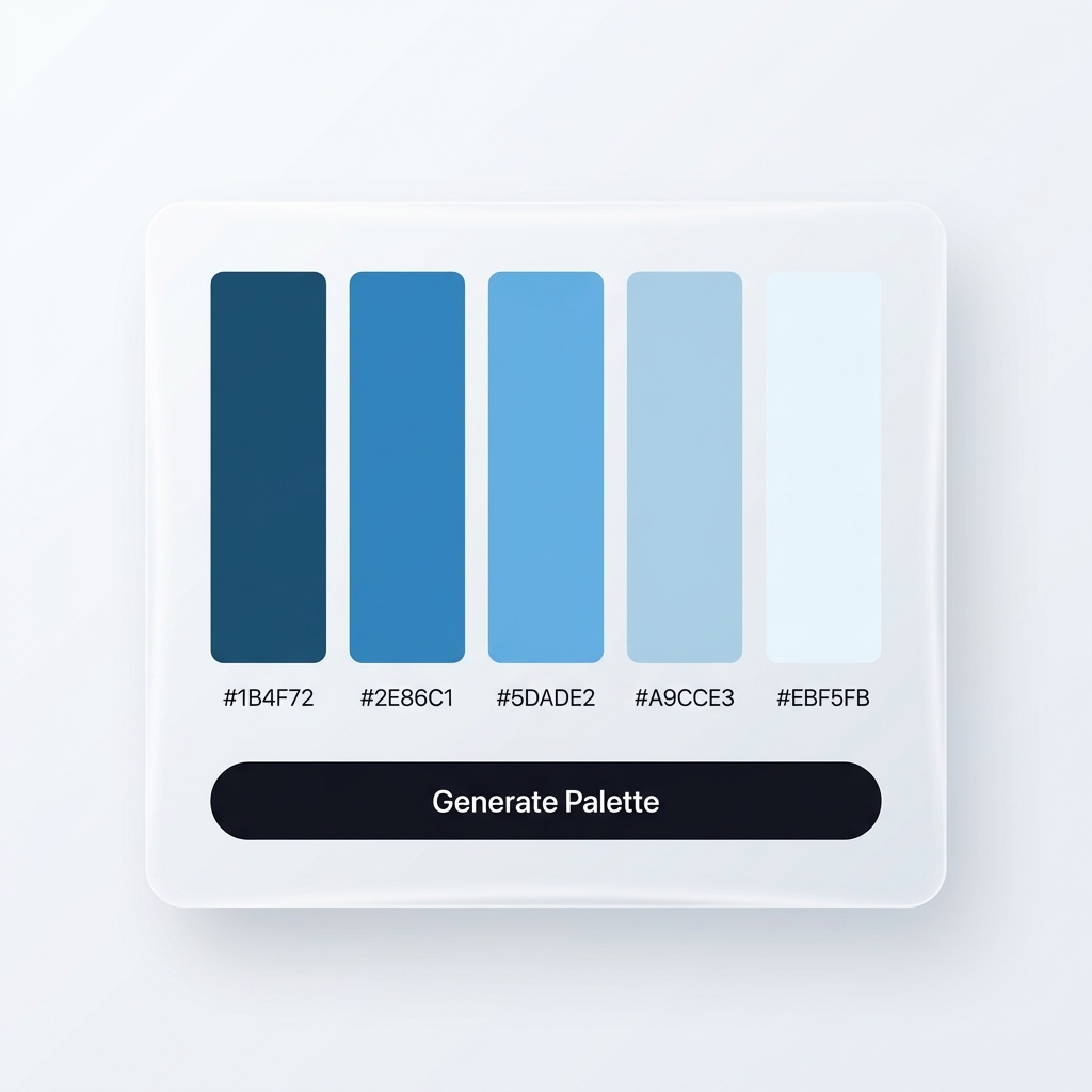
A color palette generator is a software tool that takes one or more input values — a hex code, an uploaded image, a mood keyword, or a random seed — and outputs a set of colors that work harmoniously together. The output typically includes 3 to 10 color swatches, each with its hex, RGB, and HSL values.
Under the hood, most generators apply classical color theory. The Sessions College Color Calculator is a good reference for understanding the mechanics: the tool places your base color on a 360-degree color wheel and calculates relationships like complementary (directly opposite), analogous (adjacent), triadic (equal thirds of the wheel), tetradic (four equal quadrants), and monochromatic (same hue, varied lightness and saturation). These mathematical relationships produce combinations that feel balanced because the human eye is tuned to perceive them as such.
More sophisticated tools go further. Huemint uses a machine learning model trained on thousands of human-curated palettes to generate schemes that feel contemporary rather than merely correct. ColorMagic accepts natural language inputs — you type "forest at dusk" and receive a palette — by mapping semantic concepts onto color space through an AI model.

The key mechanic that makes any generator useful in real work is the lock-and-regenerate pattern: you lock the one or two colors you already know (your brand primary, for instance), then hit generate until the tool fills in the remaining slots with mathematically and aesthetically compatible choices. This preserves your constraints while reducing the exploratory work from hours to seconds.
2. What Are the Best Free Color Palette Generators for Designers?
The free tier options available today cover the full spectrum from fast-and-simple to AI-powered. Here are the standout tools by use case:
For speed and exploration: Coolors remains the industry default for rapid iteration. Hit the spacebar and a new five-color palette appears instantly. Lock your favorites and keep cycling. It also exports to Adobe, Figma, and PDF. According to the Noun Project Blog's roundup of palette generators, Coolors works well for designers who need quantity of options fast.
For AI-personalized palettes: Khroma trains a neural network on the 50 colors you choose at setup, then generates infinite personalized palettes in typographic, gradient, and poster views. It learns your aesthetic preferences and filters out colors you explicitly dislike.
For accessible, WCAG-compliant palettes: Venngage's Accessible Color Palette Generator ensures all pairings meet the WCAG 2.1 minimum contrast ratio of 4.5:1 for normal text. This is the right starting point for design systems where accessibility is non-negotiable.
For brand and UI system building: Figma's Color Palette Generator generates palettes directly inside the Figma ecosystem, where most UI designers already work. Paletton offers granular control over color wheel angles and offers contextual previews of each scheme applied to a sample UI.
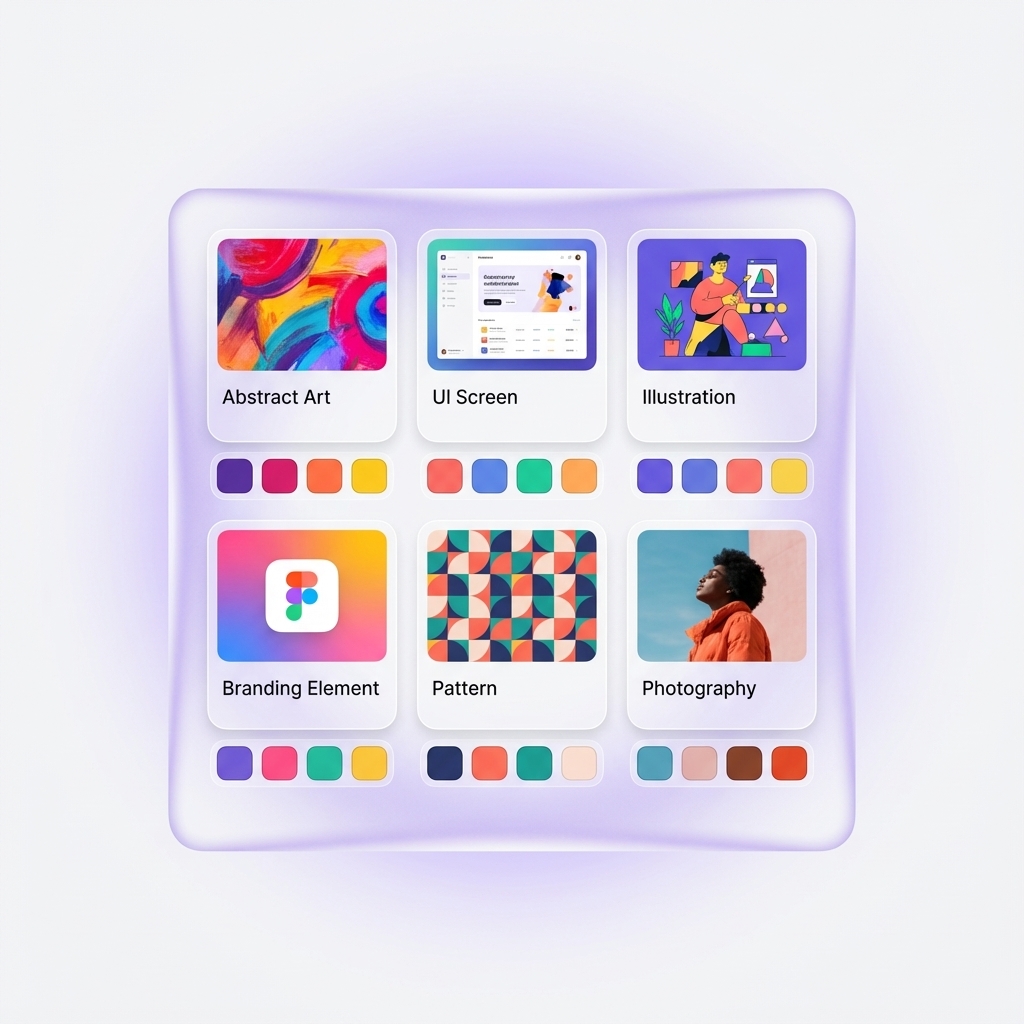
For AI-to-context workflow: Inspo AI's free tools pair color generation with a live moodboard so you see your palette applied to real design assets — not just abstract swatches — immediately after generating it.
3. How Do You Generate a Color Palette From an Image?
Photo-to-palette extraction is one of the most practical capabilities in modern color tools. The workflow: upload any image and the tool samples the most dominant colors, groups similar pixel values, and returns 4 to 8 representative hex codes.
The underlying algorithm most tools use is k-means clustering applied to the image's pixel color values in Lab color space. Lab color space is perceptually uniform, meaning two colors that look similar to the human eye sit close together numerically. By running k-means with k set to the desired number of swatches, the algorithm partitions pixel colors into clusters and returns each cluster's centroid as a palette color. The result is not simply the "most common" colors but a representative spread.
Top tools for this workflow include:
- Adobe Color's Image Extraction: Offers five extraction modes — Colorful, Bright, Muted, Deep, Dark — so you control the character of the output palette.
- Coolors' Image Picker: Simple drag-and-drop upload with immediate swatch output and lock/edit controls.
- Figma's Color Picker from Image: Outputs hex, RGB, HSB, and HSL for every extracted color, and lets you drag swatches directly into your canvas.
- Colormind's Image Mode: Uses an AI approach that aims to find colors that work together aesthetically rather than simply the most statistically frequent pixels — a distinction that matters for palettes that will actually be used in design rather than analysis.
A practical use case: you are designing a product landing page and your client provides a hero photography set. Upload one of the strongest images to Adobe Color's extraction tool, choose "Muted" mode, and you have a palette that harmonizes with the photography. This takes under 60 seconds.
4. What Are the Main Color Harmonies and Which Should You Use?
Color harmony is the principle that certain mathematical relationships between hues on the color wheel produce combinations that the eye reads as balanced. Sessions College's color theory resource and Wikipedia's overview of color schemes describe six relationships designers use most:
Complementary: Two colors directly opposite each other on the wheel (e.g., blue and orange). High contrast, visually striking. Works well for CTAs and interactive elements where you need one color to pop against another.
Analogous: Three to five colors adjacent on the wheel (e.g., yellow, yellow-orange, orange). Low contrast, harmonious, and easy on the eye. This is the go-to for interfaces where users need to stay focused without visual fatigue.
Triadic: Three colors evenly spaced at 120-degree intervals (e.g., red, blue, yellow). Vibrant and balanced. Useful for illustration-heavy brands or products targeting younger, energetic audiences.
Split-complementary: A base color plus two colors adjacent to its complement. Lower tension than a pure complementary pair, but still high visual interest.
Tetradic (square or rectangle): Four colors at 90-degree intervals. Rich options for complex design systems, but requires discipline to prevent the palette from feeling chaotic — one color must dominate.
Monochromatic: One hue at multiple lightness and saturation levels. Sophisticated, cohesive, and very easy to apply consistently. Premium SaaS brands and financial products frequently use monochromatic palettes for this reason.
For most UI/UX projects, the practical advice is: start with an analogous or monochromatic palette for the background and neutral system, then add a single complementary accent for interactive states and CTAs. This structure gives you visual coherence with enough contrast to guide user attention.
5. How Many Colors Should a Brand Color Palette Have?
There is no fixed rule, but the professional consensus, as outlined by Branding Compass and confirmed by brand strategy firm deBroome's guidelines, points to three to five colors as the functional minimum for most brands.
A working brand palette typically includes:
- 1 primary color: Your most recognizable, highest-frequency color — the one that appears in the logo, primary CTAs, and headers.
- 1 secondary color: A supporting hue that creates visual interest and flexibility across different assets.
- 1 to 3 neutral colors: Background whites, grays, and blacks that give the primary and secondary room to breathe.
- 1 semantic accent (optional): A distinct color reserved for alerts, success states, or urgency signals — especially important for UI products.
Todaymade's practical guide on brand color count notes that the real constraint is not how many colors you have but how consistently you apply them. Brands with 10 colors used inconsistently look less professional than brands with 3 colors applied with discipline.
A useful heuristic from Nine Blaess's branding research: colors for recognition (primary, secondary) and colors for navigation (semantic, functional) serve different purposes. Mixing them up — using your brand accent for both a hero section background and a "delete" button — creates visual confusion and weakens both functions.
For design system work, tools like Inspo AI's brand scanner can audit an existing brand's color usage across a library of assets, surfacing inconsistencies before they compound across a full product.
6. How Do You Choose Accessible Colors for Web and UI Design?
Accessible color design means ensuring that color combinations provide sufficient contrast for users with low vision or color blindness. The governing standard is WCAG 2.1, published by the W3C, which sets the following minimum contrast ratios:
- 4.5:1 for normal text (under 18pt or 14pt bold)
- 3:1 for large text (18pt or 14pt bold and above) and UI components like buttons and input fields
- Level AAA (enhanced): 7:1 for normal text
Approximately 8% of men and 0.5% of women have some form of color vision deficiency, as noted by Section508.gov's color accessibility resource. The most common form is red-green color blindness, which means red-on-green combinations convey nothing to a significant segment of users.
Practical steps for accessible palette selection:
- Start with a contrast checker early. Do not choose your full palette and check accessibility at the end. Tools like WebAIM's Contrast Checker and Venngage's Accessible Palette Generator integrate accessibility into the generation step itself.
- Avoid relying on color alone to convey meaning. A red error state needs an icon or text label alongside it, not just the red color.
- Test with a color blindness simulator. Adobe Color includes a "Color Blind Safe" accessibility check under its Accessibility Tools tab. Figma's accessibility plugins (such as A11y Color Contrast Checker) run checks inline as you design.
- Build dark mode accessibility from the start. Every color in your palette needs a dark-mode counterpart. A blue that reads at 4.8:1 on white may fall below 3:1 on a dark navy background.
The AudioEye guide to accessible colors points out that high-contrast accessible palettes frequently also outperform on conversion metrics — they are simply easier for all users to read and interact with, not just those with visual impairments.
7. How Does AI Make Color Palette Generation Better Than Manual Methods?
Manual color selection asks a designer to hold color theory knowledge, trend awareness, brand constraints, and accessibility requirements in working memory simultaneously, then translate all of them into a coherent multi-color system. AI tools offload the first two to computation and let the designer focus on judgment and refinement.
According to SuperAGI's comparative analysis of AI vs. traditional color selection, AI-assisted palette generation reduces time spent on color selection by up to 70%. A separate analysis from SuperAGI on AI vs. manual palette generation found that 62% of designers already use AI tools for at least some design tasks, with color being one of the highest-frequency applications.
The specific advantages AI brings to palette generation:
Trend analysis at scale: Tools like Khroma train on thousands of popular human-made palettes. The output reflects current aesthetic trends without the designer needing to spend hours browsing Dribbble and Behance.
Semantic-to-visual translation: AI tools like ColorMagic and Huemint can take a concept ("trustworthy but approachable", "dark academia editorial") and generate a palette that expresses that concept, bridging brand strategy and visual output.
Personalization over time: Tools that learn from your approval and rejection history (Khroma does this explicitly) improve with use. They function as a trained taste collaborator rather than a generic calculator.
Cross-constraint optimization: Generating a palette that is simultaneously harmonious, on-brand, and WCAG-accessible requires juggling multiple constraints at once. AI tools can optimize across all three simultaneously rather than sequentially.
Where human judgment still dominates: cultural color associations, industry-specific conventions (finance products avoid red-dominant palettes for obvious reasons), and the final decision about whether a palette feels right for a specific brand story. The best workflow pairs AI-generated options with human curation.
Platforms like Inspo AI take this further by connecting AI color generation directly to a design inspiration library, so you can validate how a palette performs against real design references before committing to it.
Build Better Palettes, Faster
Color is a design system's foundation. Get it right and every downstream decision — typography pairings, component states, illustration styles, photography art direction — clicks into place more easily. Get it wrong and no amount of polished execution recovers the incoherence.
The good news: the barrier to excellent color work has never been lower. Free tools now put AI-powered, theory-sound, accessibility-checked palette generation within reach of every designer on every project.
The practical starting point is to use a free color palette generator to explore broadly, then apply human judgment to narrow down to a palette that carries both technical rigor and brand meaning. From there, see your palette in real design context before committing.
Explore Inspo AI's free design tools to generate palettes, build moodboards, and audit your brand colors in one unified workspace — completely free to start.