TLDR
- A summer color palette draws from cool, muted, and desaturated tones rooted in seasonal color analysis theory, making it one of the most versatile palettes in design.
- The four core sub-types each carry a distinct character: True/Cool Summer is calm and classic; Soft Summer is greyed and understated; Light Summer is airy and delicate; Deep/Dark Summer is rich and dramatic.
- Each sub-type carries its own hex code signature, from the icy
#B0C4DEof Light Summer to the deep plum#4A2545of Dark Summer.- For UI designers and brand teams, understanding these sub-types turns vague "summer vibes" into a precise, repeatable design system.
Introduction
The summer color palette sits at the intersection of cool undertones and restrained saturation, giving designers one of the most sophisticated and broadly applicable color families to work with. Unlike the bright warmth of spring or the deep intensity of autumn, the summer palette favors hues that feel filtered, hazy, and considered. Think powder blue, dusty rose, soft lavender, and muted sage rather than bold primaries or earthy terracottas.
For UI/UX designers, brand teams, and freelancers, understanding a true summer color palette means more than picking soft colors at random. It means knowing the four distinct sub-types, the specific hex codes that define each one, and how to apply them to digital products, brand identities, and design systems. This guide covers all of it, backed by seasonal color theory and digital design best practices.

What Defines a Summer Color Palette?
The summer color palette originates from seasonal color analysis, a system developed in the 20th century that sorts colors into four primary seasonal families based on undertone, value (light vs. dark), and saturation (clear vs. muted). Summer sits firmly in the cool, muted quadrant of this system.
What sets a summer palette apart from every other season is its combination of blue-based undertones with low saturation. Colors in the summer family are never vivid or warm. They carry grey or blue undertones that give them a soft, atmospheric quality, as if seen through morning fog or soft afternoon light.
The palette reads as calm, sophisticated, and refined. The full summer family avoids true black, preferring charcoal and navy instead. It avoids true white too, gravitating toward off-whites with a cool or blue-grey cast, such as #F0F4F8 or #EEF2F6. Most importantly, summer colors avoid any yellow, orange, or earthy warmth. Every hue sits on the cool half of the color wheel.

According to seasonal color theory experts at The Concept Wardrobe, "Soft Summer is muted and cool. The Soft Summer colour palette contains highly desaturated, greyed out colours." This characteristic applies across all four summer sub-types, though each takes it in a different direction in terms of depth and lightness.
What Are the Four Summer Color Sub-Types?
Seasonal color analysts have broken the broader summer family into four distinct sub-types, each with its own tonal signature and use case in design.
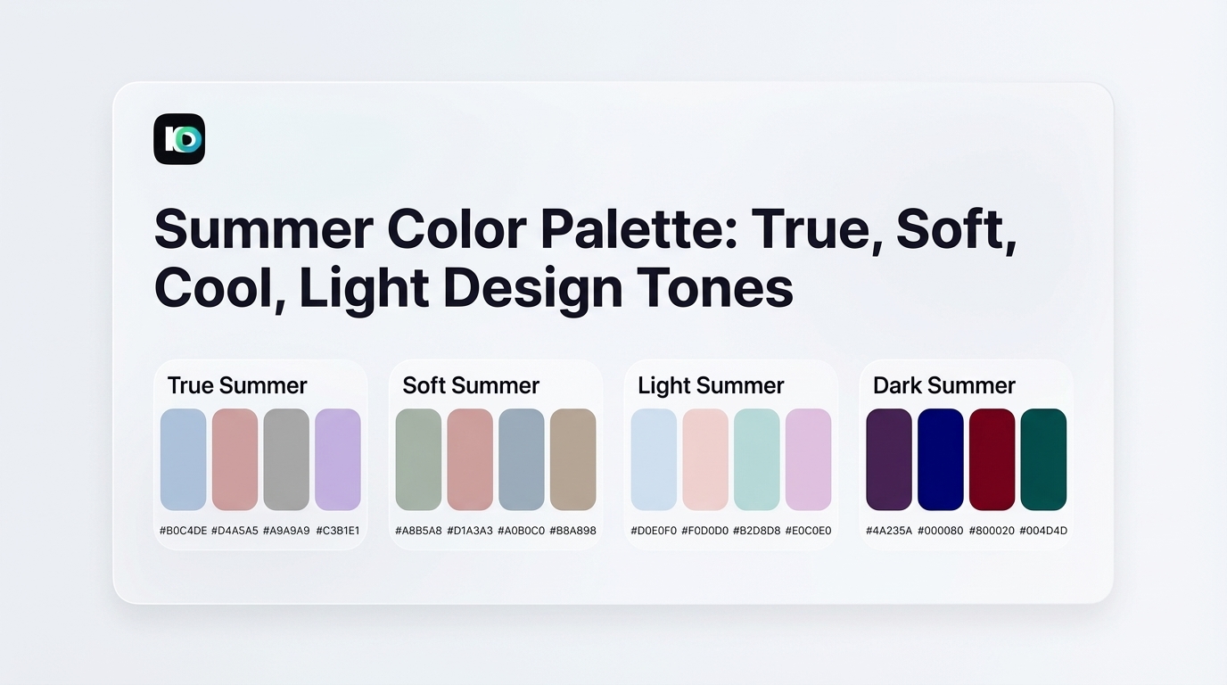
True Summer (also called Cool Summer) represents the purest expression of the summer palette. It sits at the center of the seasonal color wheel with a direct cool bias and medium saturation. Colors here feel balanced and classic, neither too light nor too dark, never vivid. True Summer is the baseline against which the other three sub-types diverge.
Soft Summer sits at the border between summer and autumn, picking up the slightest hint of warmth while staying firmly cool and highly muted. It is the most desaturated of the four sub-types. Soft Summer hues look greyed out and blended, giving designs an understated, editorial quality. The Concept Wardrobe notes these colors would make most other seasonal types look washed out, but in context they deliver quiet elegance.
Light Summer borrows luminosity from the spring family. Colors are still cool and muted, but they gain significant lightness, producing icy, barely-there tones. Light Summer is the palest and most delicate of the four. It feels ethereal and fragile, ideal for fintech dashboards, wellness brands, or premium SaaS interfaces.
Deep/Dark Summer borrows depth from the winter family. It keeps the cool undertone but pushes colors toward medium-deep to deep values. Dark Summer hues feel rich and dramatic, with colors like deep plum, dark teal, and muted burgundy sitting comfortably in this territory. According to Color Analysis App, "Deep summer mixes cool with medium-to-deep value for a sophisticated, low-key appearance."
Understanding these four sub-types allows designers and brand teams to select the right level of depth and saturation for their specific context, rather than applying "soft summer colors" as a one-size category.
What Are the Hex Codes for Each Summer Sub-Type?
Specific hex codes give designers reliable anchor points for each summer sub-type. The following breakdown covers the core hues across all four families.
True/Cool Summer hex codes:
- Dusty blue:
#5B7FA6 - Mauve rose:
#C17E8C - Powder lavender:
#B8A9C9 - Cool slate:
#6B8CAE - Soft mauve:
#B08090 - Blue-grey neutral:
#8C9BAD
Soft Summer hex codes:
- Greyed sage:
#8A9B8A - Muted rose-grey:
#BC8B8B - Dusty blue-grey:
#8A9BAD - Warm taupe-grey:
#A8998C - Cadet grey:
#96A8B2 - Faded mauve:
#B89BA8
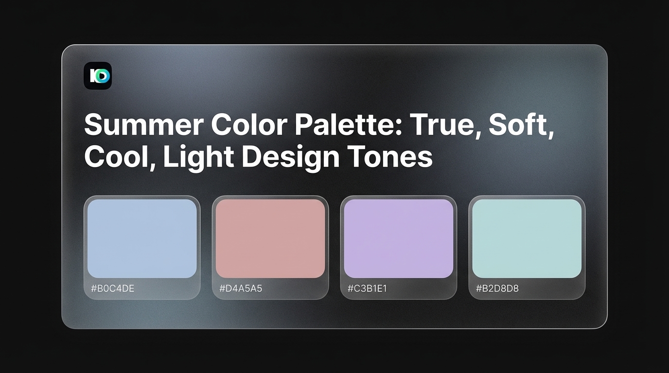
Light Summer hex codes:
- Icy blue:
#B0C4DE - Pale blush pink:
#F0C8C8 - Soft mint:
#B2D8D8 - Light lilac:
#D3C0E0 - Pale periwinkle:
#CCCCFF - Silver mist:
#D0D8E8
Dark/Deep Summer hex codes:
- Deep plum:
#4A2545 - Dark teal:
#2A5060 - Muted burgundy:
#6B2838 - Deep navy:
#1E2E48 - Dark dusty rose:
#8C3E50 - Charcoal blue:
#3A4A5C
Tools like Inspo AI make it easy to search these hex codes, build moodboards around each sub-type, and test color combinations against real UI and brand contexts, saving hours of manual trial and error.
How Does the Summer Palette Differ from the Winter Palette?
Summer and winter share the same cool, blue-based undertone, which makes them easy to confuse. But they differ fundamentally in saturation and contrast, and this distinction has real consequences for design.
Winter palettes prioritize intensity and contrast. Winter hues are clear, vivid, and ungreyed. They create high-contrast combinations such as pure black #000000 with crisp white #FFFFFF or electric cobalt with hot fuchsia. As Soul of Color puts it, "True Summer's palette feels calming and soft, like a misty morning, while True Winter's colours feel striking and crisp, like a snowy winter night."
In design terms:
- Winter suits bold, high-contrast interfaces where clarity and authority are the primary goals, such as legal tech, fintech security products, or news platforms.
- Summer suits products that want to feel approachable, premium, and calm, such as wellness apps, lifestyle SaaS, editorial design tools, and B2B platforms that target a professional but human audience.
Another key difference is the role of black and white. Winter palettes use both freely. Summer palettes replace black with deep charcoal or navy (#2C3E50 or #1E2E48) and replace white with soft off-whites (#F5F7FA). Mixing true black into a summer palette creates a jarring tonal clash that undercuts the intended softness.
The practical rule: if your design needs to feel powerful and sharp, choose winter. If it needs to feel considered and refined without sacrificing sophistication, choose summer. Both communicate professionalism, but through entirely different emotional registers. UXmatters notes that muted palettes "deliver a message of modernity, serenity, and calm" in web design contexts.
How to Apply a Summer Color Palette in UI and Brand Design
Translating a summer color palette into a functional design system requires more than picking a set of soft hex codes. It demands a structured approach to hierarchy, contrast, and accent selection.
Start with a tonal foundation. For Light or True Summer, set your background to an icy off-white such as #F4F6FA or #EEF2F6. For Dark Summer, a deep blue-charcoal like #1E2A3A works well as a dark-mode base.
Use mid-saturation blues and mauves for primary UI elements. Buttons, active states, and primary calls to action benefit from hues like #5B7FA6 (dusty blue) or #6B8CAE (slate). These carry enough contrast against light backgrounds to pass WCAG accessibility guidelines without forcing a high-saturation override.
Reserve the deeper summer tones for type and borders. Rather than using pure black #000000 for body text, shift to #2C3A4A or #3A4555. It reads cleanly while staying within the palette's tonal range.
Use a single accent for interactive highlights. Soft lavender #B8A9C9 or dusty rose #C17E8C work well for hover states, notifications, or accent badges without breaking the muted atmosphere.
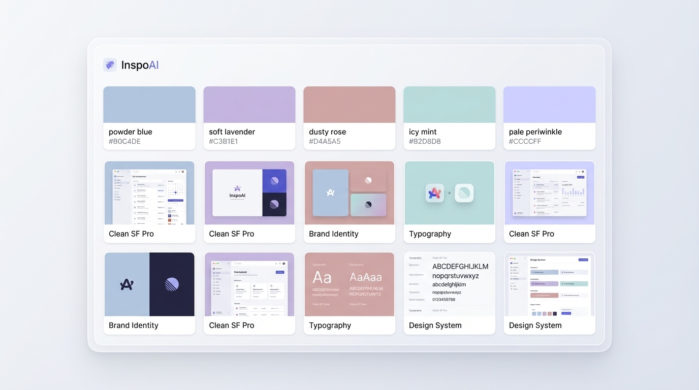
Platforms like Inspo AI give designers a structured way to curate summer color references, scan existing brand assets for tonal consistency, and build digital moodboards that keep the entire team aligned on the chosen sub-type. Its AI-powered brand scanner can detect whether a set of uploaded assets skews toward Soft Summer, Light Summer, or another tonal family, making it particularly useful during brand audits.
According to CC Creative Design, muted palettes in UI/UX "enhance user experience by reducing visual strain and making content more approachable," which is precisely why summer hues dominate SaaS dashboards, wellness apps, and premium editorial interfaces in 2025.
What Are the Most Popular Summer Color Combinations?
The most effective summer color combinations keep all hues within the same tonal family while varying value (lightness) to create depth and hierarchy.
Powder blue + dusty rose + soft grey:
#B0C4DE + #D4A5A5 + #9DA8B3. This trio is one of the most recognizable summer combinations. It reads as gentle and balanced, widely used in wellness, beauty, and lifestyle branding.
Soft lavender + cool mint + pale periwinkle:
#C3B1E1 + #B2D8D8 + #CCCCFF. This combination skews toward Light Summer territory and works exceptionally well for SaaS onboarding screens, mobile app UI, and brand systems that want a modern, airy feel.
Muted navy + slate blue + soft mauve:
#3A5068 + #6B8CAE + #B08090. This darker combination draws from True and Dark Summer and suits financial platforms, editorial publications, and B2B SaaS interfaces where authority and refinement need to coexist.
Charcoal blue + deep plum + dusty rose:
#3A4A5C + #4A2545 + #C17E8C. This combination anchors firmly in Dark Summer territory and suits premium brand identities that want drama without warmth.
Icy mint + pale blush + silver mist:
#B2D8D8 + #F0C8C8 + #D0D8E8. The purest Light Summer combination, ideal for dashboards, packaging, and print collateral that targets a soft, premium audience.
Canva's color wiki confirms that cool summer pairings like turquoise #01B9CC, soft pink #F3B9DF, and spearmint #D3E9E7 consistently rank among the most-used summer combinations in design templates. The through-line in every successful summer palette is tonal harmony: keep saturation consistent across all hues and let value contrast do the work.
How to Build a Custom Summer Color Palette for Your Brand
Building a custom summer palette is a five-step process that moves from undertone confirmation through to a full, tested design system.
Step 1: Confirm your undertone. Every summer palette starts cool and blue-based. Check your existing brand assets. If your neutrals carry even a hint of yellow or orange, you are not working with a summer palette. True summer neutrals stay in the grey-blue zone.
Step 2: Choose your sub-type. Decide whether your brand calls for the calm balance of True Summer, the editorial understatement of Soft Summer, the ethereal lightness of Light Summer, or the dramatic depth of Dark Summer. Each sub-type sends a distinct emotional signal.
Step 3: Set your three foundation colors. Pick a background neutral, a primary mid-tone, and a text/border dark. For a Light Summer brand: #F4F6FA (background) + #7A9EB8 (primary mid) + #2C3A4A (text).
Step 4: Add one or two accent hues. Accent colors in a summer palette come from adjacent hues on the cool side of the wheel, such as soft lavender, dusty rose, or pale mint. Keep them at the same saturation level as your foundation colors.
Step 5: Test and validate with references. Pull real-world design references that match your chosen sub-type, check contrast ratios for accessibility, and verify that all colors read harmoniously on both light and dark backgrounds.
Inspo AI's free tools speed up this process significantly by letting you search curated visual references filtered by color tone, build and export moodboards, and run AI-powered brand audits directly against your uploaded color tokens.
Conclusion
The summer color palette rewards designers who take the time to understand its four sub-types. True/Cool Summer delivers classic calm. Soft Summer brings greyed-out sophistication. Light Summer offers delicate, airy luminosity. Dark Summer adds dramatic depth without sacrificing cool refinement. Each sub-type gives brand teams and UI designers a precise, consistent tonal system rather than a vague seasonal mood.
The hex codes, combinations, and application principles in this guide give you everything you need to start building with confidence. If you want to speed up the research, reference-gathering, and palette-building stages, Inspo AI's free design tools give you a searchable library of curated visual references, an AI moodboard builder, and a brand scanner designed for exactly this kind of color work. Start with your sub-type, commit to your tonal range, and let the palette do the rest.