TLDR
The soft summer color palette is defined by cool, muted, low-saturation tones that carry a consistent grey veil. Here is what you need to know:
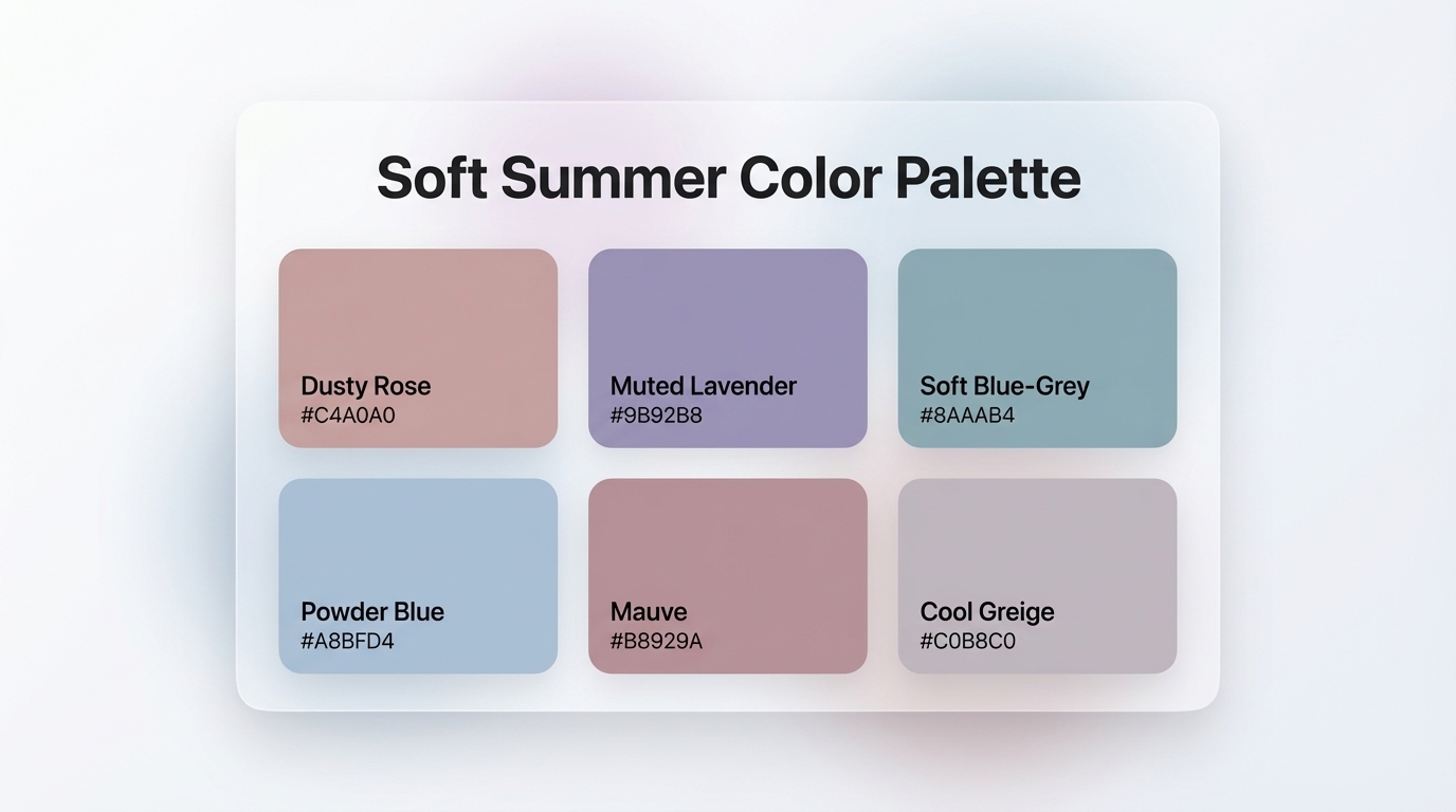
- Core soft summer colors include: dusty rose
#C4A0A0, muted lavender#9B92B8, soft blue-grey#8AAAB4, powder blue#A8BFD4, mauve#B8929A, and cool greige#C0B8C0- Softness (mutedness) is the defining quality of this sub-season, not coolness or lightness
- The palette creates a calming, premium aesthetic in UI design, ideal for wellness, editorial, and lifestyle SaaS products
- To use it in digital design, apply muted tones to backgrounds and card surfaces, and pair with near-dark text to maintain contrast and WCAG accessibility
Introduction
Color is rarely just aesthetic. In UI and brand design, color shapes perception, sets tone, and directs the eye long before a single word gets read. The soft summer color palette occupies a rare space in the design spectrum: it is cool without being cold, muted without being flat, and refined without sacrificing warmth. Built around highly desaturated, grey-toned hues like dusty rose, muted lavender, and soft blue-grey, this palette signals restraint and sophistication. It has become a reliable system for designers who want their products to feel premium and approachable at the same time. This guide covers everything you need to know about soft summer colors, from their origins in seasonal color analysis to specific hex codes and practical UI application strategies you can put into practice today.

What Is a Soft Summer Color Palette?
The soft summer color palette is one of three sub-seasons within the Summer family in the 12-season color analysis system. It sits between True Summer and Soft Autumn on the seasonal color spectrum, which means it shares coolness with the Summer family while borrowing a touch of Autumn's earthiness and depth.
The defining characteristic of Soft Summer is softness, meaning high desaturation. Every color in this palette carries a grey veil over it, reducing chroma and giving each hue a quiet, dusty quality. As The Concept Wardrobe puts it: "Soft Summer contains highly desaturated, greyed-out colours that would make other colour seasons look washed out."
For designers, this palette is defined by three key properties:

- Cool undertones across every hue
- Low saturation with a consistent grey filter
- Medium depth, neither very light nor very dark
In practice, this means the palette reads harmonious at a glance. No single color fights for attention. Every tone sits in quiet agreement with the others, which makes Soft Summer one of the most cohesive palettes to build a UI system around. According to Color Analysis App, Soft Summer is "cool, muted and low contrast with medium depth," which means designers should opt for subtle blends rather than bold color statements. The result is a visual aesthetic that feels calm, considered, and quietly luxurious — a hallmark of premium digital products.
What Colors Does the Soft Summer Palette Include?
 Summer Color Palette Tool — Six Core Swatches">
The soft summer palette centers on six core color categories, each pulled toward grey and away from pure, vivid saturation.
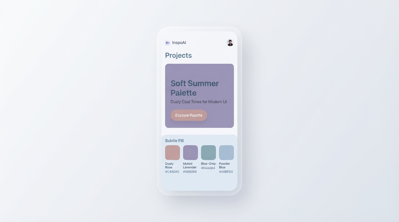
Dusty Rose (#C4A0A0) is the most iconic soft summer pink. It sits far from hot pink or coral, reading instead as a muted, pinkish-grey that communicates softness without sentimentality. As Figma's color guide notes, dusty rose "blends pink with hints of gray" for a gentle, accessible tone.
Muted Lavender (#9B92B8) brings a cool purple depth that avoids the vibrancy of true violet. It carries a faint greyish cast that keeps it understated and easy to pair.
Soft Blue-Grey (#8AAAB4) is the palette's primary neutral accent — a cooled-down slate that works for icons, borders, dividers, and secondary text.
Powder Blue (#A8BFD4) sits lighter and airier, perfect for background fills, card surfaces, or subtle section breaks.
Mauve (#B8929A) deepens the dusty rose family with a more purple-leaning undertone, adding richness without warmth.
Cool Greige (#C0B8C0) functions as a near-neutral base. It blends grey and beige with a cool lean, keeping UI surfaces from reading as pure white while staying firmly within the muted cool vocabulary.
Beyond these six, the palette extends into dusty sage green (#A8B5A2), soft charcoal (#6B7280), rose taupe (#C4A8A0), and muted lavender-blue (#B0B8D4). The thread running through all of them is the same: every hue reads quiet, greyed, and cool.
How Does Soft Summer Differ from True Summer and Light Summer?
All three Summer sub-seasons share a cool, soft quality, which makes them easy to confuse. The distinction lies in which quality each sub-season prioritizes above all others.
As Soul of Color explains: for Soft Summer, the primary characteristic is softness (mutedness). For True Summer, the primary characteristic is coolness. For Light Summer, the primary characteristic is lightness.
Here is how that plays out in practice:
- True Summer carries more blue-based coolness and slightly more contrast. Its colors feel cleaner and more blue-toned. Think cornflower blue, soft blue-lavender, and icy rose. It suits healthcare interfaces, tech platforms, and clean editorial brands.
- Light Summer sits higher in value, with a more pastel-like brightness. Colors feel airy and delicate, but not particularly muted or atmospheric. It suits wedding brands, lifestyle blogs, and soft beauty products.
- Soft Summer sits at the lowest saturation of the three. Its colors feel dusty, hazy, and atmospheric, as My Colour Stylist describes it: "hazy tinted landscapes revealing heathers, purpled mountains, gentle greens and silvered lochs." This palette suits luxury SaaS products, wellness platforms, editorial design tools, and curated lifestyle brands.
For designers, this distinction is meaningful. A True Summer palette might feel clean and clinical. A Light Summer palette might feel fresh and approachable. The Soft Summer palette reads more editorial and premium — the right choice when "sophisticated, not cold" is the goal.
What Colors Should a Soft Summer Palette Avoid?
The most important colors to exclude from a Soft Summer palette are those with high chroma, warm undertones, or extreme value contrast.
According to InStyle, Soft Summer should avoid "overly warm or highly saturated colors like bright orange, neon yellow, mustard, or intense red." These colors break the low-saturation harmony that makes Soft Summer work as a cohesive system.
For UI design specifically, avoid:
- Pure black (
#000000) as a primary text color. Swap it for a soft dark charcoal like#3B3B3Bor#4A4A4A, which maintains readability without creating harsh contrast against muted backgrounds. - Pure white (
#FFFFFF) as a page background. Prefer a cool off-white or pale greige like#F5F3F2, which harmonizes with the dusty tones around it. - Saturated accent colors including neon green, hot coral, electric blue, or vivid orange. All of them clash with the low-chroma premise of the system.
- Golden or amber tones which carry warm undertones that shift the palette toward Soft Autumn territory.
The Color Analysis App also recommends substituting stark black with charcoal and pure white with soft white "to maintain the look." This applies directly to UI design: the palette only works when all components speak the same muted language, with no single element shattering the quiet harmony.
Where Did Seasonal Color Analysis Come From?
Seasonal color analysis has roots in the Bauhaus movement of the 1920s. Johannes Itten, a painter and professor at the Bauhaus Design Academy, first explored the idea that individuals are instinctively drawn to color harmonies that mirror their own complexion and personality. The Color Analysis Timeline documents Itten's work at Bauhaus as among the earliest formal explorations of personal color harmony in design education.
In 1942, Suzanne Caygill formalized the concept, originating personal color analysis as a consultative practice. Her work linked an individual's coloring — skin, hair, and eyes — to a specific harmonious set of colors.
The system reached mass popularity in 1980 when Carole Jackson published Color Me Beautiful, which introduced a four-season model (Spring, Summer, Autumn, Winter) to a mainstream audience. Color analysts later expanded the four-season system into twelve sub-seasons, giving rise to Soft Summer, True Summer, and Light Summer as distinct categories. According to Wikipedia's color analysis entry, the method has seen a significant resurgence driven by social media communities and growing consumer interest in personalized aesthetics.
For designers, this history matters because seasonal color analysis offers a tested, emotionally grounded framework for palette selection. Inspo AI draws on this kind of systematic color thinking directly, giving designers structured tools to explore and apply curated color systems to real products.
How to Apply the Soft Summer Palette to UI and Brand Design
 Inspo AI Creator Studio — Soft Summer Tones in a Real Product UI">
The soft summer palette translates into digital products with strong versatility. Its muted tones work hardest in three key roles: background surfaces, card fills, and accent elements.
For background surfaces, use cool greige (#C0B8C0) or powder blue (#A8BFD4) at a very low opacity (around 10-15%) as a page or section wash. This creates a subtle tinted background without overpowering content or reducing contrast.
For card fills, dusty rose (#C4A0A0) and muted lavender (#9B92B8) work well as lightly tinted card backgrounds when applied at 10-12% opacity over white. The tint suggests color presence without compromising text readability.
For accent elements, soft blue-grey (#8AAAB4) functions as an ideal border, icon fill, or divider tone. Mauve (#B8929A) works as a secondary button background, tag color, or badge accent.
One critical consideration is contrast. The IxDF UI Color Palette guide emphasizes that color in UI design must serve readability as a primary function. Because Soft Summer tones have inherently low contrast, they should never appear as body text on light backgrounds. Reserve them for decorative, structural, and illustrative roles. Body text should stay in a near-dark neutral like #3B3B3B to meet WCAG 2.1 minimum contrast ratios.
Inspo AI's brand scanner and creator studio let designers test soft summer combinations directly in context, previewing how muted tones behave across UI components before committing to a full design system.
How to Build a Soft Summer Color System for a Website or App
A solid soft summer color system for digital products follows a four-tier structure.
Tier 1: Base Neutrals
Choose a background and surface duo. For soft summer, use a cool off-white (#F5F3F2) as the page background and soft greige (#EDE9E6) as the card surface. These two tones create depth without harsh contrast.
Tier 2: Muted Mid-Tones
Select two or three tinted mids from the core palette. Powder blue (#A8BFD4), muted lavender (#9B92B8), and dusty rose (#C4A0A0) all work well as section fills, tag backgrounds, or illustration accents.
Tier 3: Functional Dark
Choose a dark neutral for text and interactive elements. Soft charcoal (#3B3B3B) maintains WCAG AA contrast ratios against pale backgrounds without the harshness of pure black. Per WCAG 2.1 guidelines, normal body text needs a minimum contrast ratio of 4.5:1 against its background.
Tier 4: Primary Accent
Pick one tone from the mid-tier to serve as the primary interactive accent for buttons, links, and key CTAs. Soft blue-grey (#8AAAB4) or mauve (#B8929A) serve this role well. Darken the chosen accent by 20-25% for hover and active states to maintain clear interactivity signals.
Once all four tiers are set, the system holds cohesively. Every component draws from the same muted, cool vocabulary, and the resulting UI reads as deliberate and refined. As Figma's color palette guide notes, a thoughtful color palette "creates an impactful dialog between what you design for your brand and the target audience."
Conclusion: Build Your Soft Summer Color System with Inspo AI
The soft summer color palette is one of the most adaptable and aesthetically sophisticated systems available to digital designers. Its dusty cool tones — from dusty rose #C4A0A0 to muted lavender #9B92B8 to powder blue #A8BFD4 — create interfaces that feel calm, premium, and purposeful. They suit any digital product that values refinement over noise.
The key to making the system work in UI and brand design is structure: use the muted tones as decorative and surface-level elements, pair them with near-dark neutrals for text, and commit fully to the low-saturation vocabulary across every component.
Ready to build your own soft summer color system? Explore Inspo AI's free tools to search 150,000+ curated design assets, scan any brand's color identity, and generate color palettes grounded in real design thinking.