TLDR
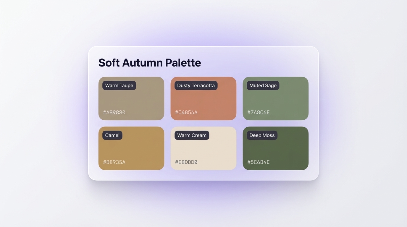
- The soft autumn color palette centers on warm, muted, low-chroma tones: dusty terracotta, warm taupe, muted sage, camel, and deep moss.
- Core hex codes to know:
#A89880(warm taupe),#C4856A(dusty terracotta),#7A8C6E(muted sage),#B8935A(camel),#E8DDD0(warm cream),#5C6B4E(deep moss).- In UI design, these tones create interfaces that feel premium, calm, and grounded without the clinical coldness of grey-dominant palettes.
- Soft autumn sits between Soft Summer and True Autumn in the 12-season color analysis system, defined by mutedness first and warmth second.
Introduction
The soft autumn color palette is one of the most versatile and sophisticated groups of hues available to designers today. Rooted in seasonal color analysis but increasingly popular across UI, brand, and digital design, these warm, muted, earthy tones strike a rare balance: they feel rich without being loud, grounded without being heavy, and elegant without feeling cold. Hex codes like #A89880 (warm taupe), #C4856A (dusty terracotta), and #7A8C6E (muted sage) create interfaces and brand identities that resonate on a deep emotional level. For UI/UX designers and brand teams ready to move beyond generic neutral palettes, the soft autumn color palette offers a complete visual language. This guide breaks down exactly what the soft autumn palette is, which colors it contains, how it compares to related seasons, and how to apply it practically in real digital design work.
What Defines the Soft Autumn Color Palette?
The soft autumn color palette belongs to the Autumn family in the 12-season color analysis system. According to The Concept Wardrobe, soft autumn sits between Soft Summer and True Autumn on the seasonal flow chart, and its defining characteristic is mutedness first, warmth second.

Every color in this palette carries a grey undertone that softens its saturation. Bright, vivid, or cool tones do not belong here. Instead, soft autumn relies on colors that feel lived-in and organic, as though they came directly from autumn foliage, dried grasses, clay soil, and mossy stone.
Three characteristics define the palette:
- Muted / low chroma: Colors carry a grey or brown veil rather than appearing pure or vivid.
- Warm undertones: The palette leans golden and yellow-green, never icy or blue-toned.
- Medium value: Neither very dark nor very light, the range sits in a comfortable middle depth.
For designers, these three properties translate into a palette that is immediately recognizable yet subtle. When you apply hex codes like #E8DDD0 (warm cream), #A89880 (warm taupe), or #5C6B4E (deep moss), you create visuals that feel organic and premium rather than clinical or on-trend for a single season.

The palette also reads as universally inviting. Adobe Express notes that "natural muted tones build trust and connection" with audiences, which explains why soft autumn consistently appears in fintech interfaces, wellness brands, and premium editorial products where trust and warmth both matter.
How Does Soft Autumn Differ from True Autumn and Deep Autumn?
All three sub-seasons sit within the Autumn family, but each carries a different primary driver. Soul of Color maps the distinction clearly:
- Soft Autumn: Mutedness is primary. Warmth is secondary.
- True Autumn: Warmth is primary. Mutedness is secondary.
- Deep Autumn: Darkness and depth are primary. Colors are richer, deeper, and more saturated.
From a design perspective, these differences translate directly into how each palette functions in an interface.
True Autumn centers on hex codes like #C0612B (pumpkin orange), #8B4A2B (warm cognac), and #4A6741 (forest green). These colors carry more punch and suit earthy brand identities with strong cultural associations, such as craft goods, heritage fashion, or organic food brands.
Deep Autumn pushes further into #3B2314 (deep espresso), #7A2B1A (brick red), and #1E3A2F (dark forest). These hex values suit luxury heritage brands or dark-mode UI products that want weight and drama.
Soft Autumn stays in the quieter range: #C4856A (dusty terracotta), #B8935A (camel), #7A8C6E (muted sage). These values work particularly well in UI design because they carry warmth without overwhelming the user with saturation or visual weight.
According to Sterling Style Academy, soft autumn also draws influence from Soft Summer through its Summer parent season, which is why it reads slightly cooler and more restrained than True Autumn despite belonging to the warm Autumn family. For designers, this subtle coolness is actually an asset: the palette remains warm enough to feel grounded, yet soft enough to work across light-mode SaaS products, editorial platforms, and personal brand identities.
Which Colors Does the Soft Autumn Palette Include?
 Autumn Palette - Color Swatches UI Panel">
The soft autumn palette contains a consistent family of earthy, muted hues organized into three functional groups. Use these as a working reference for UI, brand, or content design.
Neutrals and Base Colors
| Hex | Name | Primary Use |
|---|---|---|
#E8DDD0 |
Warm Cream | Page backgrounds, canvas areas |
#A89880 |
Warm Taupe | Secondary surfaces, card fills |
#D4C4B0 |
Sand Beige | Border highlights, hover states |
#C2AD96 |
Mushroom | Dividers, ghost UI elements |
Mid-Tones and Accents
| Hex | Name | Primary Use |
|---|---|---|
#C4856A |
Dusty Terracotta | Primary accents, active states |
#B8935A |
Camel | Icon fills, warm highlights |
#A0704A |
Tawny Brown | Supporting accents, tag labels |
#BC7B77 |
Dusty Rose | Soft-luxury accent applications |
Deep Anchors
| Hex | Name | Primary Use |
|---|---|---|
#7A8C6E |
Muted Sage | Buttons, category tags, secondary CTAs |
#5C6B4E |
Deep Moss | Footer areas, strong UI anchors |
#6B5B45 |
Dark Walnut | Body typography |
#4A3728 |
Deep Umber | Headings, icon strokes, darkest anchor |
According to Color Hex, authentic soft autumn combinations keep saturation below 40% and maintain warm golden undertones throughout the full range. Introducing cool greys or blue-adjacent neutrals breaks the palette's cohesion immediately.
How Do You Use Soft Autumn Colors in UI Design?
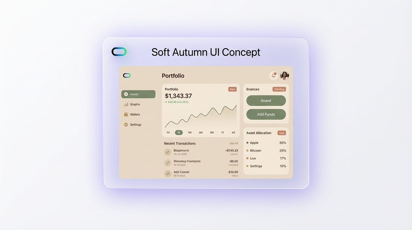
Applying the soft autumn color palette to UI design requires thinking in layers: background, surface, accent, and typography. Each layer gets a different tonal depth.
Background layer: Use #E8DDD0 (warm cream) or #F5EDE2 (a slightly lighter warm off-white) as your canvas. This single decision immediately separates a product from generic white-background SaaS tools.
Surface layer: Place cards and panels on #A89880 (warm taupe) or lighter variations like #D4C4B0 (sand beige). This creates a physical depth that flat design often loses.
Accent layer: Reserve #C4856A (dusty terracotta) or #B8935A (camel) for primary interactive elements. These hues draw the eye without the aggression of a saturated CTA button.
Typography layer: Use #4A3728 (deep umber) for headings and #6B5B45 (dark walnut) for body text. Both colors carry sufficient contrast against warm cream backgrounds while staying within the palette's warmth range. Avoid pure black #000000 entirely as it feels too sharp against these muted surfaces.
Secondary CTAs and category filters: #7A8C6E (muted sage) adds visual interest as a secondary action color. Its green undertone creates a split-complementary tension with terracotta that reads as sophisticated rather than jarring.
Inspo AI makes this process faster by letting you search for curated UI references filtered by color mood and aesthetic. Instead of manually testing each hex combination in Figma, you pull real product screenshots that already use soft autumn tones and study how those color decisions map to actual interface hierarchy, before writing a single line of CSS.
As Figma's color resource library notes, understanding how colors interact is essential for establishing clear hierarchy. Soft autumn's built-in tonal range does much of that hierarchy work for you automatically.
What Colors Complement Soft Autumn Tones?
Complementary relationships in the soft autumn palette follow warm color theory principles rather than strict opposite-wheel pairings. The goal is harmony over high contrast.
Analogous combinations produce the most cohesive results. Pair #C4856A (dusty terracotta) with #B8935A (camel) and #A89880 (warm taupe) for a monochromatic warm tone-on-tone composition. This combination appears frequently in premium wellness and editorial brand identities.
Split-complementary combinations add controlled visual tension. #7A8C6E (muted sage) against #C4856A (dusty terracotta) sits across the warm-cool boundary within the muted range. This pairing surfaces in high-end fintech interfaces and personal branding precisely because it feels both grounded and interesting.
Supporting neutrals as connectors: #D4C4B0 (sand beige) and #E8DDD0 (warm cream) serve as universal bridges. Place either shade between any two stronger soft autumn tones and the composition settles into coherence.
Colors to keep out of the palette:
- Cool greys (
#9E9E9E): clash with the golden undertones - Pure white (
#FFFFFF): reads as jarring against warm cream surfaces - Saturated blues or purples: strip all warmth from the composition
- High-chroma colors (
#FF4500): pull visual attention in a direction the palette cannot support
According to Twelve and Twenty-Eight, warm neutrals like beige and taupe act as "visual anchors" in soft autumn compositions, grounding more expressive tones like terracotta or sage and maintaining overall cohesion. In digital design, this anchoring function also improves readability by reducing the number of competing focal points on screen.
Where Did Seasonal Color Analysis Come From?
Seasonal color analysis has a longer history than most designers expect. Ana Silva Stylist traces its roots to Carole Jackson's 1980 book Color Me Beautiful, which built on the color harmony theories of Swiss Bauhaus painter Johannes Itten. Before Jackson, Albert H. Munsell developed his Munsell Color System in the early 20th century, classifying colors by hue, value, and chroma. The Colour Mentor notes that Munsell's framework gave analysts the precise vocabulary to describe why certain colors feel harmonious together while others create visual dissonance.
Jackson's contribution was translating this art-theory foundation into a practical four-season framework (Spring, Summer, Autumn, Winter), mapped to personal appearance and undertone. The system evolved in the following decades into the 12-season model, which subdivides each primary season into three sub-types. For Autumn, those sub-types are Soft Autumn, True Autumn, and Deep Autumn.
The 12-season expansion happened largely through independent stylists and consultants in the 1990s and 2000s, well before TikTok and YouTube brought the concept to a mass audience in the early 2020s. Today, "soft autumn color palette" ranks among the highest-searched color queries globally, driven by a generation of designers, stylists, and brand builders who recognize the commercial power of warm muted tones.
For design teams, this history carries practical value. The soft autumn palette brings cultural weight along with its hex codes. A brand identity or product UI that uses #C4856A and #7A8C6E together does not just look pleasant: it triggers associations with warmth, premium craft, and organic authenticity that decades of color psychology research have consistently reinforced.
How Do You Build a Moodboard with Soft Autumn Tones?
A strong soft autumn moodboard anchors every design decision before you open your design tool. Here is a practical process that produces consistent results.
Start with base colors. Pin or collect at least three neutral anchor shades: #E8DDD0 (warm cream), #A89880 (warm taupe), and #D4C4B0 (sand beige). These establish the background temperature of the entire moodboard.
Add one or two accent colors. Pick your primary accent from the terracotta or camel range. #C4856A and #B8935A both work well as primary accents. Add #7A8C6E (muted sage) if you want a secondary accent with green-adjacent depth.
Collect reference imagery. Seek out photography, textures, and UI screenshots that already live in the soft autumn range. Look for dried botanicals, linen textures, clay ceramics, aged wood, and earthy stone surfaces. These textures reinforce the palette's organic character and give the moodboard a tactile quality that pure color swatches cannot achieve alone.
Add typography samples. Choose a warm serif typeface for headings and a clean humanist sans-serif for body text. Both should feel warm and slightly rounded rather than geometric or clinical.
Review for cohesion. Check that every element on the moodboard stays within the muted, warm range. One stray cool-toned image or bright accent will pull the whole board out of alignment.
Inspo AI speeds up every step of this process. The platform lets you search design references, extract color palettes directly from images, and organize everything into a structured moodboard in one workspace. Instead of manually gathering screenshots from dozens of sites, you filter by aesthetic, color temperature, and industry and pull soft autumn UI references into a single view within minutes.
According to Coolors and Color Hunt, muted earth tone palettes consistently rank among the most-saved combinations by professional designers, confirming that the soft autumn aesthetic has genuine commercial traction well beyond personal styling communities.
Conclusion
The soft autumn color palette gives UI designers and brand teams a precise, emotionally resonant color system built on warmth, restraint, and depth. The core hex codes: #A89880 (warm taupe), #C4856A (dusty terracotta), #7A8C6E (muted sage), #B8935A (camel), #E8DDD0 (warm cream), and #5C6B4E (deep moss) form a complete, production-ready palette that works across backgrounds, surfaces, accents, and typography without compromise.
Whether you plan to use soft autumn tones in a SaaS product, a brand identity, or a content design system, the key is consistency across every layer. A single off-tone element pulls the whole composition out of its warmth range.
If you want to build, explore, and test your own soft autumn moodboard faster, visit Inspo AI's free tools for color extraction, moodboard creation, and curated design references in one place. Your next best interface might start with a single shade of dusty terracotta.