TLDR
- PX is an absolute CSS unit; REM is relative to the root font size
- The conversion formula is: REM = PX / base font size (default 16px)
- REM scales with user browser preferences, which is essential for accessibility
- The recommended base font size for REM calculations is 16px
- Free tools like NekoCalc, Testsigma, and Inspo AI's free tools suite make conversion instant
- Figma's Dev Mode now supports REM display, closing the design-to-code gap
Introduction
If you've spent any time building responsive websites, you've probably wrestled with the px vs. rem debate. Pixels feel intuitive. You design in Figma at 24px, you write 24px in CSS. Simple. But there's a catch: px is absolute. It doesn't scale when a user increases their browser font size, which means your carefully crafted typography breaks for millions of people who rely on that accessibility setting.
That's where a px to rem converter becomes essential. REM units scale proportionally with the root font size, making your typography respond to both user preferences and system settings. The result is a site that's more accessible, more consistent, and far easier to maintain at scale. Whether you're a freelance designer handing off specs to developers or a UI engineer building a full design system, the px to rem conversion process is one of the most practical skills in modern web work.

What is a PX to REM Converter and Why Do Designers Use It?
A px to rem converter is a tool that translates absolute pixel values into relative REM units for use in CSS. Rather than doing manual division every time you need to translate a design spec, a dedicated converter lets you enter a pixel value, set your base font size, and get the exact REM equivalent in seconds.
Designers use px to rem converters because modern web development strongly favors REM over PX for font sizes, spacing, and layout measurements. PX values are fixed. Once set, they don't respond to changes in a user's browser preferences or system accessibility settings. REM values scale relative to the root element's font size (the html element), which browsers default to 16px.
The practical benefit is significant. If you define your body text as 1rem instead of 16px, a user who has configured their browser to display larger fonts at 20px will see your text scale accordingly. The layout adapts without any additional CSS on your end.

According to freeCodeCamp, relative units like REM are flexible and scale based on the root element's font size, making them the preferred choice for building device-agnostic, accessible web products. For design teams working inside tools like Inspo AI's free web utilities, having a quick converter on hand removes friction from the design-to-code workflow and keeps sprints moving.
What is the Difference Between PX and REM in CSS?
PX (pixel) and REM (root em) are both CSS measurement units, but they behave in fundamentally different ways.
PX is an absolute unit. One CSS pixel corresponds to 1/96th of an inch in print media, and on screens it represents a device-independent point that stays fixed regardless of any parent or root element settings. As DEV Community explains, changing a px value doesn't ripple through the rest of your CSS. Each element is sized independently.
REM is a relative unit. It stands for "root em" and always resolves relative to the font size of the root (html) element. If your root font size is 16px, then 1rem = 16px, 1.5rem = 24px, and 0.75rem = 12px. Change the root font size and every REM value in your CSS scales proportionally.
This distinction matters enormously for accessibility. If a user increases their browser's default font size from 16px to 20px, REM-based layouts scale up harmoniously. PX-based layouts stay frozen, potentially making text too small to read or causing elements to overlap.
DubBot's accessibility guide emphasizes that people with low vision commonly rely on browser font size adjustments, and REM is the CSS unit that accommodates those preferences correctly. EM is a related relative unit, but unlike REM, EM is relative to its parent element's font size rather than the root. This can create compounding scaling issues inside nested components, which is why most design systems prefer REM for global typographic consistency.
How Do You Convert PX to REM Manually?
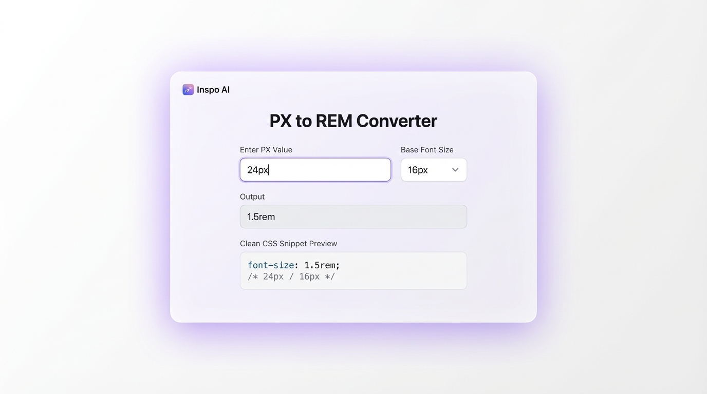
The formula for a manual px to rem converter calculation is straightforward:
REM = PX value / Base font size
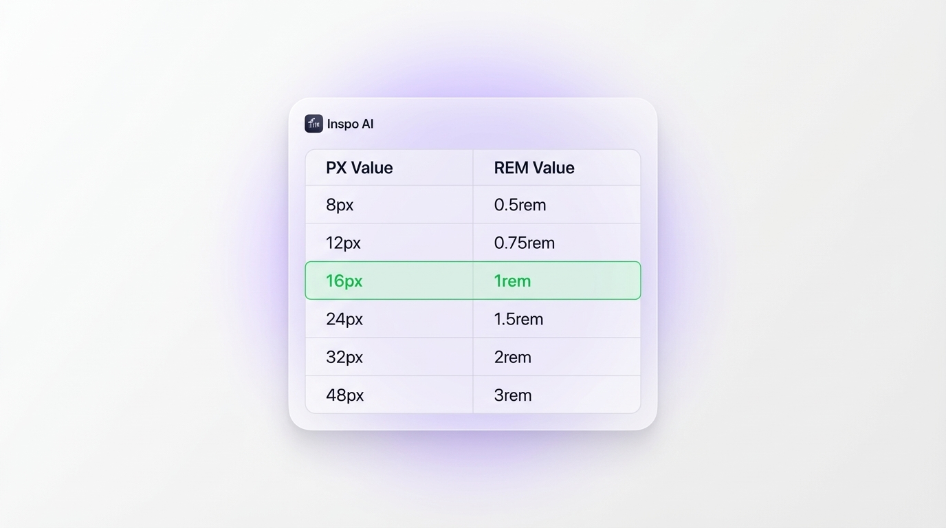
With the browser default base font size of 16px:
16px = 1rem24px = 1.5rem(24 / 16 = 1.5)32px = 2rem(32 / 16 = 2)12px = 0.75rem(12 / 16 = 0.75)10px = 0.625rem(10 / 16 = 0.625)
To perform the conversion manually, divide your target pixel value by the root font size. Stack Overflow documents the core formula as rem = px / base font, applied via a CSS rule on the html element.
Some teams use the "62.5% trick" to simplify mental math. By setting html { font-size: 62.5%; }, you rebase the root to 10px (62.5% of the browser default 16px). This makes 1rem = 10px, so 24px = 2.4rem. It sounds cleaner, but it requires overriding base font sizes across your entire CSS to maintain visual consistency and can silently break accessibility when misapplied.
For production environments, many developers automate conversions using Sass functions or CSS custom properties. DEV Community's Sass guide outlines three approaches using Sass mixins and functions that eliminate manual calculation entirely. That said, for quick single-value checks during design review, a dedicated px to rem converter tool is almost always the fastest option.
What Base Font Size Should I Use for REM Calculations?
The short answer: use 16px as your base font size, and don't override it.
Browsers default to a 16px root font size for a reason. Chrome, Firefox, and Safari all use this value when no explicit html { font-size } is set. CNP Agency's analysis outlines the mathematical elegance of 16px as a base. It divides cleanly into common typographic values: 8, 12, 24, 32, and 48px all produce clean REM numbers without trailing decimals.
Finsweet's Client-First documentation states it directly: "1rem = 16px conversion is the browser default," and following that convention means your layout automatically inherits the user's preferred base font size.
The temptation to set html { font-size: 10px } for simpler math is understandable. But it's a common accessibility mistake. When a user increases their browser's default font size to improve readability, a manually hardcoded pixel value on the root element prevents that preference from propagating through your CSS. Josh Comeau's accessibility deep dive identifies this as one of the most impactful accessibility errors in frontend development.
The best practice is to leave the html font-size unset, or set it to 100% (which inherits from the browser). Use 16px as your mental reference for converter calculations and trust REM to handle the scaling.
Why is REM Better Than PX for Responsive Design?
REM gives you a single control point for scaling your entire layout. When you build a design system with REM, changing one value (the root font size) scales every component that uses REM units simultaneously. A widely shared Reddit post in the webdev community documents a real-world case where an app needed to compress for small corporate laptop screens. Because everything was written in REM, one CSS change (font-size: 13px on the root element) compressed the entire UI without touching a single other rule.
PX values don't cascade. Scaling down a PX-based interface means hunting and updating every individual value across the stylesheet, a process that becomes exponentially messier as a codebase grows.
REM also integrates cleanly with media queries. Using REMs in breakpoints (@media (min-width: 48rem)) means the breakpoints themselves scale with user font preferences, a pattern SitePoint advocates for more robust, user-responsive behavior.
From an accessibility standpoint, Josh Comeau's pixel guide identifies font sizing as the single most critical context for using REM. Users who set large browser fonts because of visual impairments have their preferences respected automatically when you build in REM.
REM isn't always the right choice. Borders, box shadows, and some precise UI constraints work better in PX. But for typography and layout, REM builds flexibility into the system from the ground up.
How Do Design Tools Handle PX to REM Conversion?
Historically, design tools like Figma operated exclusively in pixels, creating a persistent gap between designer specifications and developer REM implementations. That gap has been narrowing.
Figma's Dev Mode now displays measurements in REM when the user configures it, bridging the handoff gap directly inside the tool. UX Collective's coverage of Figma's REM support notes that this was a long-requested feature from the design community, as manual mental-math conversion during handoffs had been a consistent workflow friction point.
For Webflow, the Client-First framework by Finsweet defaults to REM across the board, treating the browser's inherited font size as the base. This makes Webflow builds more accessible by default and eliminates the need to manually convert designer px specs into REM for every CSS property.
In VS Code and other code editors, plugins and snippets convert inline px comments to REM automatically. Sass preprocessing handles conversion through functions and mixins, as documented by DEV Community.
The workflow that produces the least friction for most teams: design in pixels in Figma (since it aligns with how designers visually think about spacing), use a px to rem converter at handoff to annotate specifications for developers, and let the development environment handle the CSS output. Inspo AI's free tools include design utility tools built for exactly this kind of design-to-code workflow, reducing manual conversion overhead during handoff.
What Are the Best Free PX to REM Converter Tools Online?
Several solid free px to rem converter tools are available, each with slightly different feature sets depending on your workflow:
NekoCalc PX to REM - A fast bidirectional converter with a comprehensive reference table. Set your custom base font size and convert instantly. No frills, consistently accurate results.
Testsigma PX to REM Converter - Offers both single-value and bulk CSS processing modes with custom root font sizing. Useful for converting an entire stylesheet's worth of values in one pass.
Bug0 CSS Unit Converter - Converts between PX, REM, EM, percentage, and PT simultaneously, with a configurable base font size and live CSS code snippets ready to copy. Ideal for teams needing ready-to-paste output.
TestMu AI Converter - Clean bidirectional tool with EM and percentage outputs alongside REM, good for cross-unit design token work.
Graceful Web Studio Converter - Built specifically with accessibility in mind and includes a full reference table for common typographic sizes at the 16px base.
For design-forward teams who want CSS utility tools alongside AI design search, moodboard building, and brand auditing, Inspo AI's free tools packages converters and design utilities within a single creative toolset, which is useful when you want to stop jumping between a dozen separate browser tabs during a design sprint.
Conclusion: Make the Switch to REM
Mastering the px to rem converter workflow is one of the highest-leverage upgrades a UI designer or frontend developer can make to their process. It makes your typography scale gracefully across devices, respects user accessibility preferences, and gives your design system a single point of control for global scaling. Once you internalize the formula (REM = PX / 16) and make a converter a standard part of your workflow, responsive design becomes meaningfully simpler.
The tools are free. The math is learnable. The payoff in better accessibility, cleaner code, and faster design handoffs is immediate.
Ready to streamline your design-to-code workflow? Explore Inspo AI's free tools for a full suite of CSS utilities, converters, and design resources built for modern UI/UX teams.