TLDR: Glassmorphism is a UI design style that simulates frosted glass using CSS properties like
backdrop-filter: blur(), semi-transparent backgrounds, and subtle borders. This guide covers everything from the core CSS properties to accessibility best practices and the best free glassmorphism CSS generator tools available in 2026. Whether you are writing the code by hand or using a visual tool, this is your complete reference.
Introduction
Glassmorphism has become one of the most recognizable visual styles in modern interface design. From Apple's Liquid Glass in iOS to SaaS dashboards and landing pages, the frosted glass aesthetic now signals premium, contemporary UI work. And for good reason: it creates depth, visual hierarchy, and a sense of layered space that flat design simply cannot replicate.
But pulling off glassmorphism well requires more than a single line of CSS. You need to understand the right property stack, how contrast and accessibility interact with translucency, and when to use dark versus light backgrounds. This guide answers every question designers and developers commonly ask, from the basics of the glassmorphism CSS generator workflow to advanced implementation tips for production interfaces. If you have ever wanted to nail frosted glass effects consistently, this is where to start.

What is glassmorphism and why is it popular in UI design?
Glassmorphism is a UI design trend that mimics the visual behavior of frosted glass. It uses semi-transparent backgrounds, background blur effects, subtle borders, and soft box shadows to create elements that appear to float over a colorful or image-based background while allowing that background to show through in a softened, blurred form.
The term was coined in 2020 by UI designer Michal Malewicz and gained rapid traction as Apple adopted a similar aesthetic in macOS Big Sur and iOS 14. By 2025, Apple had evolved the concept even further with its Liquid Glass material, bringing real-time depth and motion to the effect across all its platforms. Microsoft's Fluent Design System also uses a glassmorphic material called Acrylic, confirming the style's place in mainstream design systems.
Why has it remained popular for so long? Several reasons. First, glassmorphism adds genuine visual depth to interfaces that had grown increasingly flat. Second, it works especially well in dashboards, cards, modals, and navbars, precisely the components that designers build most often. Third, when executed with care, it signals quality and craft. The transparency communicates lightness; the blur suggests layering and hierarchy without resorting to heavy shadows or gradients.

According to Nielsen Norman Group, thoughtful use of glassmorphism can establish clear visual hierarchy and depth, though it requires solid design fundamentals to avoid usability problems. In 2026, it has moved from trend to established design tool.
How do you create a glassmorphism effect with CSS?
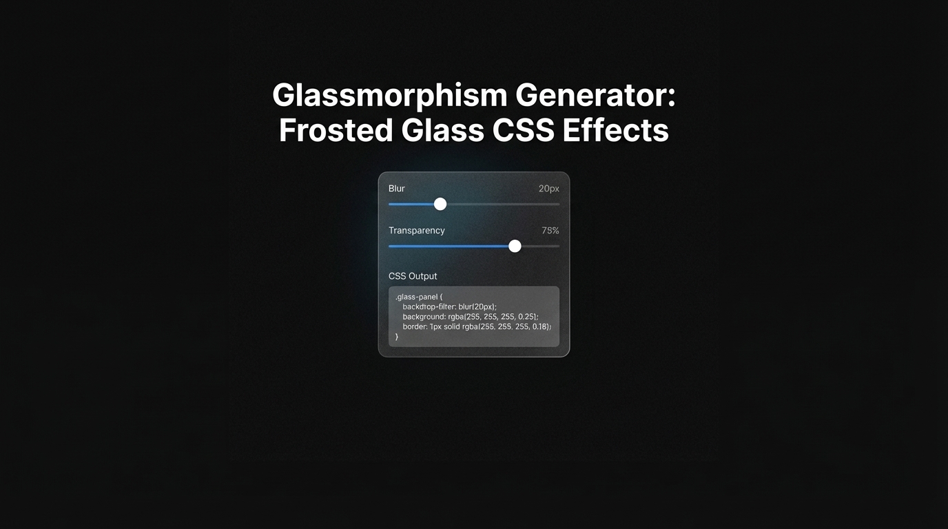
Creating a glassmorphism effect in CSS requires four key ingredients working together: a colorful or visually rich background behind your element, a semi-transparent background color on the element itself, a backdrop-filter blur applied behind the element, and a subtle border to define the glass edge.
Here is a minimal working example:
.glass-card {
  background: rgba(255, 255, 255, 0.15);
  backdrop-filter: blur(12px);
  -webkit-backdrop-filter: blur(12px);
  border: 1px solid rgba(255, 255, 255, 0.25);
  border-radius: 16px;
  box-shadow: 0 4px 24px rgba(0, 0, 0, 0.1);
}
The rgba background gives translucency. The backdrop-filter applies the blur to whatever sits behind the element in the stacking context, not to the element itself. The border uses a semi-transparent white to simulate the light-catching edge of real glass. The box shadow anchors the card so it does not appear to float without gravity.
One critical detail: backdrop-filter only works when the element has a partially transparent or semi-transparent background. A fully opaque background blocks the blur entirely. You also need to include the -webkit- vendor prefix for Safari support, which as of 2026 still requires it on some older devices.
For the effect to read as glass, your background needs visual content behind it. A glassmorphic card on a plain white background looks like a white card with rounded corners. The effect comes from the blur acting on colorful content, gradients, images, or overlapping elements behind the panel. FreeCodeCamp provides a solid baseline tutorial for beginners building their first frosted glass card.
What CSS properties create the frosted glass look?
Four CSS properties combine to produce the glassmorphism effect. Each plays a specific role:
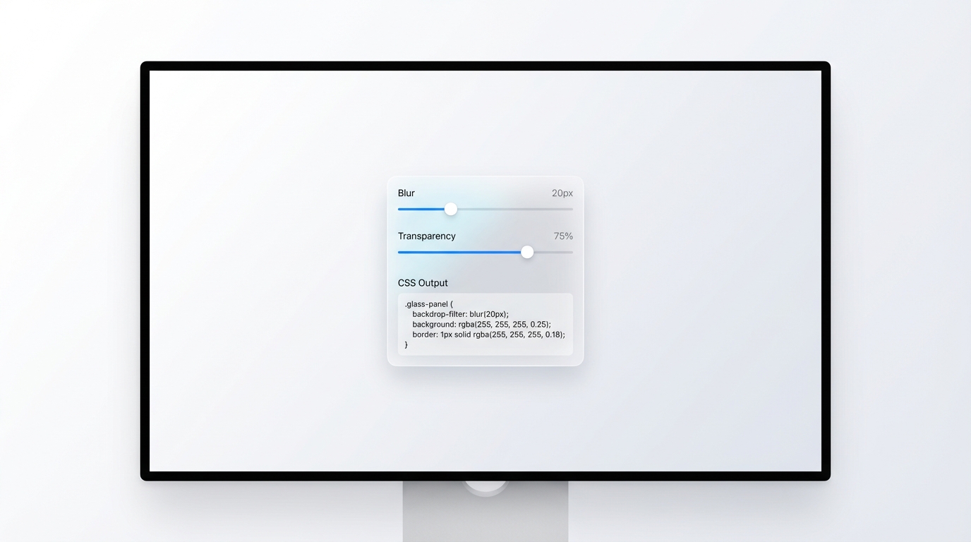
backdrop-filter: blur() is the defining property. It blurs the content rendered behind the element, producing the frosted appearance. A blur value between 8px and 20px is typical for most UI components. Lower values create a subtle hint of translucency; higher values produce a more dramatic frosted effect.
background-color using rgba() sets the color and opacity of the glass surface itself. A value like rgba(255, 255, 255, 0.15) creates a lightly tinted white glass. For dark glass, try rgba(0, 0, 0, 0.2). The alpha channel controls how much of the background bleeds through.
border using a semi-transparent color simulates the light refraction at the edge of real glass. A 1px border of rgba(255, 255, 255, 0.3) is a common starting point. For dark mode, reduce the opacity to around 0.15.
box-shadow grounds the element and adds dimensional realism. A soft outer shadow like 0 8px 32px rgba(0, 0, 0, 0.12) is typical. Some implementations also add an inner shadow on the top edge for a convex glass effect.
Secondary properties that refine the look include border-radius for soft edges, backdrop-filter: saturate() or brightness() to adjust how the background colors read through the glass, and overflow: hidden to prevent blurred content from leaking outside the card boundaries. Tools like Inspo AI surface real-world glassmorphism examples from production interfaces so you can study exactly how other design teams are combining these properties in context.
How do you use backdrop-filter in CSS for glassmorphism?
backdrop-filter is the CSS property that does the heavy lifting in any glassmorphism implementation. It applies a graphical effect, most commonly a blur, to the area behind an element. Unlike filter, which affects the element and its children, backdrop-filter affects only the rendered content behind the element in the stacking context.
The most commonly used function is blur():
backdrop-filter: blur(16px);
-webkit-backdrop-filter: blur(16px);
But backdrop-filter accepts multiple functions chained together:
backdrop-filter: blur(12px) saturate(180%) brightness(1.1);
-webkit-backdrop-filter: blur(12px) saturate(180%) brightness(1.1);
Adding saturate(180%) intensifies the colors bleeding through the glass, which creates a more vivid frosted appearance. brightness() lets you lighten or darken the background as seen through the glass, useful for ensuring legibility.
As of 2026, backdrop-filter has approximately 96% global browser support according to PixCode, with Chrome, Edge, Firefox, and Safari all supporting it. The -webkit- prefix remains necessary for older Safari on macOS and iOS.
One important performance note: backdrop-filter is GPU-accelerated in modern browsers, but it can significantly impact frame rate on lower-end Android devices and older hardware. For performance-sensitive interfaces, you should scope it to key components rather than applying it liberally. Josh W. Comeau's detailed guide on backdrop-filter covers several optimizations including progressive enhancement fallbacks for browsers where the property is unsupported.
Is glassmorphism accessible and good for UX?
Glassmorphism presents genuine accessibility challenges, and understanding them is essential before deploying it in production. The core issue is contrast. A semi-transparent element placed over a colorful background creates a dynamic contrast situation: the effective contrast between foreground text and background changes depending on what content happens to be behind the glass at any given moment. WCAG 2.1 requires a minimum contrast ratio of 4.5:1 for normal text, and it is difficult to guarantee that ratio when the background is variable.
According to Axess Lab, the most common accessibility failures with glassmorphism are insufficient text contrast, visual noise from complex backgrounds bleeding through the glass, and cognitive load from competing visual layers. Users with low vision, photosensitivity, or cognitive processing differences are most affected.
The good news: accessible glassmorphism is achievable with the right approach. Key strategies include:
- Using a semi-opaque color overlay behind text to guarantee minimum contrast regardless of background content
- Keeping background images or gradients behind glass panels relatively low in contrast and saturation
- Avoiding text directly on glass panels that contain highly variable or animated backgrounds
- Testing with real accessibility tools like browser contrast checkers and screen readers
New Target recommends limiting transparency to decorative and structural components, reserving high-contrast, stable backgrounds for any element containing body text or interactive controls. Used selectively, glassmorphism can be both beautiful and inclusive.
How do you combine glassmorphism with dark and light backgrounds?
Glassmorphism behaves fundamentally differently on dark versus light backgrounds, and understanding the distinction helps you apply the effect intentionally rather than by guesswork.
On light backgrounds, glass panels use low-opacity white fills: rgba(255, 255, 255, 0.15) to rgba(255, 255, 255, 0.35) is a typical working range. The border is a slightly brighter white at low opacity. The overall result reads as clean, airy, and modern. Apple's light mode glass aesthetic in iOS is a reference point for this approach.
On dark backgrounds, the glass requires different values. Using a white fill on a dark background produces a grey panel rather than the frosted glass appearance. Instead, use rgba(255, 255, 255, 0.08) to rgba(255, 255, 255, 0.12) for the fill, combined with a slightly higher blur value (16px to 24px) to compensate for the reduced tint. Borders on dark glass typically use rgba(255, 255, 255, 0.1). Alpha Efficiency provides a detailed breakdown of dark mode glassmorphism ratios.
For interfaces that support both modes, use CSS custom properties to switch glass values with a media query:
:root {
  --glass-bg: rgba(255, 255, 255, 0.15);
  --glass-border: rgba(255, 255, 255, 0.25);
}
@media (prefers-color-scheme: dark) {
  :root {
    --glass-bg: rgba(255, 255, 255, 0.08);
    --glass-border: rgba(255, 255, 255, 0.1);
  }
}
When building dark glassmorphism on near-black backgrounds specifically, adding a subtle purple, blue, or teal glow behind the panel creates the visual richness the blur needs to operate against. A flat dark background behind a glass card produces very little visible frosting effect, since there is no chromatic content for the blur to act on.
What are the best free glassmorphism CSS generator tools in 2026?
Several strong glassmorphism CSS generator tools exist, each offering slightly different controls and outputs. Here are the most reliable options for designers and developers in 2026:
Hype4 Academy Glassmorphism Generator is the original tool, created by Michal Malewicz who coined the term glassmorphism. It offers blur, refraction, and depth sliders and generates production-ready CSS. Used by over 250,000 designers across 137 countries.
CSS Portal Glassmorphism Generator provides fine-grained control over blur, transparency, border radius, border color and opacity, and background tint. Output includes both standard and -webkit- prefixed properties.
CodeShack CSS Glassmorphism Generator offers presets alongside custom controls and lets you preview the effect against different background images, which is especially useful for testing readability and contrast.
Creativist Studio Glassmorphism Generator includes saturation and brightness controls alongside the standard blur and transparency sliders, covering the full backdrop-filter function set.
UI.Glass focuses on clean visual output and is popular for quick prototyping. It supports color tint selection so you can generate glass panels that match a specific brand palette.
All of these tools generate the core CSS but rely on you providing a visually rich background for the effect to read well. For finding real-world glassmorphism references to inspire your own implementations, Inspo AI lets you search and filter interface examples by style, giving you a library of glassmorphism designs from live production products to study alongside your generator output.
Conclusion: Build Better Glass Effects, Faster
Glassmorphism CSS generator tools remove the guesswork from getting blur values, opacity, and borders right. But the deeper skill is knowing how to apply the effect in context: choosing the right background richness, maintaining accessible contrast, switching values cleanly between light and dark modes, and keeping performance in check.
The designers who use glassmorphism most effectively treat it as a layering and hierarchy tool, not just a visual texture. Cards surface above gradients. Modals float above content. Navigation bars separate from page backgrounds. When the blur effect serves structure, it earns its place.
Ready to find glassmorphism references from real production interfaces and build your moodboard? Explore the design search and inspiration tools at Inspo AI to discover how today's best UI teams are applying frosted glass effects in the wild.