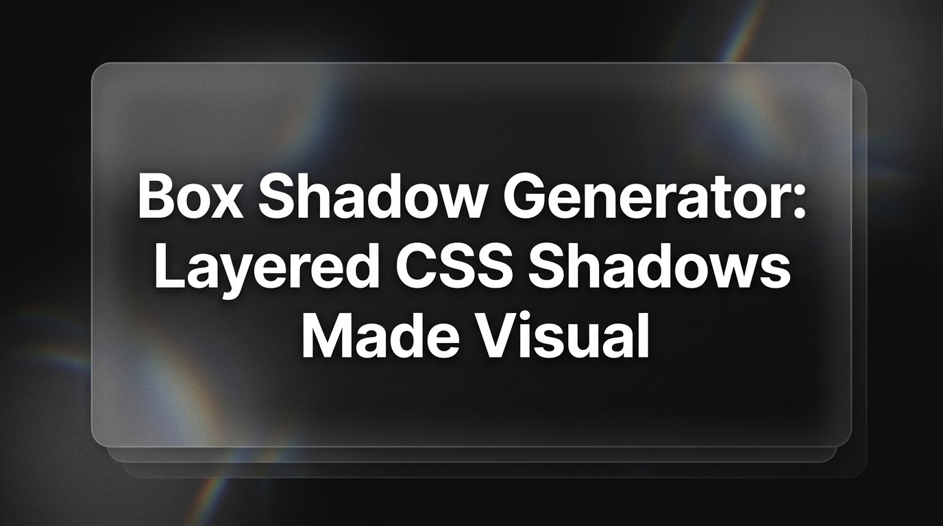
TLDR
- A box shadow generator lets you build CSS shadow effects visually with sliders and copy production-ready code instantly
- The CSS
box-shadowproperty takes up to five parameters: horizontal offset, vertical offset, blur radius, spread radius, and color- Multiple shadows can be layered by separating declarations with commas — this produces the most natural, polished depth effects
box-shadowdiffers from CSSfilter: drop-shadow()in how it handles transparency and irregular element shapes- Neumorphism and glassmorphism effects are achievable entirely with
box-shadowandbackdrop-filter
Introduction
Shadow effects are one of the most nuanced tools in a UI designer's kit. A well-placed, well-tuned shadow communicates depth, hierarchy, and materiality. A poorly tuned one looks flat, harsh, or out of place. The problem is that box-shadow syntax involves five independent variables: two offsets, blur, spread, and color opacity. Getting them right by hand requires repeated guess-and-check iterations that eat into production time.
A box shadow generator solves this by giving you real-time slider controls so you can see the effect of every parameter change without writing a single line of CSS. In this guide, we answer the seven most-searched questions about box shadows: how the property works, what each parameter does, how to layer multiple shadows, the critical difference between box-shadow and drop-shadow, how to achieve neumorphism and glassmorphism, and which free box shadow generator tools are worth bookmarking in 2026.

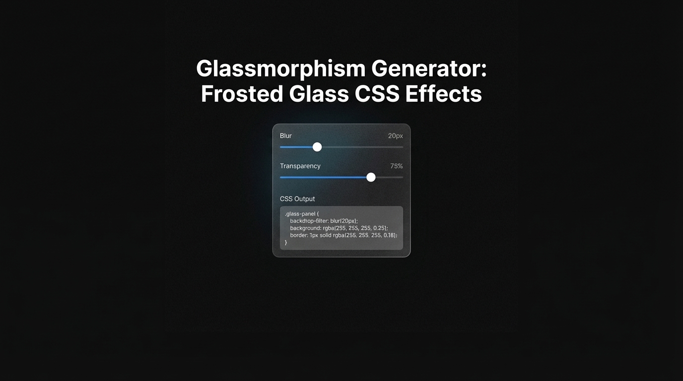
What is a box shadow generator and why do UI designers use it?
A box shadow generator is a browser-based tool that gives you visual slider controls for every parameter of the CSS box-shadow property and outputs optimized CSS you can copy directly into your stylesheet. Instead of manually adjusting values like box-shadow: 0 10px 30px -5px rgba(0, 0, 0, 0.2), you drag a slider and watch the preview update instantly.
UI designers use these tools for several interconnected reasons. First, shadow values interact with each other in non-obvious ways: increasing blur radius while keeping spread at zero produces a very different result than increasing spread. Visualizing these interactions is far faster than inferring them from numbers alone.
Second, multi-layer shadows — which produce the richest, most natural-looking depth effects — require writing two or three comma-separated shadow declarations. Composing these visually is dramatically more efficient than writing them manually and refreshing the browser.

Third, shadow design directly affects perceived elevation and brand tone. Material Design, for example, specifies 24 elevation levels, each with a precisely calibrated three-layer shadow. Getting these right by hand without a tool is genuinely tedious.
According to Utilify Zone, a well-built box shadow generator handles all of this through a simple interface: add shadow layers, adjust each one independently, toggle inset mode, and copy the finished CSS. The output is clean and production-ready with no vendor prefixes needed for modern browsers.
For designers exploring shadow styles for new projects, Inspo AI's free tools include an AI design search feature where you can browse real-world UI examples to see how professional products handle depth and shadow before you start building your own system.
How does the CSS box-shadow property work?
The box-shadow property adds one or more shadow effects to the outside (or inside) of an HTML element's bounding box. The browser renders the shadow using the element's border-box dimensions, which means it follows the rectangle of the element — including any border-radius that has been applied.
The basic syntax is:
.card {
  box-shadow: 0 4px 12px rgb(0 0 0 / 0.15);
}
CSS-Tricks describes the complete syntax as: