TLDR
- A CSS gradient generator is a browser tool that lets you design gradients visually and copy the resulting CSS code instantly
- CSS supports three gradient types: linear, radial, and conic, each with a repeating variant
- You can add unlimited color stops at precise percentage positions to build rich multi-color transitions
- Gradients work as backgrounds, borders, text fills, overlays, and more
- Top free tools include cssgradient.io, learnui.design, ColorZilla, and uiGradients
Introduction
Gradient backgrounds appear throughout modern web design: in hero sections, product cards, CTA buttons, and data visualizations. Writing gradient CSS by hand is tedious and error-prone. A CSS gradient generator removes the guesswork by letting you drag color stops, adjust angles, and see production-ready output code instantly. Whether you're building a clean purple-to-blue SaaS header or a warm sunset mesh background, a good generator turns hours of trial and error into a five-minute task.
In this guide, we answer seven of the most common questions about CSS gradients: what they are, how each type works, how to add color stops, where you can apply them, and which free tools consistently deliver the cleanest results. If you are a UI/UX designer, front-end developer, or a marketer building landing pages, this guide gives you everything you need to use CSS gradients confidently and efficiently.

What is a CSS gradient generator and how does it work?
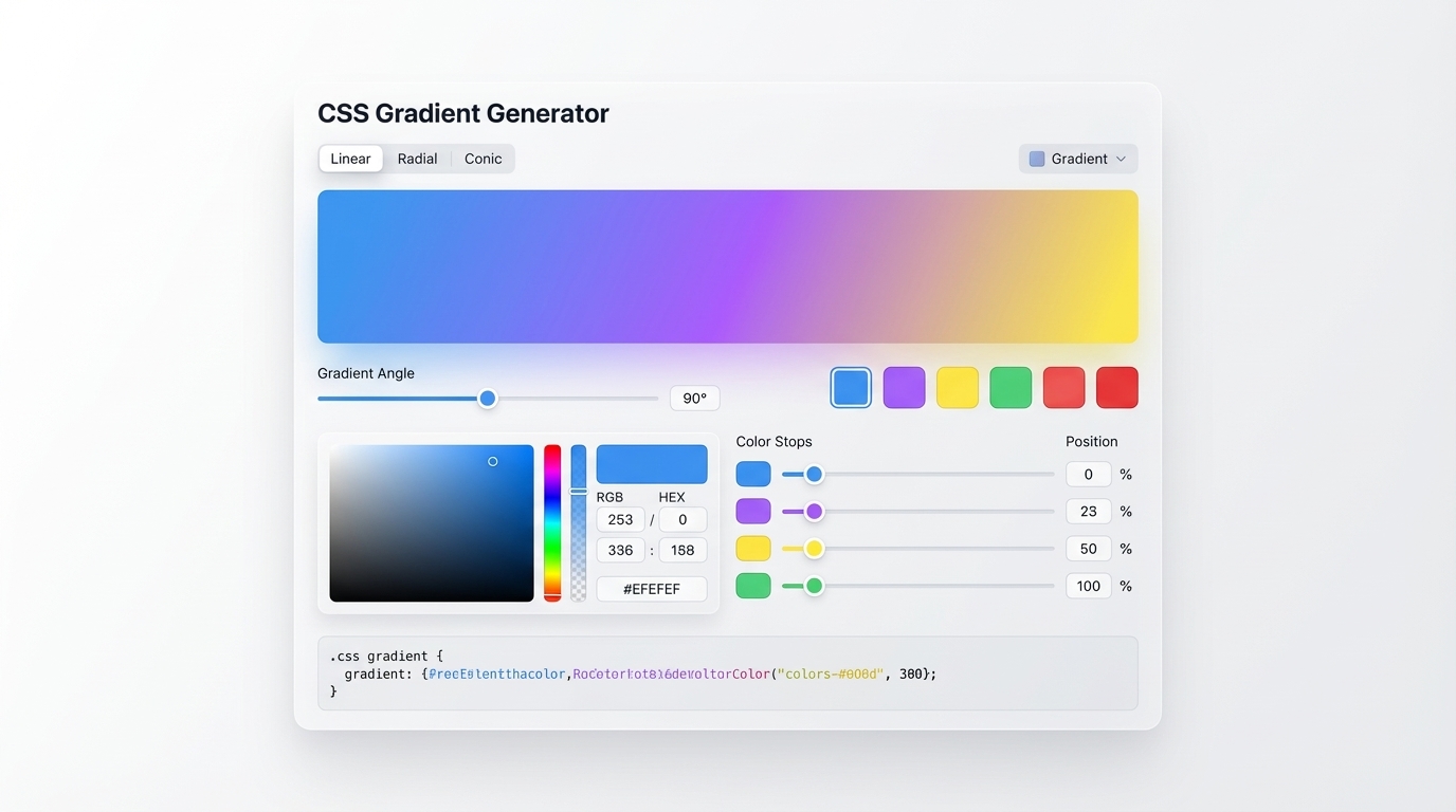
A CSS gradient generator is an in-browser tool that gives you a visual canvas for designing gradient styles and then outputs production-ready CSS code you can paste directly into your project. Instead of manually writing values like background-image: linear-gradient(135deg, #6366f1 0%, #a855f7 50%, #ec4899 100%), you interact with a drag-and-drop interface where you move color stops, adjust angles or positions, and watch the output update in real time.
Under the hood, CSS gradients are represented by the <gradient> data type — a special kind of <image> value — that the browser renders dynamically without requiring a raster image file. MDN Web Docs explains that gradients are defined mathematically, meaning they scale perfectly at any resolution and add zero extra HTTP requests to your page.
A generator bridges the gap between the visual intent in your head and the precise numerical syntax CSS requires. Most tools give you four core controls: gradient type (linear, radial, conic), color pickers for each stop, a position or angle input, and a live CSS output panel. Advanced generators like cssgradient.io also offer per-stop opacity controls, repeating gradient support, and the ability to import an existing gradient from CSS or from an image file.

For designers who are not primarily front-end coders, a CSS gradient generator is the fastest path from color inspiration to deployed background code. The tool handles all the mathematical precision — you focus on the visual result.
What are the different types of CSS gradients?
CSS defines three primary gradient types, each producing a distinctly different visual shape and motion.
Linear gradients are the most common. They blend colors along a straight line — top to bottom, left to right, or any custom angle in degrees. The direction can be set with keywords like to right or with a degree value like 135deg. Brands like Stripe and Instagram use bold linear gradients as core elements of their visual identity.
Radial gradients radiate colors outward from a central origin point. The shape can be a circle or an ellipse, and you control where the center sits and how far the gradient extends. Radial gradients work well for spotlights, ambient glows, and soft product photography backgrounds.
Conic gradients sweep colors around a central point like a pie chart or color wheel. They were added to the CSS specification more recently and are excellent for charts, angle indicators, and decorative geometric patterns. The conic-gradient() function accepts angle-based color stops.
Each type also has a repeating variant: repeating-linear-gradient(), repeating-radial-gradient(), and repeating-conic-gradient(). These tile the gradient at a defined interval, which is useful for striped or patterned backgrounds without image files. CSS-Tricks provides a comprehensive breakdown of all three types with live demos and copyable syntax examples.
Understanding when to use each type is a foundational skill for any UI/UX designer who builds directly with CSS.
How do you create a linear gradient in CSS?
A linear gradient needs at minimum a direction and two colors. The simplest possible declaration is:
background-image: linear-gradient(#6366f1, #a855f7);
Without a direction keyword, the gradient runs top to bottom by default. To change direction, add a keyword or an angle:
/* Left to right */
background-image: linear-gradient(to right, #6366f1, #a855f7);

/* Diagonal, 135 degrees */
background-image: linear-gradient(135deg, #6366f1, #a855f7);
You can use background (shorthand) instead of background-image. Most developers prefer the shorthand because it allows stacking a gradient with a fallback solid color on a single line.
Direction keywords include to top, to bottom, to left, to right, to top right, and other diagonal combinations. Angle values give more precise control: 0deg is bottom to top, 90deg is left to right, and 180deg is top to bottom.
W3Schools CSS Gradients confirms that browser support for linear-gradient() is universal across all modern browsers. Vendor prefixes like -webkit-linear-gradient() were once required but are no longer necessary for any browser released after 2013.
When using a CSS gradient generator, the tool handles direction and angle syntax automatically. You rotate a visual handle on the canvas and copy the output — no mental conversion between angles and directions required.
How do you create a radial gradient in CSS?
The radial-gradient() function creates a gradient that emanates from a central origin point and spreads outward as either a circle or an ellipse. The basic syntax is:
background-image: radial-gradient(circle, #6366f1, #a855f7);
By default, the gradient uses an ellipse shape and centers itself within the element. You can override both the shape and the origin position:
/* Circle anchored to the top-right corner */
background-image: radial-gradient(circle at top right, #6366f1, #a855f7);

/* Ellipse at a specific coordinate */
background-image: radial-gradient(ellipse at 70% 30%, #6366f1, #a855f7);
The size of the radial gradient is controlled with keywords: closest-side, closest-corner, farthest-side, and farthest-corner (default). These define how large the gradient shape grows before the final color fills the remainder of the element.
According to MDN's radial-gradient() reference, the function has been baseline-available across all major browsers since 2015, making it safe to use without fallbacks in virtually any modern project.
Radial gradients are particularly effective for depth in card designs, spotlight glow effects behind icons, and soft ambient color washes that preserve text legibility. A good CSS gradient generator gives you a visual drag handle to reposition the origin point without guessing at percentage coordinates.
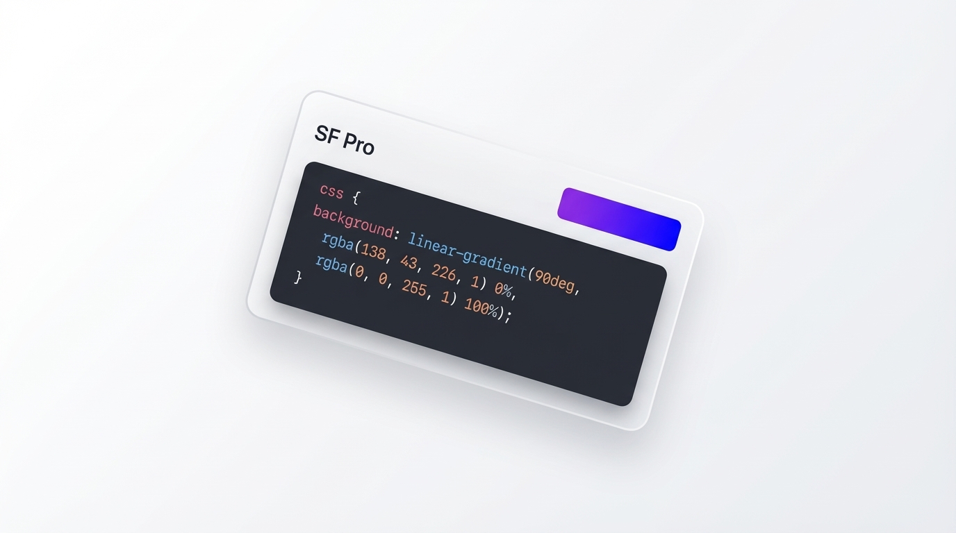
How do you add multiple color stops to a CSS gradient?
Color stops are the building blocks of complex gradients. Each stop defines a color and the position along the gradient line where that color is fully dominant. You can add as many stops as needed, separated by commas:
background-image: linear-gradient(
  90deg,
  #003f5b 0%,
  #2b4b7d 25%,
  #5f5195 50%,
  #98509d 75%,
  #cc4c91 100%
);
Positions are expressed as percentages of the gradient line's total length, or in absolute units like px or em. If you omit positions, the browser distributes stops evenly: two stops get 0% and 100%, three stops get 0%, 50%, and 100%, and so on.
You can also create hard color transitions with no blending by stacking two stops at the same position:
background-image: linear-gradient(
  90deg,
  #6366f1 0%,
  #6366f1 50%,
  #a855f7 50%,
  #a855f7 100%
);
This produces a sharp two-color split. Jakub.kr's Understanding Gradients explains how color interpolation models — RGB, HSL, LCH, OKLCH — affect the midpoint color quality in multi-stop gradients. Modern browsers support color-interpolation-method in gradients, giving designers control over which color space the blend happens in and helping avoid the muddy mid-gradient greys and browns common in sRGB blends.
A CSS gradient generator is especially valuable here: dragging and repositioning five or six color stops visually is far more intuitive than calculating percentage values by hand.
Can you use CSS gradients as backgrounds and borders?
CSS gradients work anywhere the browser accepts an <image> value, which unlocks more use cases than most designers initially expect.
As a background: The standard use case. Apply a gradient to background-image or the background shorthand on any block-level element.
As a border: The border-image property accepts gradient values. You can create vivid, multi-color borders without image files using a layered background technique:
.card {
  border: 3px solid transparent;
  background-image: linear-gradient(white, white),
    linear-gradient(135deg, #6366f1, #a855f7);
  background-origin: border-box;
  background-clip: padding-box, border-box;
}
This layers a solid white background beneath a gradient border, producing a clean gradient-outlined card.
As text fill: Using background-clip: text and color: transparent, you can apply a gradient directly to rendered text:
.gradient-text {
  background: linear-gradient(to right, #6366f1, #ec4899);
  -webkit-background-clip: text;
  -webkit-text-fill-color: transparent;
  background-clip: text;
}
As a transparent overlay on images: Gradients placed over photography are one of the most common techniques in hero section design, creating a fade-to-color effect that makes text readable over complex backgrounds.
For designers who need color palette inspiration before opening a CSS gradient generator, Inspo AI's free tools include a brand scanner and AI design search that help you identify and explore real-world color palettes used in leading digital products.
What are the best free CSS gradient generator tools for designers?
Several tools compete in this space, and each has distinct strengths worth knowing.
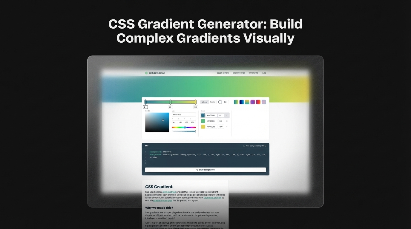
cssgradient.io is the most widely used general-purpose CSS gradient generator. It supports linear, radial, and conic gradients with a visual color stop editor, opacity controls, and a gallery of pre-built gradients for immediate inspiration. Output is clean, single-line CSS. cssgradient.io
learnui.design Gradient Generator stands out for its color-space interpolation options. You can blend gradients through LCH, OKLCH, or HSB color spaces instead of default sRGB, producing perceptually smoother transitions that avoid the muddy midpoints common in standard RGB blends. learnui.design
ColorZilla Ultimate Gradient Editor is a Photoshop-style gradient editor with preset management, hue and saturation controls, and the ability to import gradients from existing CSS or images. It remains a favorite among designers who need granular control over complex multi-stop gradients. colorzilla.com
uiGradients provides a curated library of named two-stop gradients with one-click CSS copy. For quickly grabbing a clean starting point for further refinement, it is the fastest option in the category. uigradients.com
Colorffy Gradient Generator supports advanced color harmonies — analogous, complementary, triadic — and exports to CSS variables, SCSS, and Tailwind CSS formats, making it a strong choice for design system workflows. colorffy.com
Beyond gradient-specific tools, Inspo AI provides an AI-powered design search and moodboard builder that lets you collect and organize real-world gradient examples from across the design landscape, giving you a visual reference point before you open a generator.
Conclusion: Build Better Gradients, Faster
A CSS gradient generator eliminates the disconnect between your visual intent and the code that brings it to life. Whether you're crafting a multi-stop conic gradient for a SaaS landing page or a soft radial glow for a product card, the right tool cuts hours of trial and error down to minutes.
The fundamentals are straightforward: understand the three gradient types, know how color stops work, and choose a generator that matches your workflow. As you grow more comfortable with CSS gradients, you will find yourself using them not just as backgrounds but as borders, text fills, and subtle interface accents that elevate the overall design quality.
If you want a tool that connects CSS technique with broader design inspiration — color palettes, style references, and a moodboard builder — explore Inspo AI's free tools. The AI design search and brand scanner are built specifically for designers who want to work faster and with more creative confidence.
Ready to build better gradients? Try Inspo AI's free design tools and start collecting color inspiration today.