TLDR Glassmorphism is a UI design style characterized by frosted glass surfaces, backdrop blur, semi-transparency, and subtle border highlights. It creates a sense of depth and layering without the heaviness of skeuomorphism. First popularized by Apple in 2013 and revived as a named trend in 2020, glassmorphism remains a relevant and widely used technique in 2026, particularly in SaaS dashboards, mobile overlays, and premium landing pages. This guide explains how glassmorphism works, when to apply it, how to implement it in code, and how to use it accessibly.
Introduction
Few design trends have had the staying power of glassmorphism. What started as Apple's signature aesthetic in iOS 7 evolved into a full-blown movement, peaked as a named trend in 2020 and 2021, and has since matured into a standard tool in the modern UI designer's vocabulary.
The appeal is intuitive. Frosted glass surfaces feel lightweight, layered, and tactile. They communicate depth without casting everything into darkness like pure dark mode, and they give premium SaaS interfaces a sense of visual sophistication that flat design alone can't achieve.
But glassmorphism also comes with real design tradeoffs. Applied carelessly, it reduces readability, fails accessibility standards, and makes an interface feel dated rather than refined. This guide walks through everything you need to know to use glassmorphism well.
What Exactly Is Glassmorphism in UI Design?
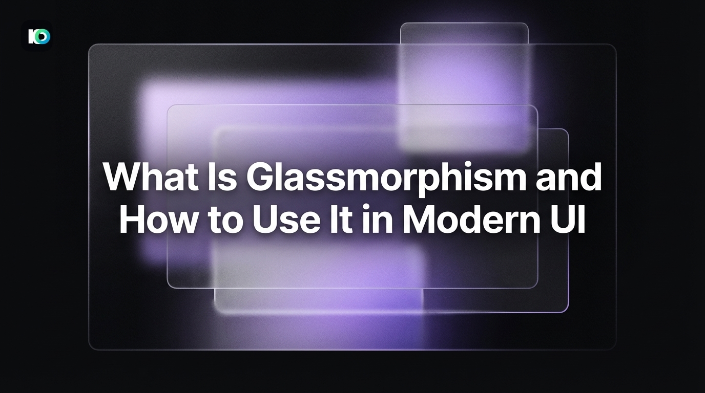
Glassmorphism is a visual design style that simulates the appearance of frosted or translucent glass applied to UI surfaces such as cards, modals, navigation bars, sidebars, and panels.
The defining visual properties are:
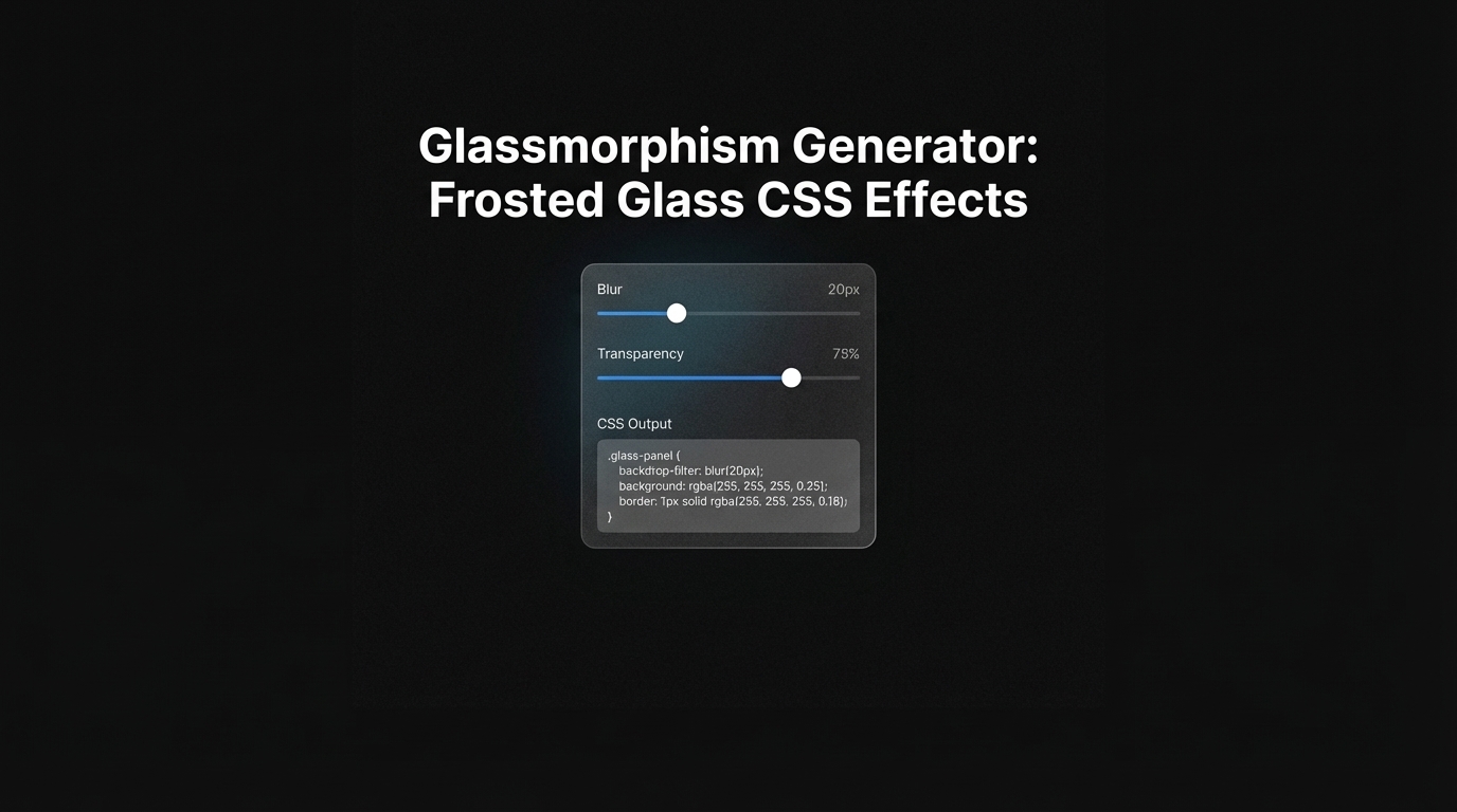
- Background blur (backdrop-filter: blur). The content behind the glass surface is blurred, creating the illusion of depth. The blur radius typically ranges from 8px to 24px depending on the intensity of the effect desired.
- Semi-transparency. The glass surface itself uses a background color with low to medium opacity (commonly rgba values between 0.1 and 0.4 alpha), allowing the blurred background to show through.
- Subtle border highlight. A thin border with a semi-transparent white or light color is applied to the edge of the glass element, simulating the light refraction you see on real glass edges. Typical values are 1px solid rgba(255, 255, 255, 0.3).
- Soft shadow. A diffused drop shadow grounds the element in space without making it feel heavy.
Together these four properties create surfaces that feel like they are floating above the background, separated by a physical layer of depth. The result is an interface that reads as modern, light, and spatially organized.
Where Did Glassmorphism Come From and How Did It Evolve?
The visual language of glassmorphism has roots in the early 2000s. Microsoft's Windows Vista (2006) introduced Aero Glass, a translucent window chrome that used blur and transparency to create a sense of depth in the operating system UI. It was widely noticed, though the technical performance cost on hardware of the era made it polarizing among users.
Apple's iOS 7 (2013) brought the aesthetic into the mainstream. The redesign, led by Jony Ive, stripped away iOS 6's heavy skeuomorphic textures and replaced them with flat colors, translucency, and blur effects throughout the system UI, most visibly in the Control Center and notification panels.
The trend receded through the mid-2010s as flat design took hold, but it resurged dramatically in 2020. Designer Michal Malewicz published a widely shared post formally naming and defining "glassmorphism" as a design trend, and the term spread quickly through the design community on Dribbble, Behance, and Twitter. The timing aligned with a broader shift toward depth and layering in premium SaaS design after years of ultra-minimal flat interfaces.
By 2023 and into 2026, glassmorphism has settled into a mature, widely applied technique rather than a trend-of-the-moment. It appears across macOS, iOS, Android, and countless SaaS products, now used selectively rather than as an all-encompassing design system.
What Are the Key Visual Properties That Define Glassmorphism?
Understanding glassmorphism technically is the foundation for using it well. There are four properties designers need to control precisely.
backdrop-filter: blur(). This CSS property blurs everything behind the element. A value of blur(12px) is a common starting point; values above blur(24px) can make the background unreadable, which may be intentional for modal overlays but problematic for persistent UI panels. Note: backdrop-filter is hardware-accelerated in modern browsers but can cause performance issues if overused.
background: rgba() or oklch() with alpha. The glass surface uses a color with alpha below 1. Pure white at rgba(255,255,255,0.15) is a common recipe. For dark glass, rgba(0,0,0,0.25) works well. Avoid alpha values above 0.5 because the transparency effect becomes too subtle to read as glass.
border. A 1px or 1.5px border using rgba(255,255,255,0.3) to rgba(255,255,255,0.6) creates the characteristic light-edge refraction. On dark glass, try rgba(255,255,255,0.15).
box-shadow. A soft, spread shadow such as box-shadow: 0 8px 32px rgba(0,0,0,0.12) grounds the element. Heavier shadows conflict with the lightness of the glass aesthetic and should be avoided.
Supporting elements that enhance glassmorphism include a colorful or gradient background (the blur effect needs visual contrast to read as glass), layered depth with multiple elements at different z-levels, and generous border-radius (16px to 32px) to avoid harsh corners that fight the soft glass feel.
When Should You Use Glassmorphism in Your UI?
Glassmorphism works well in specific contexts and poorly in others. Knowing the difference is the mark of a mature designer.
Best-fit contexts:
- Floating overlays and modals, where the frosted glass effect naturally communicates that the underlying content is still present but deprioritized.
- Cards on a vibrant, gradient, or photographic background, where the blur effect has enough visual contrast to read clearly.
- Navigation sidebars and top bars in SaaS dashboards, where the glass aesthetic adds premium quality without disrupting content legibility.
- Mobile bottom sheets and action panels, where translucency creates a sense of spatial continuity with the screen below.
- Hero sections and landing pages in premium product marketing, particularly for design tools, fintech, and AI products.
Contexts where glassmorphism struggles:
- Content-dense interfaces where readability is paramount. Legal documents, data tables, and medical records UIs are poor fits.
- Low-end device targets. backdrop-filter is computationally intensive; consider providing a fallback solid background for older devices.
- Interfaces with white or very light solid backgrounds. Glass blur requires contrast to be visible. On a #FFFFFF background, the effect disappears entirely.
- Accessibility-critical overlays where the blurred background content could be mistaken for readable information by users with cognitive disabilities.
Are There Accessibility Concerns With Glassmorphism?
Yes, and they are worth taking seriously. Several accessibility challenges are inherent to glassmorphism when applied without care.
Contrast ratios. WCAG 2.1 requires a minimum contrast ratio of 4.5:1 for normal text and 3:1 for large text. Semi-transparent backgrounds make this calculation complex because the effective contrast changes depending on what content sits behind the glass surface. A dark text color on a light glass panel may meet contrast requirements against a white background but fail against a dark section of a gradient. The safest approach is to test contrast dynamically or to use a sufficiently opaque background (alpha above 0.7) in text-heavy glass panels.
Motion and blur sensitivity. The CSS backdrop-filter property can trigger discomfort in users who are sensitive to motion or visual distortion. While backdrop-filter does not animate by default, animated glass panels (flying in, expanding, or collapsing) can cause issues. Apply @media (prefers-reduced-motion) rules to disable or simplify glass animations for users who have this setting enabled in their OS.
Focus indicators. Frosted glass surfaces can obscure keyboard focus rings if focus styles are not explicitly defined. Always test tab navigation through any glassmorphic component to ensure focus states are visible against the glass background.
Screen readers. Glassmorphism has no direct impact on screen reader accessibility; it is purely visual. Semantic HTML structure and proper ARIA labeling remain the primary concerns for assistive technology users regardless of visual style.
How Do You Implement Glassmorphism in Web and Mobile Interfaces?
The core CSS for a glassmorphic card is straightforward:
.glass-card {
  background: rgba(255, 255, 255, 0.15);
  backdrop-filter: blur(12px);
  -webkit-backdrop-filter: blur(12px);
  border: 1px solid rgba(255, 255, 255, 0.3);
  border-radius: 24px;
  box-shadow: 0 8px 32px rgba(0, 0, 0, 0.10);
}
Always include -webkit-backdrop-filter alongside backdrop-filter for Safari compatibility. As of early 2026, Safari still requires the vendor prefix.
For React or component-based frameworks, encapsulate this into a reusable GlassCard component so your glass style is consistent across the product. Avoid repeating the CSS across individual components, as inconsistent blur or opacity values undermine the cohesive glass aesthetic.
For Tailwind CSS projects, backdrop-filter utilities are available via the backdrop-blur-* class family. A glassmorphic card in Tailwind looks like:
<div class="bg-white/15 backdrop-blur-md border border-white/30 rounded-3xl shadow-lg">
  <!-- content -->
</div>
For native mobile (iOS/SwiftUI), the .ultraThinMaterial, .thinMaterial, and .regularMaterial modifiers provide system-native glassmorphism that automatically adapts to light and dark mode. SwiftUI's material system is the cleanest way to implement glass on Apple platforms.
For Android/Jetpack Compose, native glass blur is more limited. RenderEffect with BlurMaskFilter is the recommended approach from Android 12+, but fallback solid surfaces should still be designed for older OS versions.
Is Glassmorphism Still Relevant in 2026 UI Design Trends?
Glassmorphism has not peaked and faded like some micro-trends. Instead, it has evolved from a defining trend into a foundational technique within the broader vocabulary of modern UI design.
In 2026, glassmorphism appears throughout Apple's visionOS spatial computing UI, where translucent floating panels are the primary interaction surface. Microsoft uses glass-like surfaces across Windows 11's Mica and Acrylic material system. Google's Material You design language incorporates transparency and blur in contextual bottom sheets and dynamic color panels.
In the SaaS and startup design space, glassmorphism is a standard signal of premium product quality. AI-focused products and design tools in particular tend to use glass surfaces because the aesthetic aligns with the spatial, intelligent feel these products want to convey. Inspo AI, for example, uses layered glass panels throughout its UI to communicate the kind of depth, precision, and refinement that its target audience of designers and brand teams expects.
The key shift in 2026 is restraint. The all-glass, every-surface approach that characterized 2020-2021 Dribbble shots looks excessive by today's standards. The most respected product designs use glassmorphism selectively: a floating toolbar here, a modal surface there, a hero card on the landing page. Selective application reads as considered and intentional; blanket application reads as a trend imitation.
If you're using design inspiration tools like Inspo AI to research current UI trends, you'll find glassmorphism consistently appearing in the portfolios and products that define the premium SaaS aesthetic, always in service of clarity and depth rather than as decoration for its own sake.
Conclusion
Glassmorphism is a powerful, mature design technique when applied with intention. The frosted glass aesthetic creates depth, communicates layering, and gives interfaces a premium feel that pure flat design cannot replicate. But it requires precise control of blur radius, transparency, border highlights, and shadow to look refined rather than muddy, and it requires accessibility testing to ensure it does not compromise usability for any user group.
The recipe is clear: use it selectively on floating surfaces, ensure sufficient contrast for all text elements, provide solid-surface fallbacks for older devices, and test against a real, vibrant background rather than a white canvas.
Used well, glassmorphism is not a trend. It is a tool. And in 2026, it remains one of the most effective tools available for communicating premium, modern, spatially intelligent UI design.
Looking for glassmorphism inspiration and real-world examples? Explore Inspo AI to search AI-indexed design patterns, build moodboards, and keep your glassmorphism work grounded in what the best design teams are shipping right now.
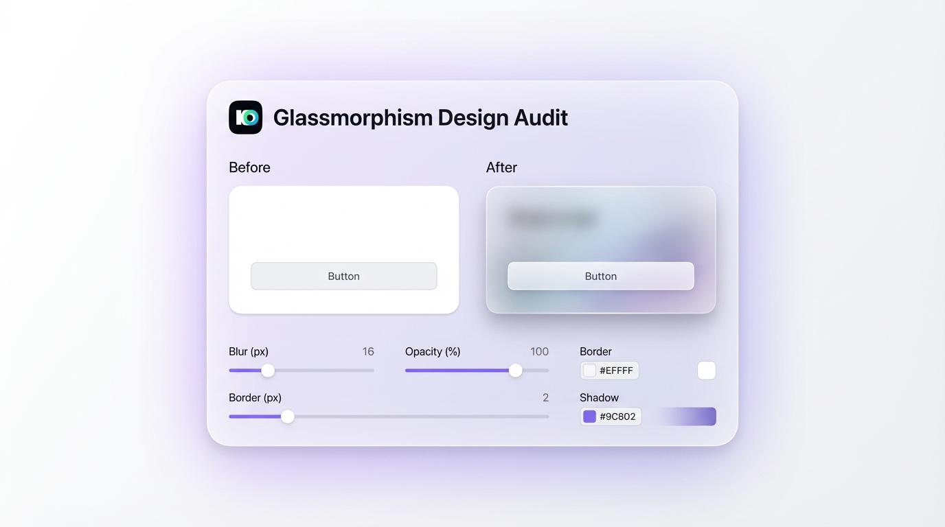
Use InspoAI's design audit feature to analyze glassmorphism implementation across blur, opacity, and border properties.
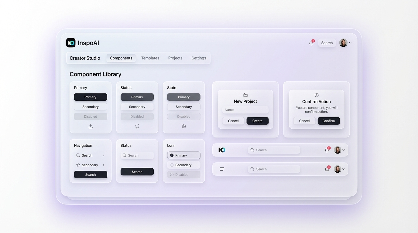
InspoAI's creator studio lets you build and iterate on glassmorphic component systems with curated design references.
Last updated: April 2026