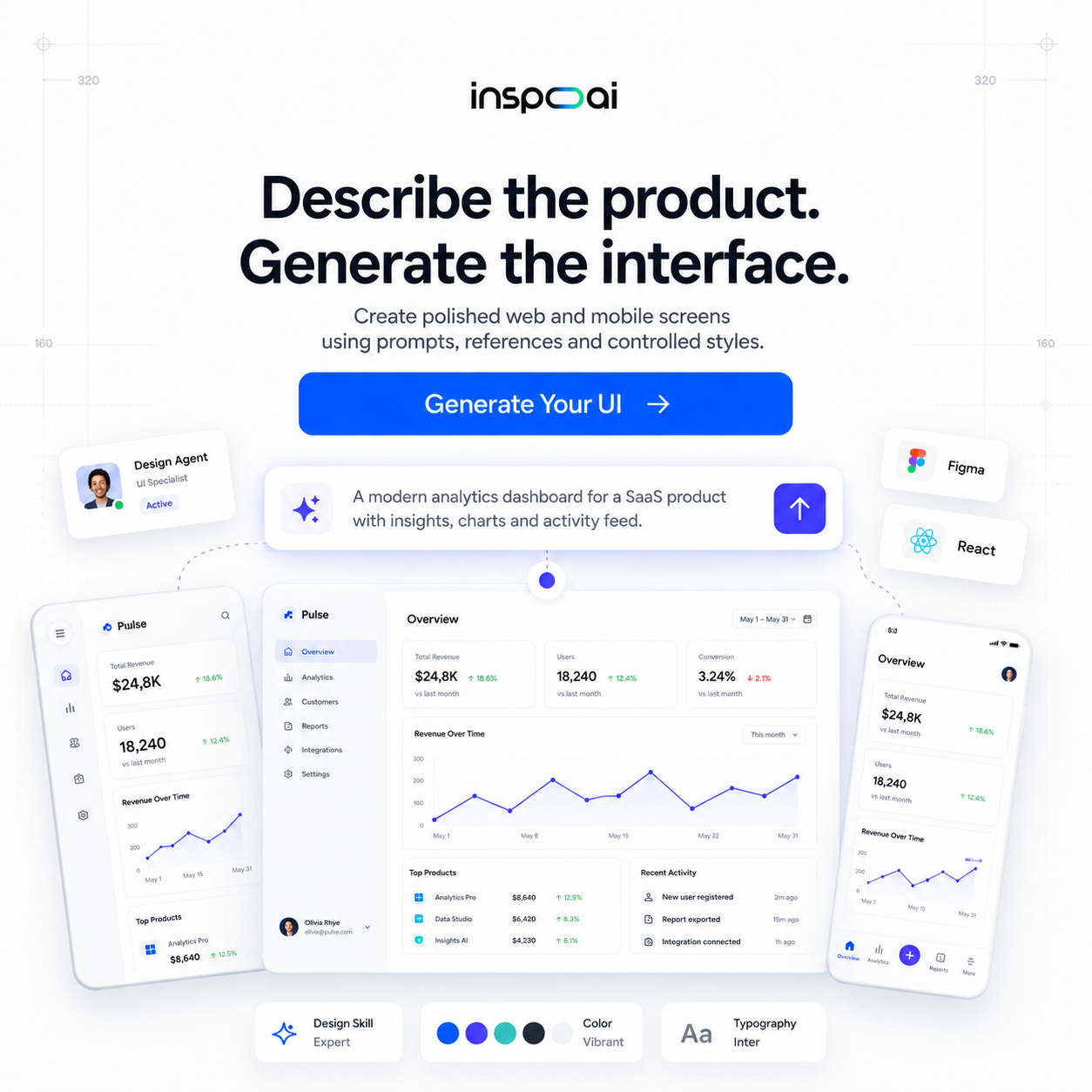
TLDR Color is one of the most powerful levers in UI design, and the right color palette tool can cut hours off your workflow. This guide covers the best color palette tools for UI designers in 2026, from AI-powered generators to WCAG accessibility checkers, plus practical advice for integrating them into your day-to-day process.
Introduction
Color does more than make an interface look good. It communicates hierarchy, triggers emotion, and signals trust or urgency before a user reads a single word. For UI designers, building a palette that works across components, states, and breakpoints is one of the most technically demanding parts of the job. A good color palette tool turns hours of manual iteration into minutes of structured exploration.
The landscape of color tools has expanded significantly over the past few years. Between AI-assisted generators, real-time accessibility checkers, and palette extractors that analyze brand visuals in seconds, there are more options than ever. This guide cuts through the noise and identifies the tools that actually belong in a modern UI design workflow in 2026.

What is a color palette tool and why do UI designers specifically need one?
A color palette tool is software designed to help designers create, organize, and validate sets of colors for use in visual design. For UI designers, the requirements go deeper than general graphic design. You need colors that work across interactive states (hover, focus, disabled), maintain contrast ratios for accessibility compliance, scale across a design system, and remain consistent when exported to code.
General-purpose palette tools may generate beautiful combinations, but they rarely account for how a color behaves at different opacities, over dark and light backgrounds, or against system-level defaults like browser chrome. UI-specific tools solve for these edge cases directly.
Beyond aesthetics, color in UI design carries semantic weight. Red signals an error. Green signals success. Blue typically means a link or interactive element. A good palette tool helps you establish these conventions deliberately rather than accidentally, so your interface communicates clearly without relying on additional labels or instructions.
According to research published by the Nielsen Norman Group, color is one of the primary mechanisms through which users build mental models of an interface. Getting it right from the start saves significant rework later in the product lifecycle.
What are the main categories of color palette tools?
Color palette tools fall into four broad categories, and understanding the difference helps you pick the right one for each task.
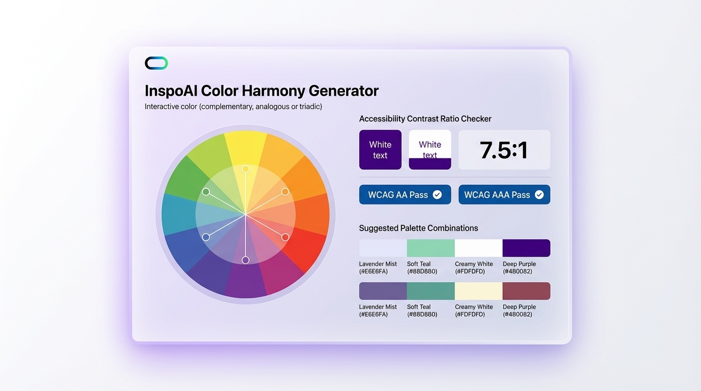
Palette generators create color combinations from a seed color or image. They typically apply color theory models (complementary, triadic, analogous, split-complementary) to produce harmonious sets. Tools like Coolors and Adobe Color sit in this category.
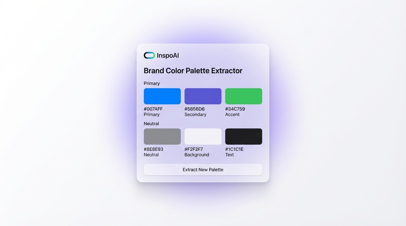
Brand and image color extractors pull dominant colors from a logo, photograph, or website URL. These are particularly useful when you need to build a UI palette that stays faithful to an existing brand. Inspo AI's Brand Scanner does exactly this, letting you analyze any brand's visual identity and extract its core color system in seconds.
Accessibility checkers evaluate whether foreground and background color combinations meet WCAG 2.1 or WCAG 3.0 contrast requirements. Tools like Contrast Checker and Stark (a Figma plugin) specialize here.
Design system integrators go a step further by helping you document and export palette tokens directly into code formats like CSS variables, JSON, or Tailwind config files. Tokens Studio and Style Dictionary cover this territory.
Most professional UI designers use tools from multiple categories, often combining a generator with an accessibility checker before finalizing anything.
What are the best color palette tools for UI designers in 2026?
Here is a practical breakdown of tools worth your time in 2026.
Coolors remains a strong go-to for rapid palette generation. Its keyboard-driven workflow (spacebar to generate, lock to freeze colors you like) is fast and intuitive. The free tier is generous, and the Figma plugin integrates smoothly.
Adobe Color is powerful for designers already in the Adobe ecosystem. Its color wheel, harmony rules, and trend libraries are excellent. The accessibility tools are built in, and palettes sync directly to Creative Cloud Libraries.
Stark (Figma Plugin) is the standard for accessibility checking inside Figma. It checks contrast ratios, simulates color blindness, and generates audit reports you can share with stakeholders.
Huemint uses machine learning to generate palettes for specific design contexts, including UI layouts, branding, and illustrations. Its AI understands spatial color relationships, which makes its suggestions more relevant than random generators.
Inspo AI's Brand Scanner deserves a place on this list for its ability to analyze competitor or reference brands and extract their full color system. If you're building a UI that needs to sit alongside or respond to an established brand, this feature alone can save significant research time.
Realtime Colors lets you preview any color combination on a live website mockup before committing, which bridges the gap between palette theory and real-world UI application.
How does AI improve the process of selecting colors for UI design?
AI changes color selection in three meaningful ways: contextual relevance, speed, and constraint awareness.
Traditional color theory tools operate on mathematical relationships between hues. They can tell you that a color is complementary, but they cannot tell you whether that pairing feels appropriate for a fintech dashboard versus a children's educational app. AI models trained on large design datasets can make contextual suggestions. They learn the visual conventions of different industries and apply them when generating palettes.
Speed is another significant improvement. AI-powered tools can analyze a URL, extract brand colors, infer tone and personality, and suggest a complete UI palette in under a minute. What used to take a research session now takes a prompt.
Constraint awareness is perhaps the most underappreciated benefit. AI tools built specifically for design understand WCAG ratios, dark mode requirements, and component state variations. Rather than generating a beautiful palette that fails accessibility tests, they can optimize within those constraints from the start.
Platforms like Inspo AI integrate AI across the design inspiration workflow, connecting color discovery with broader visual research. If you spot a color palette you love in a reference image or competitor screenshot, the AI design search can surface similar examples to validate the direction before you commit.
The practical implication is that AI does not replace the designer's judgment on color. It accelerates the exploration phase and reduces the gap between initial idea and validated, production-ready palette.
Why does color accessibility matter, and what standards should UI designers follow?
Color accessibility is both a legal and ethical responsibility. Approximately 300 million people worldwide experience some form of color vision deficiency, and millions more rely on high contrast for readability due to aging or environmental conditions (bright sunlight, low-quality screens). Designing without accessibility in mind excludes a meaningful portion of your audience.
The primary standard is WCAG 2.1, published by the W3C. It defines three conformance levels:
- Level A: Minimum requirements, primarily structural.
- Level AA: The standard most organizations target. Requires a contrast ratio of at least 4.5:1 for normal text and 3:1 for large text.
- Level AAA: The highest standard, requiring 7:1 for normal text. Not always achievable in full-featured UIs but worth targeting for critical content.
WCAG 3.0 is in draft as of 2026 and introduces a more nuanced model called APCA (Advanced Perceptual Contrast Algorithm), which accounts for font weight, size, and polarity in ways the current ratio formula does not.
For UI designers, the practical workflow is: design your palette first, then validate every text/background combination against the relevant standard. Use a tool like Stark or the built-in contrast checker in Figma. Flag failures early rather than late, since color changes cascade through a design system.
Never rely on color alone to convey meaning. Pair it with iconography, text labels, or patterns so that users with color vision deficiencies still receive the full information.
How do I integrate color palette tools into a practical UI design workflow?
Integration is where most designers lose time. The problem is not the tools, it is moving between them without losing fidelity or context. Here is a workflow that keeps things clean.
Step 1: Research phase. Before opening any generator, gather visual references. Use Inspo AI's AI design search to collect UI examples in your product category. Notice the color conventions, the emotional tone, and what feels familiar vs. unexpected to users in that space.
Step 2: Seed color selection. Choose one anchor color that reflects the brand's personality and target audience. This becomes your generator's starting input.
Step 3: Generate and filter. Run several variations in Coolors, Huemint, or Adobe Color. Keep options that feel contextually right for your use case. Aim to shortlist three to five palettes.
Step 4: Accessibility validation. Run every candidate palette through Stark or a contrast checker. Disqualify combinations that fail AA unless you can adjust them without changing the palette's character.
Step 5: Contextual preview. Use Realtime Colors or a rough Figma mockup to see the palette on actual UI components, not just color squares.
Step 6: Token documentation. Once a palette is selected, define it as design tokens (primary, secondary, surface, on-surface, error, success, etc.) and export to your codebase format. This step ensures your palette survives handoff without drift.
Revisit the palette at each major design milestone. Colors that work in a prototype often need adjustment once real content, photography, and user flows are in place.
What mistakes do UI designers commonly make with color palettes?
Even experienced designers fall into predictable traps with color.
Using too many colors. A UI palette should typically contain four to six core colors, plus semantic colors for system states. More than that creates visual noise and makes the interface harder to parse. The impulse to include accent after accent usually signals uncertainty about the brand direction, not creative richness.
Ignoring dark mode. A palette built only for light mode will break visually when dark mode is applied. Design both from the start, or at minimum test your light-mode palette against a dark surface before shipping.
Trusting your monitor uncritically. Different screens render color differently. What looks great on a calibrated design display may read as flat or garish on a standard laptop screen. Test on multiple devices.
Skipping semantic naming. Naming colors by their hex value or hue (blue-500, orange-300) rather than their function (primary-interactive, warning-background) makes maintenance harder. When you need to change the brand's primary color, semantic naming means one update propagates everywhere. Hue-based naming means hunting down every instance manually.
Over-indexing on trends. Color trends in UI design move fast. Basing a palette entirely on what is popular in a given year risks feeling dated within twelve months. Use trend research for inspiration and context, but anchor your palette in the brand's long-term personality.
Conclusion
A strong color palette is not a nice-to-have for UI designers. It is infrastructure. It underpins your design system, guides user behavior, and shapes the emotional experience of your product. The tools available in 2026 make the process faster and more rigorous than ever, from AI-powered generators that understand context to accessibility checkers that catch problems before they reach users.
The best workflow combines research, generation, validation, and documentation into a repeatable process. Tools like Inspo AI help you anchor that process in real-world design examples and brand analysis, so your palette decisions are informed by what actually works in your category.
Ready to sharpen your color workflow? Explore the full suite of design tools at inspoai.io and see how AI-powered design research can change the way you work.