TL;DR
- A color contrast checker measures the luminance ratio between a foreground color and its background to verify WCAG compliance.
- WCAG AA requires a minimum 4.5:1 ratio for normal text and 3:1 for large text. WCAG AAA raises those thresholds to 7:1 and 4.5:1 respectively.
- Low contrast is the single most common accessibility violation on the web, present on 83.6% of all websites according to WebAIM's 2024 Million analysis.
- Tools like Inspo AI let you run contrast checks and full design audits without switching between multiple apps.
Introduction
Every UI/UX designer has faced the moment when a beautiful color palette fails a contrast audit. That soft gray text on a white card looks clean and minimal in Figma. In production, it is invisible to anyone with low vision, cataracts, or color blindness. A color contrast checker solves that problem before it reaches users. It calculates the mathematical luminance ratio between two colors and tells you, definitively, whether that combination meets Web Content Accessibility Guidelines (WCAG) standards. With over 1 billion people worldwide living with some form of visual impairment, color contrast sits at the intersection of good design and legal obligation. The questions below cover everything you need to know, from the raw ratios to practical fixes you can apply today.
What Is a Color Contrast Checker and How Does It Work?
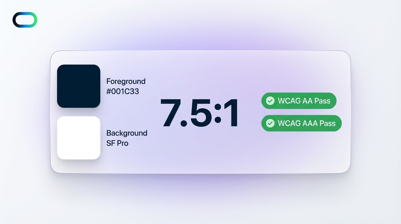
A color contrast checker is a tool that computes the relative luminance of two colors and expresses the difference as a ratio. The formula comes from the W3C's WCAG 2.1 specification, which defines relative luminance as a linearized representation of the sRGB color space. The tool takes your foreground color (typically text) and background color, converts each to a luminance value between 0 and 1, and then divides the lighter value by the darker one. The result is a ratio like 4.5:1 or 7:1. A ratio of 1:1 means no contrast at all (identical colors), while 21:1 is the maximum possible contrast, achieved by pure black on pure white.

In practice, you enter two hex, RGB, or HSL values. The checker returns whether your combination passes WCAG Level AA, WCAG Level AAA, or both, and it shows those results separately for normal text, large text, and UI components. Modern checkers like WebAIM's Contrast Checker also offer real-time previews so you can see the text rendered at the tested contrast level. Inspo AI's free tools take this further by bundling the contrast checker inside a broader design audit workflow, so you get page-level insights alongside individual color pair checks.
The underlying math is deterministic. There is no gray area. Either your colors pass or they do not, which makes a contrast checker one of the most objective tests in a designer's accessibility toolkit.
What Contrast Ratio Do You Need to Pass WCAG AA?
WCAG Level AA is the benchmark most accessibility laws point to as the minimum standard. According to the W3C WAI documentation on Success Criterion 1.4.3, the requirements are:

- Normal text (below 18pt regular or 14pt bold): minimum 4.5:1
- Large text (18pt or larger regular, 14pt or larger bold): minimum 3:1
- UI components and graphical objects: minimum 3:1 against adjacent colors (WCAG SC 1.4.11)
The 4.5:1 threshold for normal text accommodates users with moderately low vision who do not use assistive technologies. The 3:1 threshold for large text reflects that bigger letterforms remain legible at lower contrast levels due to their increased stroke width and size. UI components such as input field borders, focus indicators, and icon fills also need to hit 3:1.
There are three notable exceptions. Disabled UI components have no contrast requirement, on the logic that their inactive state communicates non-interactivity. Pure decorative elements that carry no informational value are also exempt. And logotypes, because brand mark colors are a legal and brand equity consideration outside a designer's direct control, carry no contrast requirement under WCAG.
If you build for any government, education, or enterprise audience, AA compliance is your legal floor in the United States under the ADA, and in the European Union under the European Accessibility Act, which became enforceable in June 2025 per ADA.gov.
What Is the Difference Between WCAG AA and WCAG AAA?
WCAG organizes its success criteria into three conformance levels: A, AA, and AAA. Level A contains the minimum baseline requirements. Level AA adds the contrast and other criteria that most laws mandate. Level AAA is the enhanced standard, designed for specialized contexts where users have significant accessibility needs.
For color contrast specifically, Level Access explains the distinction clearly:
| Context | WCAG AA | WCAG AAA |
|---|---|---|
| Normal text | 4.5:1 | 7:1 |
| Large text | 3:1 | 4.5:1 |
That jump from 4.5:1 to 7:1 for body text is significant. Pure black (#000000) on pure white (#FFFFFF) achieves 21:1, so AAA is well within reach for dark text on light backgrounds. The challenge arises with brand-colored text, muted UI tones, and light text on colored backgrounds.
The AudioEye guide to WCAG conformance levels notes that Level AAA is appropriate as a target for medical platforms, government portals, and products serving aging populations. Most design teams treat AA as non-negotiable and pursue AAA where feasible, especially for body copy, labels, and error messages where clarity is critical. The practical rule: aim for AA everywhere, and push to AAA for primary reading content.
What Counts as "Large Text" Under WCAG?
The definition of large text is specific and matters a great deal in practice, because passing the lower 3:1 threshold instead of 4.5:1 gives designers meaningfully more palette flexibility. According to WCAG SC 1.4.3 (Minimum Contrast), large text is:
- 18pt (approximately 24px) or larger in normal weight
- 14pt (approximately 18.67px) or larger in bold weight
The key word is "approximately." WCAG uses CSS point values, and 1pt equals 1.333px at 96 DPI, the default web resolution. So 18pt maps to roughly 24px and 14pt maps to roughly 19px. A 20px bold heading qualifies as large text. A 20px regular-weight body paragraph does not.
Font weight also matters. A 17px medium-weight (500) type does not qualify. A 17px bold (700) type, being 14pt equivalent, does qualify. Berkeley's Digital Accessibility guide recommends treating 18px regular and 16px bold as your practical thresholds if you want a comfortable buffer above the minimums, since rendering engines and font metrics vary slightly across operating systems.
One common mistake designers make is relying on the large-text threshold for small caps or all-uppercase type. WCAG does not grant exceptions for capitalization. If the actual font size in CSS falls below 18pt regular or 14pt bold, the 4.5:1 ratio applies regardless of letter case.
Does WCAG 2.2 Change the Contrast Requirements?
WCAG 2.2 was finalized as a W3C Recommendation in October 2023 and updated in December 2024. The good news for design teams is that the core contrast ratios remain unchanged. The 4.5:1 and 3:1 thresholds from WCAG 2.1 carry forward into 2.2 without modification, as confirmed in the W3C's official WCAG 2.2 changelog.
What WCAG 2.2 does add is nine new success criteria focused on cognitive accessibility, mobile interactions, and focus visibility. Most relevant for designers: Success Criterion 2.4.11 (Focus Appearance, AA) now requires that keyboard focus indicators have sufficient contrast and size, making the 3:1 non-text contrast requirement for UI components more relevant than ever.
WCAG 2.2 also removed the outdated SC 4.1.1 (Parsing), which had no practical impact on contrast testing. The AudioEye WCAG 2.2 overview notes that organizations should update their test suites to include the new focus criteria, but existing contrast testing workflows stay valid. Run your color pairs against the same ratios you always have. Use a checker that explicitly labels itself WCAG 2.2 compliant, like Inspo AI's free tools, to confirm you cover all three relevant success criteria: 1.4.1, 1.4.3, and 1.4.11.
Does Contrast Apply to UI Components and Icons, Not Just Text?
Yes. WCAG Success Criterion 1.4.11 (Non-text Contrast), introduced in WCAG 2.1 and carried forward into 2.2, requires that UI components and meaningful graphics achieve a minimum 3:1 contrast ratio against adjacent colors. This covers:
- Input field borders and outlines
- Checkbox and radio button borders
- Toggle switches in both on and off states
- Focus indicators (further strengthened in WCAG 2.2)
- Informational icons and graphical elements
- Required form field indicators
Siteimprove's explanation of the contrast rule highlights a common oversight: designers test text contrast rigorously but overlook button outlines, icon fills, and form field borders. A light-gray input border on a white background can look refined on a high-resolution display and still fail the 3:1 threshold for SC 1.4.11.
The three exceptions to 1.4.11: inactive or disabled components, purely decorative graphics, and logos. Everything else that communicates state, action, or meaning requires that 3:1 ratio. This makes it important to audit not just your color swatches but your complete component library, including all interactive and informational states.
Is Poor Color Contrast a Legal Risk?
The legal risk from color contrast failures grows every year. AllAccessible's 2025 guide reports that low contrast is the single most common accessibility violation on the web, present on 83.6% of all websites analyzed in WebAIM's 2024 Million study. That statistic correlates directly with litigation trends.
According to DarrowEverett's 2025 analysis of ADA litigation, the first half of 2025 continued the upward trend in ADA website accessibility lawsuits, with plaintiffs citing WCAG failures, including contrast violations, as the primary basis for claims. In 2024, 4,605 ADA lawsuits were filed, per AllAccessible.
The ADA's April 2024 final rule update explicitly adopts WCAG 2.1 AA as the technical standard for Title II entities (state and local governments). The European Accessibility Act, which became enforceable for businesses across EU member states in June 2025, applies the same standard to private-sector products and services.
For UI/UX designers, the practical implication is clear. Contrast issues are no longer a niche QA concern. They represent real legal exposure for the businesses whose products you build, especially in regulated industries like finance, healthcare, and government.
How Do You Fix Low Contrast Issues in a UI Design?
Fixing contrast failures does not require abandoning your design system. It requires targeted adjustments. Here is a practical process:
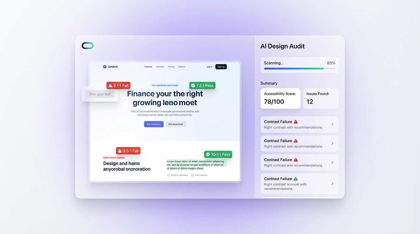
1. Identify failing pairs first. Run a full audit with a tool like Inspo AI's design audit feature, which overlays contrast ratio labels directly on UI screenshots and flags failing elements in red. This gives you a prioritized fix list instead of checking colors manually.
2. Darken or lighten, do not shift hue. Contrast is a luminance calculation, not a hue calculation. Shifting a gray text from #999 to #767676 (the lowest hex that passes 4.5:1 on white) preserves your neutral palette while achieving compliance. Ben Myers' guide to fixing low contrast text recommends using a color picker constrained to the passing luminance range so you keep the spirit of your original color.
3. Increase font size or weight for borderline colors. If your brand uses a specific mid-tone color, pushing text to 18px+ regular or 14px+ bold drops the requirement from 4.5:1 to 3:1, which opens up a wider range of compliant shades.
4. Add a scrim or overlay on image backgrounds. Text over photography or gradients requires checking the contrast at the lowest-contrast region of the image. A semi-transparent dark overlay behind text is a reliable fix. Harvard's Digital Accessibility Services also recommends off-white (#FCFCFC, #F5F5F5) instead of pure white as a background for body text, which reduces eye strain for users with dyslexia while marginally relaxing contrast math.
5. Check every interactive state. Hover, focus, active, error, and disabled states each need individual contrast checks, not just the default state.
Build Accessible UI Faster with Inspo AI
Color contrast compliance is not a one-time checklist item. It applies to every component, every state, every new color you introduce into a design system. Running manual checks through individual tools works for a single page. It does not scale to a full product.
Inspo AI brings the color contrast checker, design audit, and brand scanner into a single workflow. Run a contrast check in seconds, then push it directly into your moodboard or design audit report without switching tabs. The design audit feature scans your UI at the page level, flags contrast failures with ratio overlays, and surfaces the exact pairs you need to fix, so you spend less time auditing and more time designing.
Whether you are building a new product from scratch or auditing an existing design system for WCAG 2.2 compliance, Inspo AI gives you the tools to ship accessible, polished UI confidently.
Try Inspo AI's free tools now at inspoai.io/free-tools.
Sources: W3C WCAG 2.1 | W3C WCAG 2.2 | WebAIM Contrast Checker | Level Access - WCAG Conformance Levels | AudioEye - WCAG Levels | AllAccessible 2025 Guide | W3C WAI - SC 1.4.3 | ADA.gov 2024 Rule | Harvard Digital Accessibility | Ben Myers - Fix Low Contrast | DarrowEverett ADA Litigation 2025 | Siteimprove Contrast Rule