TLDR
- A tint mixes a base color with white; a shade mixes it with black. Together they form the backbone of any scalable color system.
- Most generators produce uneven scales because they calculate steps inside RGB or HSL, which do not match human visual perception.
- Perceptually accurate generators use modern color spaces (OKLCH or OKLab) so each step appears equally spaced to the eye.
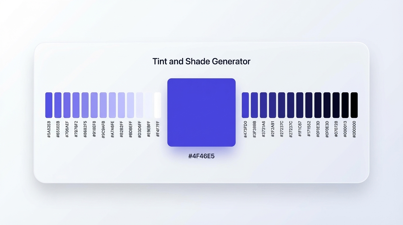
- A 40-step scale (20 tints + 20 shades) gives design teams the granularity required for design tokens, accessibility compliance, and dark mode support.
Introduction
When you build a UI, a brand identity, or a design system, you rarely use a single base color in isolation. You use an entire family that spans from near-white highlights to near-black shadows. A tint shade generator takes one hex value and produces that complete family automatically. Done well, the result is a scale where every step appears equally distant from its neighbor, ranging from soft pastels at one end to rich, deep tones at the other.
The problem is that most generators get the math wrong. They space steps evenly inside RGB or HSL, but neither color space matches how the human eye perceives lightness. The result is scales with visible jumps in some ranges and nearly imperceptible differences in others. This guide covers why that happens, how to fix it, and how tools like Inspo AI bring perceptually accurate tint and shade generation directly into your design workflow.

1. What Is the Difference Between a Tint and a Shade?
The distinction is precise.
A tint is a color mixed with white. As you add more white, the result gets lighter and less saturated, eventually approaching pure white. Classic examples include baby pink (a tint of red) and sky blue (a tint of pure blue).
A shade is a color mixed with black. As you add more black, the color darkens and loses vibrancy, eventually approaching pure black. Navy blue is a shade of pure blue; maroon is a shade of red.

A third term, tone, refers to mixing a color with gray, which desaturates it without pushing it toward either white or black. Tones appear muted or dusty compared to their base hue.
According to Wikipedia's entry on tint, shade, and tone, mixing any color with a neutral (white, black, or gray) reduces its chroma. That reduction in saturation explains why very light tints and very dark shades often look washed out compared to the original hue.
For digital design, this distinction carries practical weight. Tints work as surface colors, background fills, and subtle state indicators. Shades carry visual weight as text colors, borders, and hover states. A tint shade generator produces both families from one input, giving you a complete color vocabulary without manual trial and error. Understanding which end of the scale each UI role belongs to is the first step toward a coherent, systematic color approach.
2. How Does a Tint Shade Generator Work?
At its core, a tint shade generator interpolates between a base color and white (for tints) or black (for shades) across a set number of steps. You input a hex code, choose the number of steps, and the tool outputs a sequence of hex values covering the full range.
The simplest approach adds white or black in fixed percentage increments inside the sRGB color space. For example, maketintsandshades.com produces scales at 5%, 10%, or 20% steps and validates its output against Chrome DevTools calculations and Sass methods. This approach is deterministic and consistent, but it does not account for the non-linearity of human color perception.
More advanced generators calculate steps inside perceptually uniform color spaces. The Tints and Shades Generator on web-toolbox.dev uses OKLCH to produce variations that look natural to the human eye, because changes in OKLCH lightness correspond directly to perceived differences rather than raw numerical distances.
A generator that outputs 20 tints and 20 shades gives you 40 distinct steps plus the base, covering the full range from near-white to near-black. This is the depth that design systems like Tailwind CSS adopt with its 50-through-950 numeric scale, and it is what a well-built tool generates in seconds from a single base color.
3. Why Perceptual Uniformity Matters in a Color Scale
When you generate tints and shades inside RGB or HSL, equal numerical steps do not produce equal visual jumps. The human visual system is more sensitive to lightness changes in mid-range values than in the very light or very dark zones. This creates scales where multiple steps near white look nearly identical, while steps in the mid-range feel too far apart.
Perceptual uniformity addresses this by choosing a color space that mirrors human vision. According to AVA Palettes' guide on perceptually uniform color ramps, a perceptually uniform approach ensures each step looks visually even, not just numerically even, which produces smoother transitions and avoids unwanted jumps or muddy intermediate colors.
OKLCH (Oklab Lightness Chroma Hue), designed by Björn Ottosson in 2020 and detailed at oklch.net, builds on human vision principles so equal changes in its lightness value produce equal changes in perceived brightness. OKLCH also preserves chroma more faithfully than HSL, which means tints stay vibrant rather than going pale and chalky.
For design teams, perceptual uniformity has a direct functional payoff. You can predict contrast ratios more reliably, which matters for WCAG accessibility compliance. Smooth scales also hold together better in dark mode, where dark shades serve as surface colors and light tints move into text and icon roles. Chris Henrick's OKLCH color experiments show how OKLCH-based palettes fix contrast failures that sRGB-interpolated scales routinely introduce into production codebases.
4. How Many Color Steps Does a Design System Need?
The answer depends on the complexity of your UI, but the industry has converged on a numeric scale with at least 9 to 11 steps per color.
Tailwind CSS uses a 10-step scale per hue: 50, 100, 200, 300, 400, 500, 600, 700, 800, 900, and (since Tailwind 3) 950. Google Material Design follows a similar structure, using 50 through 900. As Dreamten's design system guide notes, Google Material popularized this numeric approach in 2014, and it lets designers and developers reference any color by its lightness weight, making handoffs precise and unambiguous.
For brand systems or custom design tokens, a 40-step scale (20 tints and 20 shades) gives significantly more granularity. You can select exactly the right surface background, the correct text color for body copy versus caption text, the ideal hover and pressed states, and a dark mode counterpart for each light mode value, all from the same base palette.
DesignerUp's Tailwind-ready color system guide recommends generating a full scale first and then selecting semantic tokens from it, rather than hand-picking individual hex values. This workflow is exactly what Inspo AI supports: generate a complete 40-step scale from any brand color, assign semantic names to the steps you choose, and export the result in token-ready formats that your development team can integrate directly.
5. Which Color Space Produces the Most Accurate Results?
The three most common color spaces for tint and shade generation are sRGB, HSL, and OKLCH. Each has trade-offs.
sRGB is the web default. Generators that work in sRGB linearly interpolate between the base color's RGB values and 255,255,255 (white) or 0,0,0 (black). The math is straightforward and the output matches browser defaults, but the perceptual spacing is uneven across the lightness range.
HSL (Hue Saturation Lightness) separates the concept of lightness from hue, which feels more intuitive for designers. However, two colors at the same HSL lightness value can look very different in perceived brightness. Evil Martians' widely cited article on OKLCH in CSS documents this limitation in detail, showing that HSL's lightness channel does not model human vision accurately enough for systematic color work.
OKLCH is the modern standard. Björn Ottosson designed it in 2020, and CSS Color Level 4 adopted it as a first-class color format. As oklch.net explains, OKLCH ensures that equal numerical changes in its lightness value produce equal perceptual changes, making it the most reliable space for building color scales that look consistent across every step. Tints generated in OKLCH stay vibrant, and shades deepen evenly, without the muddiness that sRGB and HSL interpolation regularly introduce.
For any serious design system work, a generator that operates in OKLCH or OKLab produces a noticeably better result.
6. How Tints and Shades Affect WCAG Accessibility
Color contrast is both a legal requirement and a user experience fundamental. WCAG 2.1 requires a minimum contrast ratio of 4.5:1 for normal text and 3:1 for large text against its background. The developing WCAG 3.0 standard proposes an Advanced Perceptual Contrast Algorithm (APCA) that models human contrast perception with greater accuracy than the current ratio formula.
A well-built tint and shade scale makes WCAG compliance predictable and systematic. If you identify which step in your scale passes 4.5:1 against a white surface, you apply that rule consistently across your entire component library without checking every individual color pairing.
According to AVA Palettes, perceptually uniform scales make it easier to target accessible contrast thresholds because the lightness differences between steps are consistent and foreseeable. You can identify a threshold step and rely on everything darker passing for text use cases.
A 40-step scale gives enough resolution to find the precise step that sits just above the contrast threshold for each semantic role: body text, caption text, interactive icons, and decorative fills. Scales with fewer steps force you into compromises, where the closest available step either exceeds the threshold by too much (creating unnecessarily dark text) or falls just below it (creating an accessibility failure).
Generators that output contrast ratio data alongside each hex value, and support export to CSS custom properties or JSON, convert accessibility compliance from a late-stage QA task into a structural property of the color system itself.
7. How to Export Tint and Shade Scales as Design Tokens
Design tokens bridge a color scale and a production codebase. A token assigns a semantic name to a hex value so both the design file and the engineering implementation reference the same source of truth.
The most common export formats for tint and shade scales are:
- JSON: Compatible with Style Dictionary and the W3C Design Tokens spec. Example:
{ "color": { "brand": { "500": { "value": "#4F46E5" } } } } - CSS custom properties:
--color-brand-500: #4F46E5;applied globally inside a:rootblock. - Sass variables:
$color-brand-500: #4F46E5;compatible with BEM-based codebases and most component frameworks. - Figma tokens: Via the Tokens Studio plugin, which reads JSON token files and applies them directly to Figma styles and components.
Tools like maketintsandshades.com export palettes in Hex, RGB, CSS, and JSON formats. For teams that work from a brand identity, Inspo AI's brand scanner and free tools extract every color from a logo or brand asset, generate a complete tint and shade scale for each detected color, and output the full set in token-ready formats.
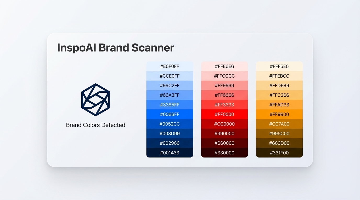 Inspo AI Brand Scanner: extracted tint and shade scales from detected brand colors">
The naming convention also matters at scale. Tailwind's 50-950 numeric system is widely understood, but many teams add a semantic alias layer on top: surface-subtle, text-primary, interactive-hover. As this LinkedIn guide on Tailwind color systems and design tokens outlines, the best practice is to maintain both layers: a raw numeric scale as the primitive foundation, and a semantic alias layer that references it for component-level usage.
Build Your Color Foundation Right
A tint shade generator does more than automate tedious work. It enforces consistency, reduces misalignment between designers and developers, and turns accessibility compliance into a structural property of your color system rather than a last-minute fix.
The difference between a mediocre generator and a great one is the math behind the interpolation. RGB and HSL-based tools produce uneven scales. OKLCH-based tools produce scales where every step looks equally spaced, making the full color family feel intentional and coherent at every breakpoint and in every component state.
If you build design systems, brand identities, or UI component libraries, a 40-step scale is the right level of granularity. It covers every semantic role, supports dark mode without manual adjustment, and gives developers a clean token structure they can extend as the product grows.
Inspo AI's free tools include a full tint and shade generator alongside a brand scanner, moodboard builder, and design audit suite. Generate your 40-step scale in seconds, export in the format your codebase needs, and build from a color foundation that holds up at every scale.
Start your free color scale at inspoai.io/free-tools.