TLDR A strong typography pairing balances contrast, hierarchy, and mood to make your design feel intentional and readable. This guide breaks down what makes font pairings work, covers the rules designers use to evaluate them, compares traditional approaches with AI-assisted discovery, and highlights the best typography pairing tools available in 2026.
Introduction
Typography is the invisible architecture of every design. Before a user registers a headline or reads a call-to-action, they have already responded to the weight, spacing, and rhythm of the type on the page. A well-considered typography pairing builds trust, establishes hierarchy, and communicates brand personality. A careless one creates friction the user cannot always name but always feels.
Finding the right font combination used to involve deep knowledge of type history, hours of manual testing, and a lot of expensive mistakes. Today, AI-powered tools have changed the discovery process dramatically. They surface contextually relevant pairings in seconds, explain the reasoning behind suggestions, and let designers iterate across dozens of options without losing focus on the actual design problem.

This guide covers what makes a pairing work, how AI has reshaped the process, and which typography pairing tools are worth using in 2026.
What makes a good typography pairing?
A good typography pairing serves three functions simultaneously: it creates visual contrast, establishes clear hierarchy, and sustains a coherent mood across all the text in a design.
Contrast is the most fundamental requirement. When two typefaces are too similar, they compete for attention without either winning. The result is visual ambiguity that makes the design feel unresolved. Contrast can come from classification (serif paired with sans-serif), weight (light with bold), structure (geometric with humanist), or width (condensed with regular). Any one of these axes is enough, as long as the difference is deliberate and clear.

Hierarchy refers to how type signals importance. Headings need to stand apart from subheadings, which need to stand apart from body copy. A good pairing gives you distinct tools for each level without requiring entirely different styling rules. The fonts should do the hierarchical work, not just the size and weight settings.
Mood coherence is subtler. Every typeface carries cultural and historical associations. Helvetica reads as modern and neutral. Garamond reads as literary and refined. Playfair Display reads as editorial and aspirational. When two fonts carry contradictory moods, the pairing creates cognitive dissonance even when the contrast is technically correct. Mood coherence asks: do these two fonts belong in the same world?
Getting all three right is the designer's job. The right tools simply shorten the path to getting there.
What are the fundamental rules designers use to evaluate type pairings?
Several principles have emerged from typography practice over decades, and they hold up across print, web, and interface design.
The one serif, one sans rule is the most cited starting point. Pairing a serif with a sans-serif gives you built-in contrast without requiring both fonts to do heavy lifting. It works because the structural difference between bracketed letterforms and clean geometric strokes creates immediate visual separation. That said, it is a starting point, not a law. Skilled designers pair two serifs or two sans-serifs all the time, provided other axes of contrast compensate.
Superfamilies and designed pairs are among the most reliable options. Type designers sometimes release a serif and a sans-serif that share underlying proportions and spacing, designed explicitly to be used together. Freight Text and Freight Sans, or the various pairings within the IBM Plex family, are examples. These work because the designer has already solved the coherence problem.
Limit to two typefaces. Most strong designs use two fonts and achieve variety through size, weight, spacing, and color. Adding a third typeface almost always introduces complexity without proportional benefit. There are exceptions for display or editorial layouts, but they require significant type expertise to execute well.
Test at actual sizes. A pairing that looks balanced in a specimen at 36px may fall apart when the body copy drops to 14px and the heading scales to 72px. Always validate in context, not in a font comparison tool.
Consider x-height compatibility. When two fonts have significantly different x-heights (the height of lowercase letters relative to caps), they can look mismatched when used at the same nominal size. Fonts with similar x-heights tend to feel more cohesive at scale.
How has AI changed the way designers find typography pairings?
Traditional type pairing research meant browsing type specimens, consulting references like "Thinking with Type" by Ellen Lupton, and manually testing combinations in Figma or InDesign until something worked. The process was slow, relied heavily on accumulated experience, and was difficult to explain to clients or stakeholders.
AI has changed this in three concrete ways.
First, AI models trained on large design datasets can identify patterns in what experienced designers pair together, across industries and contexts. They surface suggestions that reflect real-world usage rather than theoretical compatibility, which is a meaningful difference. A pairing that works for a law firm's website differs from one that works for a creative agency's portfolio, and AI tools are increasingly good at making that distinction.
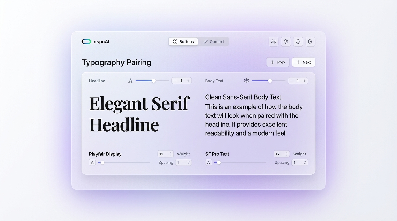
Second, AI tools reduce the cold-start problem for less experienced designers. Instead of needing to know that "Playfair Display pairs well with Source Sans Pro," a designer can describe the project's mood or industry and receive contextually relevant starting points.
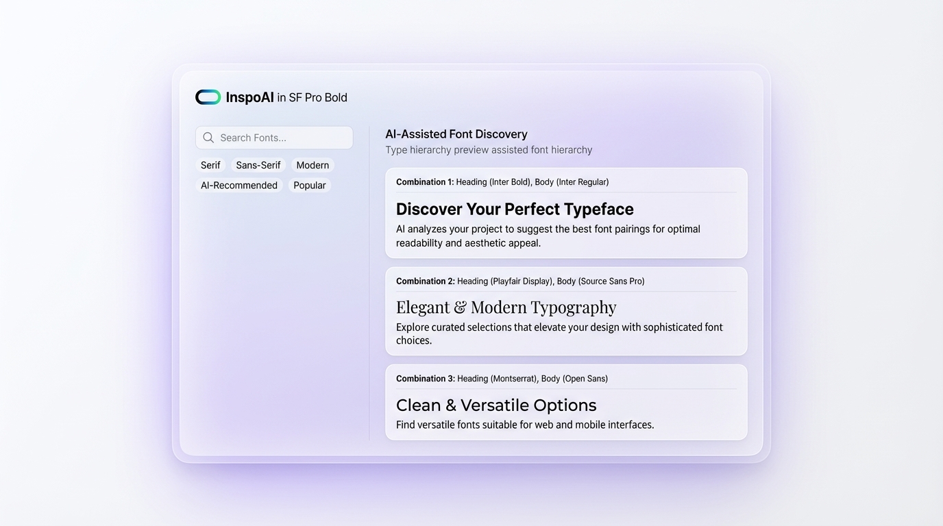
Third, platforms like Inspo AI extend this beyond isolated font suggestions. By analyzing design references, competitor branding, and existing visual systems, Inspo AI lets designers understand not just what fonts are used but how they are used at scale in real products. That context is often more valuable than a theoretical pairing suggestion.
The limitation is that AI cannot replace the final judgment call. It can narrow a shortlist from hundreds to five, but the designer still needs to evaluate those five against the project's specific constraints.
What are the best typography pairing tools available in 2026?
Fontjoy uses machine learning to generate font pairings based on a neural network trained on typographic relationships. It lets you lock specific fonts and generate new pairings around them, which is useful when you have one font decided and need to find a companion.
Google Fonts Knowledge provides not just a font library but editorial pairing suggestions with explanations of why specific combinations work. The "type pairings" articles are particularly useful for designers building on Google Fonts.
Typescale helps you build modular type scales and visualize how your pairing looks across a full hierarchy, from display headings down to captions. It exports clean CSS.
Fonts In Use is a searchable archive of real-world typography usage across print and digital. It is less a generator and more a research tool, but for finding how specific fonts are used in context, it has no equal.
Inspo AI's AI design search lets you search for interfaces, brands, and editorial layouts that use specific typographic styles. When you find a design whose type treatment you admire, you can analyze the whole visual system rather than just the font names. This is especially valuable when you are trying to match the feel of a reference rather than just replicate a pairing.
Adobe Fonts + Typekit remains a strong resource for designers in the Adobe ecosystem, with curated collections organized by mood, category, and pairing compatibility.
How do typography pairing needs differ between web design and brand identity?
The underlying principles are the same, but the constraints diverge significantly.
Web design prioritizes performance, rendering consistency, and readability at variable sizes across devices. Variable fonts have become the standard for serious web typography because they offer the flexibility of multiple weights and widths in a single file, which reduces load times while expanding design options. Web pairings also need to account for rendering differences across Windows (which uses DirectWrite) and macOS (which uses CoreText), since the same font can look noticeably different between the two.
System fonts (San Francisco, Segoe UI, Roboto) have become a practical consideration. Many product designers choose system fonts for body copy specifically to eliminate rendering variables, then layer a distinctive display or heading font on top for personality.
Brand identity has fewer technical constraints and more latitude for expression. Print, packaging, and brand collateral do not have to worry about web-safe rendering or file size. This opens the door to more complex, expressive type systems, including secondary display faces, custom lettering, and fine-grained kerning that would be impractical in a web context.
The practical implication for designers is that a pairing developed for a brand identity may not translate directly to a web implementation. It often needs a "web-ready" adaptation, substituting variable or optimized fonts while preserving the visual hierarchy and mood of the original system.
What are the most common mistakes designers make with typography pairings?
Pairing two typefaces with the same energy. A geometric sans-serif and another geometric sans-serif at similar weights look like an accident, not a decision. Both fonts occupy the same visual lane, and neither stands out.
Ignoring the body copy font. Designers spend the most time choosing the heading font and treat the body font as an afterthought. This is backwards. The body font carries most of the text in any design. If it is uncomfortable to read at sustained lengths, the pairing fails regardless of how beautiful the headline looks.
Choosing pairings based on aesthetics alone. A typeface might look exactly right but carry licensing restrictions that make it unusable in production, or render poorly at small sizes, or lack the character sets needed for a multilingual product. Always validate pairings against technical and legal requirements before presenting them.
Using too many weights as a workaround. When a pairing lacks natural hierarchy, designers often compensate by stacking up weight variations (light, regular, medium, semibold, bold, extrabold) across a single typeface. The result is noisy and inconsistent. A well-chosen pairing provides hierarchy without requiring every weight in the family.
Relying on popular pairings without evaluating fit. "X pairs with Y" is advice, not a rule. Highly cited pairings like Playfair Display with Lato or Merriweather with Open Sans are popular because they work broadly, but broad compatibility is not the same as the right choice for your specific project.
How do you test and validate a typography pairing before finalizing it?
Testing a typography pairing requires moving out of the specimen view and into the actual context of the design.
Start by setting representative content. Do not test with placeholder text. Use real copy from the project, including the longest headlines, the densest body paragraphs, and the shortest CTAs. Edge cases reveal problems that representative text hides.
Build a hierarchy sample with every level your design uses: display, H1, H2, H3, body, caption, label, link. Check that each level reads as distinct without requiring a dramatic size jump to establish separation.
Test across breakpoints. A pairing that feels balanced on a large desktop display may feel top-heavy on mobile when the heading scales down and the relative size difference shrinks. Most type scales need separate adjustments for mobile.
Check rendering across devices. Use a tool like Browserstack or simply test on a Windows laptop, a MacBook, and a mid-range Android phone. You will likely find rendering inconsistencies that require minor weight or size adjustments.
Inspo AI's design audit feature is useful at this stage for checking whether your typography choices are consistent across your mockups and whether they align with the visual conventions of your category. Catching mismatches before handoff saves significant development time.
Finally, get feedback from a non-designer who represents your target user. Technical fluency can make it hard to notice when something feels "slightly off" because you have been staring at it too long. Fresh eyes catch problems that expert eyes rationalize away.
Conclusion
Typography pairings are not about finding two fonts that look nice next to each other. They are about building a system that communicates hierarchy, sustains mood, and remains legible across every context your design will appear in. The rules of contrast, coherence, and hierarchy are not constraints on creativity. They are the foundation that makes creative decisions land.
AI has made the exploration phase faster, more contextual, and more accessible to designers at every experience level. Tools like Inspo AI go further by connecting type discovery to broader visual research, so your pairing decisions are grounded in real-world design practice rather than theoretical compatibility charts.
The next time you start a type system, spend less time rotating through random generators and more time researching how your category's best-designed products use type. Start there, validate against the principles in this guide, and you will spend far less time second-guessing the result.
Ready to accelerate your design research? Try Inspo AI for free and explore AI-powered design discovery, brand analysis, and typography inspiration in one place.