TLDR Finding quality e-commerce UI inspiration efficiently requires knowing where to look, what patterns matter most, and how to translate references into actionable design decisions. This guide covers the top resources, the 2026 design trends shaping online retail, how to moodboard product pages and checkout flows, and how AI-powered tools cut research time dramatically.
Introduction
E-commerce UI design shapes every touchpoint between a customer and a purchase. The layout of a product page, the clarity of a checkout flow, the placement of trust signals near a buy button — these visual and interaction decisions directly affect conversion rates and brand perception.
Yet finding the right inspiration for e-commerce UI is harder than it looks. Generic design galleries mix e-commerce patterns with SaaS dashboards, portfolio sites, and editorial layouts, forcing designers to scroll through dozens of irrelevant results. Platforms like Dribbble surface beautiful but often impractical concepts that do not reflect how real shopping experiences actually behave.
The designers who move fast and produce high-converting e-commerce interfaces have a systematic approach to sourcing inspiration. They know which resources yield the most relevant references, how to build focused moodboards for specific page types, and how to apply current design trends without chasing them blindly. This guide covers the full process, including how AI tools have made the entire workflow significantly faster.
What Is E-Commerce UI Design?
E-commerce UI design is the practice of designing the visual interface and interaction patterns of online shopping experiences. It encompasses everything the user sees and interacts with: navigation menus, product listing pages, product detail pages, shopping carts, checkout flows, confirmation screens, and post-purchase communication.
Good e-commerce UI design achieves two goals simultaneously: it presents products in a way that motivates purchase decisions, and it removes friction from the buying process. These goals can sometimes tension each other. A visually rich, editorial product page might look stunning but slow down load times or obscure the add-to-cart button. A conversion-optimized checkout might be efficient but feel cold and transactional.
Baymard Institute has documented over 18,000 e-commerce design examples organized across 67 page types and 500-plus UI components, based on 150,000 hours of user testing. It is one of the most comprehensive resources available for understanding what actually works in e-commerce UI — a valuable counterweight to purely aesthetic inspiration sources.
The discipline sits at the intersection of visual design, UX research, and brand strategy. An e-commerce UI designer needs to understand color psychology, typography hierarchy, mobile interaction patterns, accessibility standards, and the psychology of trust signals, all while maintaining the visual coherence of the brand. The best designers in this space are voracious consumers of both live e-commerce examples and broader design inspiration.
Where Do Designers Find E-Commerce UI Inspiration?
The most productive sources for e-commerce UI inspiration fall into two categories: live site galleries and curated design communities.
Live site galleries document real, production e-commerce interfaces. Baymard Institute remains the gold standard for research-backed examples. Mobbin offers a large library of real app and web UI screenshots tagged by page type, which is invaluable for finding mobile commerce patterns. PageFlows documents complete user flows — including checkout and onboarding sequences with video recordings — which go beyond static screenshots to show how interactions actually work.
Curated design communities like Dribbble and Behance surface high-quality conceptual work, though the designs are often aspirational rather than production-tested. Awwwards and Land-book focus on sites recognized for design excellence, with a stronger real-world basis.
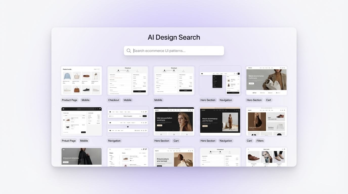
The limitation common to all these platforms is discoverability. Finding e-commerce UI examples for a specific niche — say, a luxury fashion product page on mobile — requires significant manual filtering. This is where AI-powered design search changes the workflow entirely.
Inspo AI lets designers search for e-commerce UI patterns using natural language queries. Type "minimalist luxury product page with editorial photography" and the AI returns curated visual references that match that specific aesthetic, dramatically reducing the time spent sifting through irrelevant results and letting designers spend more time doing actual design work.
What Are the Top E-Commerce UI Design Trends in 2026?
Several clear trends define e-commerce UI design in 2026, reflecting both technological shifts and evolving customer expectations.
Bento grid layouts have migrated from tech dashboards into e-commerce product listing pages. Inspired by Japanese bento boxes and popularized by Apple's marketing, these asymmetric modular grids allow designers to give different visual weight to featured products, promotions, and editorial content within a single page layout. Halo Themes identifies bento grids as one of the most visually distinctive trends of the year.
AI-powered personalization is no longer a backend feature hidden from the design layer. In 2026, interfaces themselves adapt in real time to individual user behavior, surfacing personalized product carousels, dynamic hero imagery, and contextual recommendations. UX Pilot notes that IKEA's AR app reduced product returns by 30% by helping customers visualize products in their own spaces — a preview of where personalized visual e-commerce experiences are heading.
Minimalist and clean aesthetics continue to dominate premium e-commerce. Generous white space, refined typography, and restrained color palettes signal quality and trust. Code Theorem identifies minimalism alongside mobile-first design and inclusive accessibility as the most durable 2026 trends.
Micro-interactions and motion add life to static product pages without compromising load times. Hover-reveal product details, subtle add-to-cart animations, and progress indicators in checkout flows all contribute to a sense of craftsmanship.
Neubrutalism appears as a counter-trend on the premium side, with bold type, high contrast, and raw structural layouts attracting significant attention in fashion, streetwear, and youth-facing verticals.
Voice search optimization is reshaping navigation and search UI patterns as voice commerce gains adoption, prompting designers to rethink how users discover products through non-visual entry points, according to Craftberry.
How Do You Moodboard an E-Commerce Product Page?
Moodboarding an e-commerce product page requires a more structured approach than general brand moodboarding. Because the product page serves a specific conversion function, the references you collect need to reflect both aesthetic and functional considerations — not just visual appeal.
Start by collecting references organized around the key visual zones of a product page: the hero image area, the product title and pricing block, the call-to-action zone, social proof elements like reviews and trust badges, and the product description section. UXPin's UI mood board guide recommends building UI mood boards around specific interface zones rather than complete screens, because it gives the design team more granular and actionable direction.
For each zone, collect three to five references that represent the visual quality and interaction style you are targeting. Pay attention to whitespace ratios, type hierarchy, button styles, and image treatment. For the hero image area, for example, references might include full-bleed photography, clean product-on-white staging, lifestyle context shots, and 360-degree interactive imagery examples.
Color palette references should draw from both direct competitors and adjacent industries. Fashion e-commerce frequently inspires technology product pages, and architecture photography often provides the color and texture vocabulary for beauty and wellness brands.
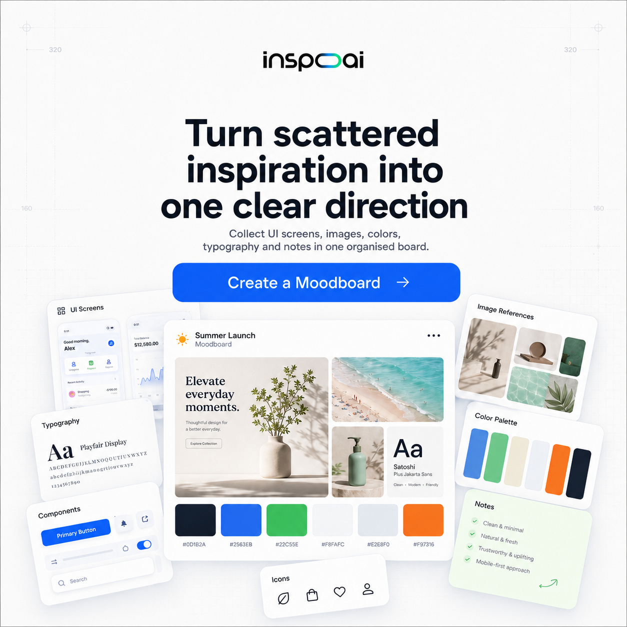
Once zone-specific references are collected, assemble them into a unified board that tells a visual story about the proposed product page. Inspo AI's moodboard builder is well-suited to this task: it lets you organize zone-specific references into structured layouts and surface additional references when a particular zone needs more visual depth.
What Makes a Good E-Commerce Product Page Design?
A high-performing e-commerce product page resolves the customer's core question as fast as possible: "Is this the right product for me, and can I trust this brand enough to buy it?" Every design decision either answers that question faster or creates noise that delays it.
The most fundamental element is a clear, fast-loading hero image. Adobe for Business highlights that the product image is the primary conversion driver on a product page, especially on mobile, where it occupies the majority of the initial viewport. Multiple image angles, zoom capability, and video options all extend the persuasion surface of the hero area.
Typography hierarchy matters enormously. Product name, price, and variant selector need to communicate their relative importance through size, weight, and spacing before the customer has consciously processed the page structure. If the price is visually smaller than the product description, there is a design problem that will cost conversions.
Trust signals — reviews, rating counts, security badges, return policy callouts — should appear proximate to the add-to-cart button, not buried at the bottom of the page. Tubik Studio's product page analysis identifies trust element placement relative to the primary CTA as one of the highest-leverage design decisions on any product page.
Mobile-first design is non-negotiable. According to Elogic Commerce, more than 70% of e-commerce traffic now originates on mobile. A product page that performs well on desktop but creates friction on mobile loses the majority of its potential customers before they reach the cart.
How Do You Design a Checkout Flow That Converts?
The checkout flow is where conversion rate optimization delivers the highest return on investment. The global average cart abandonment rate sits at 70%, according to Boundev, meaning that seven out of every ten customers who add a product to cart never complete a purchase. Even modest friction reduction in the checkout UI translates into meaningful revenue gains.
The primary design lever is friction reduction. Every additional form field, page load, account creation requirement, or hidden fee adds friction that increases abandonment probability. Salesforce identifies the most impactful improvements as single-page or accelerated checkout, guest checkout options, transparent pricing at cart entry including shipping, and multiple payment method support including digital wallets.
Single-page checkout consistently outperforms multi-page flows in conversion studies. Keeping all form fields — address, payment, order summary — visible on one screen reduces the cognitive load of the process and makes the purchase feel less daunting.
Sticky "Place Order" CTAs remain fixed at the bottom of the viewport as users scroll, keeping the action visible at all times. This is particularly impactful on mobile, where users scroll to review their order before completing the purchase.
Progress indicators help users understand where they are in a multi-step flow and how much effort remains. CartBoss notes that visible progress signals reduce abandonment by setting clear expectations and giving users a sense of control over the process.
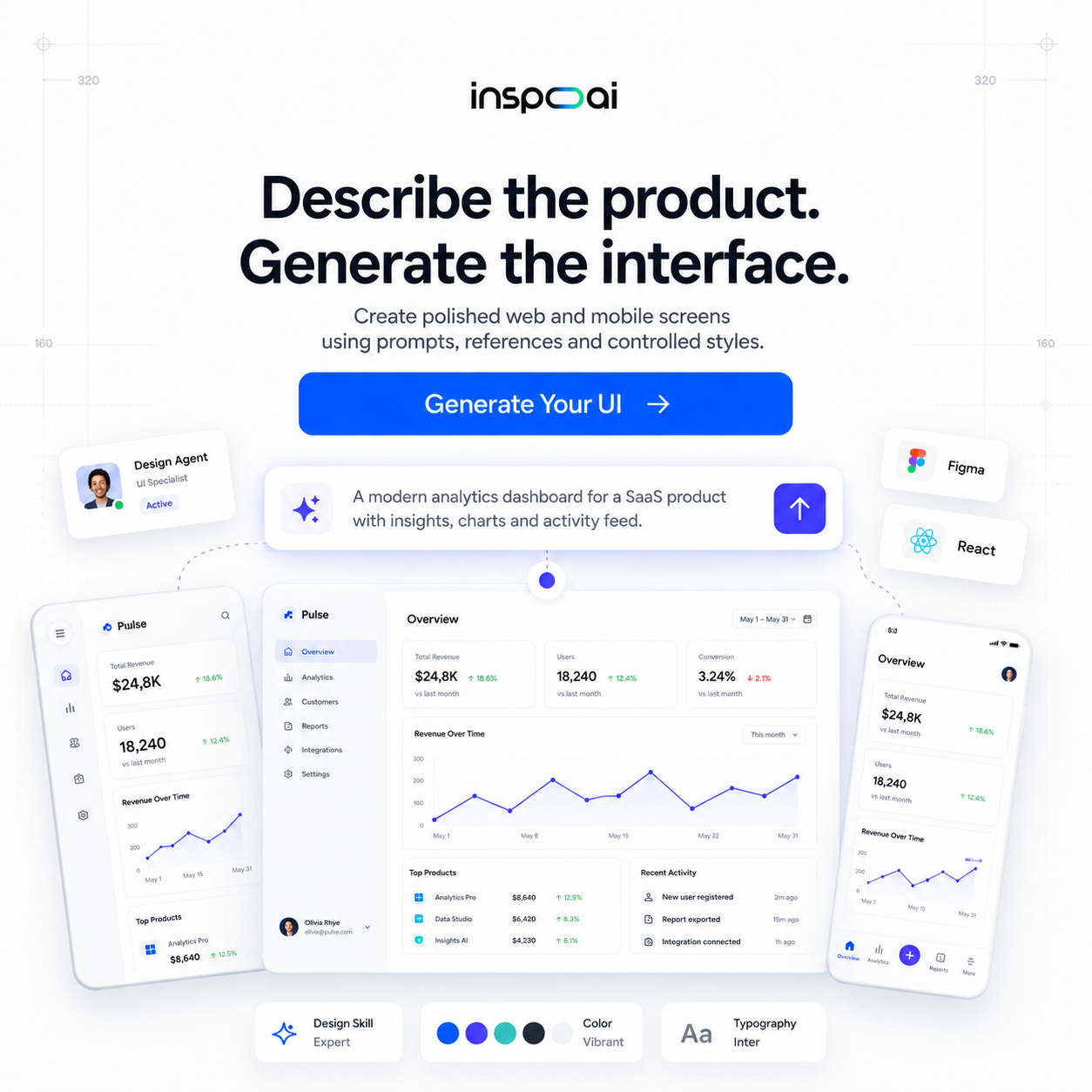
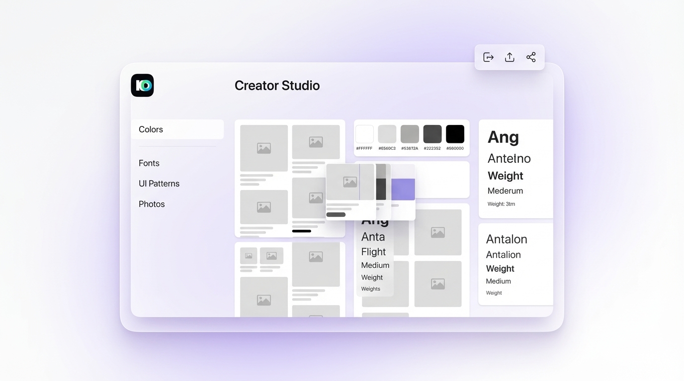 Inspo AI Creator Studio UI">
How Can AI Tools Help with E-Commerce UI Inspiration?
AI tools change e-commerce UI inspiration in three specific ways: search speed, visual coherence, and insight generation.
Search speed is the most immediate benefit. Instead of manually browsing five different galleries to find checkout flow examples with a specific visual quality, designers can query an AI design search engine and get targeted results in seconds. This is the core capability of Inspo AI, which uses AI to understand the visual and functional intent behind a search query and return curated, relevant references matched to the design brief.
Visual coherence is where AI assistance creates a meaningful quality improvement over manual curation. When a designer manually assembles a moodboard from multiple sources, the references often carry inconsistent visual DNA: different photography styles, conflicting type treatments, and mismatched color temperatures. An AI-powered tool surfaces references that share underlying aesthetic characteristics, producing tighter and more persuasive moodboards. This coherence is what separates a professional e-commerce direction board from a disjointed inspiration dump.
Insight generation is the emerging frontier. AI design tools can now analyze an existing e-commerce interface, identify the design patterns it uses, and suggest improvements or alternative directions. Inspo AI's brand scanner and design audit features let designers analyze competitor storefronts and extract the underlying design decisions at work, turning competitive research into actionable direction.
For e-commerce UI specifically, the combination of AI search, moodboard building, and design audit creates a complete research-to-direction workflow that used to take a full day and now takes under two hours. The time saved goes directly into higher-quality execution and more iterations before the design goes live.
Conclusion
E-commerce UI design is a discipline where good inspiration, well-organized and correctly applied, translates directly into better conversions and stronger brand experiences. The challenge has never been a shortage of inspiration. It has been the time cost of finding the right references, organizing them into a coherent direction, and translating that direction into specific decisions about product pages, category layouts, and checkout flows.
The resources and workflows in this guide cut that time down significantly. Start with live site galleries for research-grounded references. Layer in curated design communities for aesthetic range. Apply the 2026 trend framework to sharpen your direction. Use structured, zone-based moodboarding to translate inspiration into a specific product page and checkout flow vision.
AI tools compress the entire research and curation phase into a fraction of the traditional time. If you want to go from brief to compelling e-commerce design direction faster than your competitors, Inspo AI gives you the AI design search, moodboard builder, brand scanner, and creator studio to make it happen.
Start exploring at inspoai.io