Learn how to filter design inspiration by color, font, and industry to find exactly the references you need. This guide covers best practices for targeted design research using AI-powered filter tools.
TLDR
- Filtering design inspiration by specific attributes like color, typography, and industry reduces research time and increases reference relevance dramatically
- Color-first search helps designers validate palette choices with real-world visual precedent before committing to a direction
- Font filtering narrows the typographic reference pool to styles that are actually achievable in the project context
- Industry filters surface references from the specific competitive and user context that matters for the project
- Inspo AI supports multi-dimensional filtering across its 150,000+ asset library so designers find exactly what they need without manual sorting
Introduction
Design research without filters is expensive. Open the wrong platform, type a generic query, and you spend twenty minutes evaluating results that have nothing to do with your project parameters. The problem is not that inspiration resources are low quality. It is that broad searches return broadly useless results when you have a specific visual problem to solve.
Filtering changes the economics of design research entirely. When you can specify that you need fintech interfaces that use a warm earth-tone palette with serif typography, you skip directly to the relevant reference pool. No evaluation overhead, no context-switching between results, no wasted time on beautiful work that simply does not apply to your project.
This guide covers the three most powerful filter dimensions for design inspiration: color, font, and industry. It explains how each filter works in practice, when to use it, and how to combine filters for maximum precision.
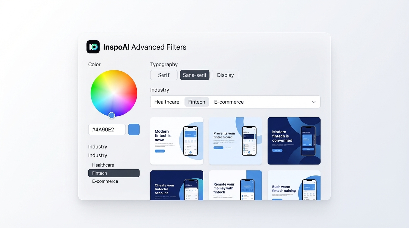
Why does filtering by color matter in design research?
Color is one of the fastest ways to establish visual alignment between a reference and a project. When a client brief specifies a brand color or when a design system already has an established palette, filtering by that color immediately narrows the reference pool to work that operates in the same visual space.
The psychology behind color-filtered research is straightforward. Seeing how other designers handle the same hue in different compositional contexts gives you a range of treatment options you would not generate from a description alone. The difference between a navy blue used as a background versus as an accent versus as a typographic color becomes instantly visible across a filtered reference set.
Color tools like Coolors and Figma's color picker are standard in the palette generation step of a project. But neither platform connects color selection to real-world design examples that use that palette in context. That connection is what color-filtered design search provides.
Practically, color filtering is most valuable during two project phases: early concept development, when you are testing whether a palette direction feels achievable, and refinement, when you need to see how specific color proportions work across interface elements. In both phases, color-filtered references reduce the number of iteration cycles needed to arrive at a confident visual direction.
How does typography filtering improve design inspiration results?
Typography filtering surfaces references that use specific type styles, weights, or classifications in a production context. This is fundamentally different from browsing type specimen galleries, which show fonts in ideal conditions rather than real interface constraints.
Designers typically need typographic inspiration in one of two scenarios. First, when they have a font already chosen and want to see how other designers handle hierarchy, spacing, and weight contrast with that classification of type. Second, when they are selecting a font and want to see how different type styles perform in comparable product contexts before committing.
Font filtering by classification (serif, sans-serif, monospace, display) is the most practical starting point for most projects. An interface that needs to feel modern and technical references a different set of typographic precedents than one targeting a luxury brand audience. Industry-specific typography research reveals that certain type conventions carry meaning that users recognize intuitively, and deviating from those conventions requires deliberate visual compensation elsewhere.
According to the UI Design Typography Fundamentals guide, the relationship between font choice and perceived brand personality is well-established. Typography filtering lets designers research that relationship empirically rather than relying on intuition alone.
What is industry-specific design inspiration and why does it matter?
Industry-specific inspiration means references from the same product category, user base, or regulatory context as the project you are designing. A healthcare app design needs to reference healthcare interfaces. A fintech dashboard needs fintech precedents. Generic "best UI design" inspiration creates work that looks polished in isolation but feels wrong in its actual market context.
The reason industry-filtering matters is user expectation. People who use healthcare apps have a mental model of what healthcare digital products look like. Navigation patterns, data density, color associations (green for health, red for alerts), and typographic density all carry category-specific meaning that users have learned from repeated exposure. Designing against those conventions requires exceptional craft to succeed and risks user disorientation if executed poorly.
Industry filtering also informs accessibility and compliance conventions that are category-specific. Financial interfaces have different contrast and text size conventions than gaming interfaces. Medical device UIs follow different interaction pattern standards than consumer social apps. References filtered by industry naturally reflect these conventions, which makes them more practically useful than generic high-quality design references.
How do you combine color, font, and industry filters effectively?
Multi-dimensional filtering produces the most precise reference sets. The key is knowing which filter to apply first based on the project constraints.
Start with the most constrained dimension. If the brand has an established color system, start with the color filter because that narrows the field most aggressively. If the industry context is highly specific (medical devices, for example), start with the industry filter. If typography is the open creative question, start there.
Add filters progressively. Do not combine all three filters simultaneously on the first query. Start with one, review the results, then add the second filter to refine. This progressive approach lets you see how each filter dimension affects the result set and avoids over-constraining to the point where you get too few results to be useful.
Use filters to challenge assumptions. If your initial concept uses a specific color palette, search for high-quality work in a competing color direction to test whether your first instinct is the strongest choice. Filters let you run comparative research efficiently.
Cross-industry filter exploration. After filtering by your primary industry, run the same color and font filters against an adjacent industry. A fintech designer who filters for their palette in hospitality interfaces often discovers compositional approaches and spatial compositions that bring freshness to an otherwise category-typical result.
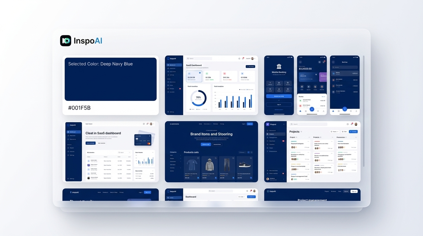
What color-based search features do professional designers actually use?
Professional designers use color-based search in three specific scenarios.
Palette validation. Before presenting a color direction to a client, designers search for real-world examples of that palette in use. Showing a client a real interface rather than abstract color swatches significantly increases buy-in. References with a similar palette show the palette "working" in a professional context.
Competitive color auditing. Before a brand enters a new market or launches a redesign, color-filtering the competitive set reveals which color positions competitors occupy. This is strategic information. Entering a market where three major competitors use deep navy blue may be a reason to differentiate with a different palette direction.
Accessibility research. Color filters let designers find examples of interfaces that achieve WCAG compliance within a specific palette range. This is more instructive than reading accessibility guidelines in isolation, because it shows how real designers solve the legibility challenges of particular color combinations.
Inspo AI supports color-based search as part of its multi-dimensional filter system, letting designers specify a dominant hue and receive curated interface references that match, drawn from its 150,000+ curated library.
How do you find industry-specific design inspiration for niche markets?
Niche market design research presents a specific challenge: there may be few directly comparable products to reference. The answer is to expand the reference industry in deliberate, controlled ways.
First degree adjacency. For a niche market, identify the broader parent category. A livestock management SaaS references agricultural technology more broadly. A litigation support platform references legal tech as a category. First-degree adjacency surfaces the category conventions that users of your niche product likely recognize from adjacent tools.
User activity adjacency. Consider what else your target users use regularly. Enterprise HR platform users also use corporate banking portals and professional productivity tools. Referencing those categories reveals the visual and interaction language those users are fluent in.
Aspiration adjacency. Consider what your target users aspire to in their own lives or work. Luxury consumers who use a high-end services marketplace may respond to editorial design references from fashion or architecture, even though those are not direct product competitors.
Industry filtering tools that allow sub-category specification within a broad vertical make this process systematic rather than intuitive. The result is a reference set that is both relevant and distinctive rather than a carbon copy of the nearest competitor.
How should design teams use filtered inspiration searches collaboratively?
Filtered design research compounds in value when teams use it consistently rather than individually.
Shared filter presets. Define and save the filter combination that matches your project's constraints: industry, dominant color range, type style. Share these presets with the full design team so every team member's research starts from the same parameters. This creates reference pool convergence without requiring a research synchronization meeting.
Filter-based design critiques. When reviewing work in progress, use industry and color filters to pull real-world references that challenge the current direction. "Here are five comparable interfaces that solve this problem differently" is a more productive critique than "I think this should feel different."
Brief-to-filter translation. Train your team to translate creative brief language directly into filter parameters. "Premium, warm, professional" maps to specific color ranges and typographic styles. Converting brief language to filter parameters makes the brief actionable immediately rather than interpretable in infinite subjective ways.
Inspo AI supports team workflows with shared moodboards so filtered research results are immediately available to the full team, eliminating duplicate research across designers working on the same project.
Conclusion
Filtering design inspiration by color, font, and industry transforms research from a broad, time-consuming browse into a precise, efficient process. Color filters validate palette choices with real visual precedent. Typography filters surface type-in-context examples rather than idealized specimens. Industry filters ensure that every reference lives in the same user expectation space as your project.
Combined, these filters make design research dramatically faster and the references it surfaces dramatically more relevant. For teams managing multiple concurrent projects, the efficiency gain compounds: filtered research that would have taken two hours of manual browsing across platforms takes minutes with the right tool.
Inspo AI provides exactly this multi-dimensional filter capability, backed by a library of 150,000+ curated design assets. Free plan available with 15 searches daily. Solo plan starts at $12/month. Team plan at $39/month for collaborative research workflows.