Stop wasting hours scrolling Pinterest for UI ideas. This guide covers the fastest, most effective ways to find UI inspiration in 2025, including AI-powered tools, curated platforms, and systems for building your own personal design library.
TLDR
Pinterest is built for mood boards, not UI research. Its algorithm surfaces what gets clicks, not what is actually well-designed. Faster, more targeted alternatives exist: Mobbin, Screenlane, Figma Community, and AI-powered tools like Inspo AI give you searchable, categorized, and contextually relevant UI references in minutes rather than hours. Build a personal inspiration library using tagged screenshots and a lightweight folder system, and you will cut your research time by at least half.
Table of Contents
- Why Pinterest Falls Short for UI Research
- What Are the Best Websites for UI Inspiration?
- How Do AI Tools Help Designers Find Inspiration Faster?
- What Is the Best Way to Search for UI Patterns?
- How Do You Build a Personal Inspiration Library?
- What Is the Difference Between UI Inspiration and UX Research?
- How Often Should Designers Refresh Their Inspiration Sources?
- Conclusion
Introduction
Every designer hits the same wall. You open a blank Figma file, your mind goes quiet, and you instinctively reach for Pinterest. Forty-five minutes later, you have 200 saved pins and still no clear direction for your onboarding flow.
This is not a creativity problem. It is a tooling problem.
Pinterest was built for home decor, recipes, and wedding planning. Its algorithm rewards engagement, not design quality. For UI designers who need to find ui inspiration fast, the platform creates noise instead of signal. The good news: a new generation of purpose-built inspiration tools has arrived, and several of them use AI to cut research time from hours to minutes. This guide covers exactly what to use, how to search effectively, and how to turn scattered references into a reusable personal library that compounds over time.
Why Pinterest Falls Short for UI Research
Pinterest is a social content platform at its core. When you search "onboarding screen UI," its algorithm surfaces posts with the most saves and repins, not the most usable, well-designed examples. This creates a feedback loop where popular beats good, and the same recycled screenshots circulate endlessly.
Several specific problems make Pinterest a poor fit for professional UI research:
No category depth. Searching "mobile app UI" returns a sea of mixed results: marketing posters, app store screenshots, random mockups, and actual interface designs, all jumbled together. There is no way to filter by component type, industry vertical, or interaction pattern.
No source context. A pinned screenshot rarely includes the product name, the design rationale, or a link to the live product. You see the surface, but not the thinking behind it.
Outdated content. Pinterest has no mechanism for surfacing only recent work. A 2018 iOS 11 screenshot sits beside a 2025 Material 3 implementation with no distinction.
The rabbit hole effect. Pinterest is engineered to maximize time on platform. Its infinite scroll and "related pins" system are optimized to keep you browsing, not to help you reach a decision faster.
Designers who track their workflows often report spending 30 to 60 minutes on Pinterest before finding anything actionable. For studios billing hourly or individual contributors working against sprint deadlines, that time cost is significant. Creative Boom documented this frustration in a 2025 roundup of Pinterest alternatives, noting that many designers actively seek platforms with more editorial curation and less algorithmic noise.
What Are the Best Websites for UI Inspiration?
Several platforms exist specifically for UI and product design inspiration, each with a different strength:
Mobbin is the gold standard for mobile UI research. Its library contains thousands of screens from real iOS and Android apps, organized by screen type (onboarding, empty states, checkout), interaction pattern, and app category. You can search for "subscription paywall" and get 80+ actual examples from live products within seconds.
Screenlane focuses on web UI and is especially strong for SaaS products. It curates examples by element type, including navbars, pricing pages, and dashboard layouts.
Figma Community provides editable design files, not just screenshots. When you need to understand how a component is built, not just how it looks, Figma Community gives you the file to inspect. Streamline Blog identifies it as the top resource for hands-on UI system references.
Dribbble remains useful for visual aesthetics and micro-interactions, but like Pinterest, its algorithm leans toward popular over practical. Use it for trend awareness, not systematic research.
Lookup.design curates design details by component with clean navigation and no social noise.
The key difference between these platforms and Pinterest is intent. They are built for designers searching with purpose, not for general consumers saving things they find pretty.
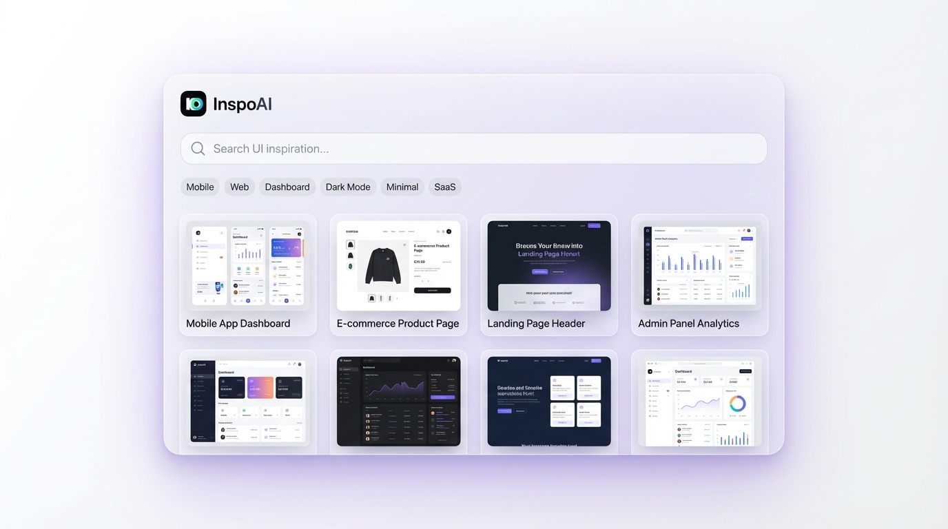 AI Design Search Interface">
How Do AI Tools Help Designers Find Inspiration Faster?
AI changes the inspiration search game in two concrete ways: semantic search and intelligent curation.
Traditional inspiration platforms require exact keyword matches. Type "settings page" and you get settings pages. Type "account management" and you might get nothing relevant, even if thousands of settings examples exist in the database.
AI-powered tools understand intent. They can surface "settings" results when you type "account preferences" or "user configuration," because the model understands conceptual similarity rather than relying on tag matching.
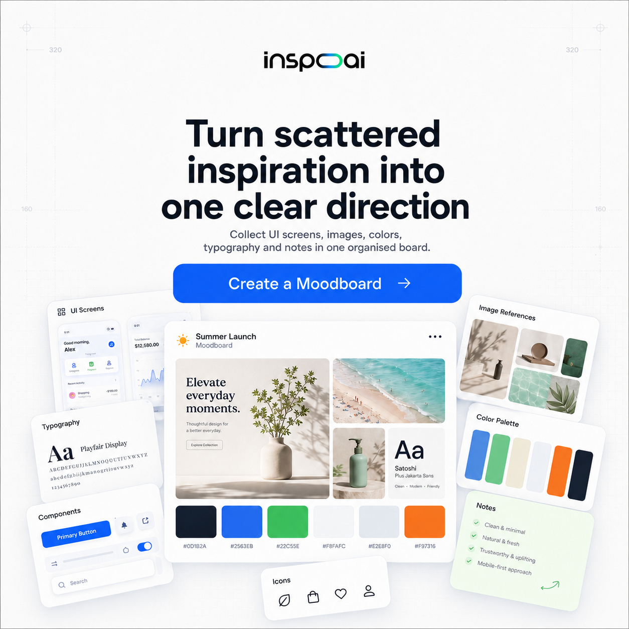
Inspo AI takes this further with a design search engine that understands visual and conceptual context simultaneously. Instead of typing keywords and scrolling, you describe what you need and the AI surfaces relevant examples from a library of 150,000+ design assets. It also includes a Brand Scanner that analyzes any website or app and extracts its visual language, giving you a structured reference you can actually use rather than a cluttered mood board.
Beyond search, AI tools support inspiration work in other ways:
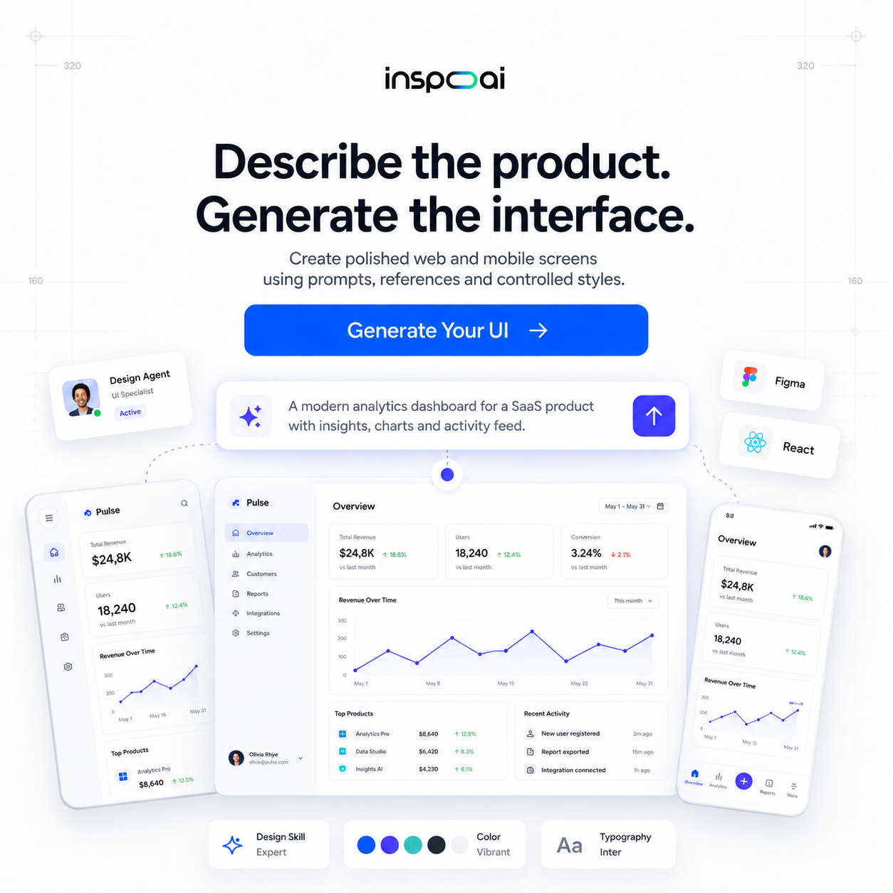
- Automated moodboard generation: Describe a product or aesthetic and get a structured visual collection in seconds.
- Design audit features: Upload your own work and get a comparison against best practices, showing where your UI diverges from patterns that work.
- Style extraction: Analyze competitor products and extract their color palette, typography hierarchy, and spacing system automatically.
For designers who bill by the hour or work within sprint cycles, cutting the inspiration phase from 45 minutes to 10 minutes compounds into significant time savings across a project.
What Is the Best Way to Search for UI Patterns?
Effective UI pattern research requires specificity. Most designers search too broadly and then complain that the results are not useful.
A better search framework uses three layers:
1. Component + state: Instead of "login screen," search "login form with error state" or "login screen with social auth options." The more specific the component and its state, the more immediately usable the results.
2. Industry vertical: A fintech dashboard has different conventions than a fitness app dashboard. Filtering by industry before looking at layouts saves you from collecting inspiration that technically looks good but does not fit your users' expectations.
3. Platform + OS version: Mobile patterns differ significantly between iOS and Android, and between OS versions. On Mobbin, you can filter by platform to ensure your references reflect current conventions.
The r/graphic_design community on Reddit highlights a common frustration: algorithm-driven platforms like Dribbble and Behance promote work that performs socially, not work that is actually practical. Curated platforms and AI search tools that let you direct the query bypass this problem entirely.
For pattern-specific research, bookmarking UI-pattern libraries (UIPatterns.com, pttrns.com) alongside your primary inspiration tool gives you the "what" and the "why" together. Pattern libraries explain the interaction logic; inspiration tools show you the visual execution. Use both.
How Do You Build a Personal Inspiration Library?
A personal inspiration library is a curated collection of design references you can access quickly, organized in a way that matches how you actually think when starting a project.
The simplest effective system has three components:
A capture tool. Browser extensions like Eagle App, Raindrop.io, or the native screenshot function on your OS let you save examples immediately without context-switching. The goal is to make saving frictionless. If it takes more than two clicks to capture something, you will not do it consistently.
A tagging taxonomy. Create a small, fixed set of tags that reflect the types of decisions you frequently make: onboarding, empty-state, pricing, navigation, dashboard, dark-mode, mobile, web. Resist the urge to create too many tags. Five to ten categories work better than fifty because you will actually use them.
A review ritual. Schedule a 15-minute weekly review of your saved items. Delete anything that does not hold up on reflection and add any missing tags. This keeps the library clean and ensures it stays useful rather than becoming a digital junk drawer.
Tools like Eagle App let you build local libraries with visual grids, while Notion and Airtable work well for teams who need a shared, searchable reference system.
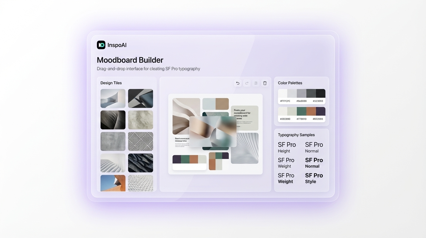
Inspo AI's Moodboard Builder adds a structured layer on top of this by letting you group saved assets into project-specific boards with color and typography metadata automatically extracted. For designers managing multiple concurrent projects, this eliminates the friction of rebuilding context every time you return to a project file.
What Is the Difference Between UI Inspiration and UX Research?
These two activities serve different purposes and require different sources. Conflating them is one of the most common mistakes junior designers make.
UI inspiration is visual. You are looking for color palettes, typography hierarchies, layout patterns, component styles, and micro-interaction ideas. The question you are answering is: how should this look and feel?
UX research is behavioral. You are studying how real users think, what they expect, where they struggle, and what mental models they bring to a product. The question you are answering is: how should this work?
UI inspiration informs design decisions. UX research validates them.
The confusion arises because many designers treat competitive UI screenshots as a substitute for user research. Seeing that five other fintech apps use a bottom navigation bar does not mean bottom navigation is the right pattern for your users. It means it is a common convention, which is useful context but not a substitute for testing.
Good research practice uses both: UI inspiration to identify the design space and generate hypotheses, then UX research (user interviews, usability testing, analytics review) to test those hypotheses against real behavior.
For inspiration specifically, purpose-built platforms serve you better than Pinterest precisely because they are organized around design intent. When you save a card from Mobbin, you know it comes from a real product that real users interact with, which gives it more informational weight than a screenshot that went viral on Pinterest for aesthetic reasons alone.
How Often Should Designers Refresh Their Inspiration Sources?
Design moves fast. An inspiration library built entirely in 2022 reflects conventions from a different era. iOS 18 introduced significant visual changes. Material You redesigned the Android vocabulary. SaaS product design shifted from dark, dense dashboards to clean, whitespace-heavy interfaces. If your reference library does not reflect current patterns, your designs will feel dated before you ship them.
A practical refresh cadence:
Weekly: Scan one curated platform (Screenlane, Mobbin, or Lookup.design) for 10 to 15 minutes. Save three to five examples that surprise you or show something you have not seen before.
Monthly: Do a focused search on a component type relevant to your current project. Look for examples from the past six months specifically.
Quarterly: Audit your saved library. Delete anything that feels outdated. Add new categories if your project work has shifted into new domains.
Annually: Review the tools themselves. New platforms emerge regularly. The Lummi Blog's 2026 roundup of Pinterest alternatives is an example of how the landscape of inspiration tools evolves year over year.
Subscribing to a design newsletter (Dense Discovery, Sidebar.io, or the Figma community digest) supplements your active search with passive exposure to new work. Passive exposure is where serendipitous ideas come from; active search is where you find solutions to specific problems. You need both.
Conclusion
Pinterest is a starting point, not a professional research tool. For designers who need to find ui inspiration fast, purpose-built platforms and AI-powered search tools dramatically reduce the time between "blank canvas" and "clear direction."
The most effective approach combines three habits: use component-specific platforms like Mobbin and Screenlane for targeted UI pattern research, use an AI search tool to surface semantically relevant references beyond exact keyword matches, and maintain a personal library with a simple tagging system that makes past research reusable.
Try Inspo AI for free at inspoai.io and get access to 150,000+ design assets, AI search, a Moodboard Builder, Brand Scanner, and 17 free design tools, all in one place. Your next project starts faster when your inspiration system works.