TLDR: A design audit is a structured review of a product's visual and interface design elements, used to identify inconsistencies, outdated patterns, and gaps in design system coverage. This guide covers the definition of a design audit, when and why to run one, the step-by-step process, the tools teams rely on, the most common findings, and how AI is accelerating the entire workflow. It also clarifies the key difference between a design audit and a UX audit.
Introduction
Every product accumulates design debt. Button styles diverge across screens. Color values drift away from the original brand palette. Spacing becomes inconsistent between components built by different designers over different quarters. Individually, these issues feel minor. Over time, they compound into a product that looks fragmented, costs more to maintain, and creates subtle confusion for users.
A design audit is the tool that addresses this. It gives design teams a full, documented picture of what they have built, how consistent it is, and where improvements are needed most. Whether you are a solo designer trying to bring order to a growing interface, a team preparing for a rebrand, or a design lead making the case for a design system, a design audit is one of the highest-leverage activities in your toolkit.

This guide covers everything: the definition, the right moments to run one, the process, the tools, common findings, and how AI platforms like Inspo AI are transforming how quickly audits get done.
1. What is a design audit?
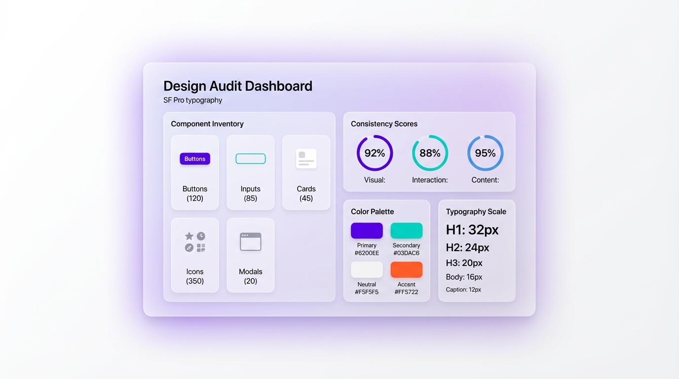
A design audit is a comprehensive evaluation of a product's existing design elements, measuring how consistently visual patterns, components, and styles are applied across the entire interface. The goal is not only to identify problems; it is to create a clear, documented inventory of what exists so that decisions about what to keep, fix, or remove are grounded in evidence rather than intuition.
A thorough design audit typically covers the following dimensions:
- Visual consistency: Do colors, typography, spacing, and iconography follow a coherent system across all screens and states?
- Component inventory: What UI components exist in the product, and are they being used correctly and consistently?
- Brand alignment: Does the interface accurately reflect the current brand guidelines, including post-rebrand updates?
- Accessibility compliance: Do elements like color contrast ratios and touch target sizes meet WCAG 2.1 AA standards?
- Design system coverage: Which parts of the product are governed by a formal design system, and which have been built ad hoc?
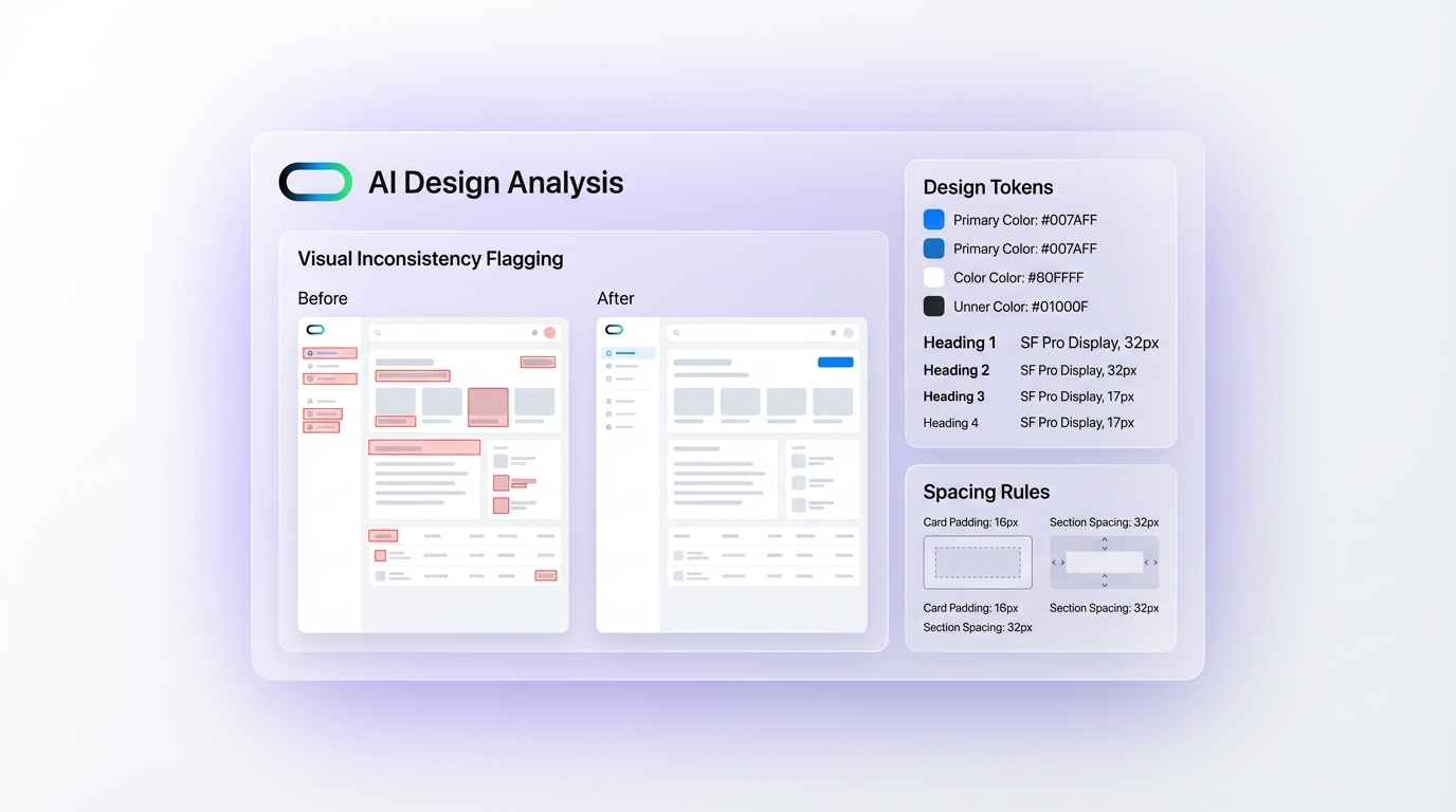
The output of a design audit is typically a detailed report or structured spreadsheet cataloguing findings, usually accompanied by annotated screenshots showing specific issues in context. According to the Nielsen Norman Group, design audits are most effective when clear criteria are defined upfront, so reviewers are evaluating against a consistent benchmark rather than personal preference (NN/g, 2022).
Design audits differ from heuristic evaluations in that they focus on visual and systemic design coherence rather than behavioral usability. They form a critical foundation for any design system initiative or major product redesign.
2. When should you run a design audit?
Knowing when to run a design audit is as important as knowing how. Several situations signal that it is time.
Before a redesign. If you are about to overhaul a product, an audit tells you what to carry forward and what to discard. Starting a redesign without auditing what exists is like renovating a building without knowing which walls are structural.
After rapid growth. Fast-moving teams accumulate visual debt quickly. When a product has scaled across multiple features built by different designers over time, the interface usually shows it. An audit resets the baseline and gives the whole team shared visibility.
When onboarding a new design team. New designers need context. An audit creates shared documentation of what currently exists so the team does not inadvertently duplicate or contradict established patterns.
Before building or expanding a design system. Design systems are far more effective when built from existing, working patterns rather than invented from scratch. An audit surfaces which components are already doing the job well and which need formalization.
When performance or conversion metrics drop. Visual inconsistency can correlate with user confusion. If users are dropping off specific flows or support volume around a UI area is rising, an audit can help diagnose whether design incoherence is a contributing factor.
According to a report by Figma, design teams that conduct regular audits spend significantly less time on rework and cross-team misalignment (Figma, 2023). The signal is clear: audits pay back their time investment.
3. Why is a design audit important for product teams?
Design audits deliver value across several dimensions that go well beyond surface-level visual cleanup.
They reduce developer handoff friction. When designers and developers are working from a patchwork of undocumented components and ad hoc styles, handoff becomes slow and error-prone. An audit creates the documentation foundation that makes handoff faster and more reliable.
They improve user experience quality. Inconsistent interfaces create cognitive friction. Users adapt to the patterns they encounter early in a product and are disoriented when those patterns break down in later screens. A design audit identifies these breaks before they erode trust.
They surface accessibility issues early. Audits frequently uncover accessibility failures, including low contrast ratios, missing focus states, and touch targets that are too small, that might otherwise remain invisible until a formal accessibility review or a user complaint.
They create cross-functional alignment. Product managers, engineers, and designers often hold different mental models of what the product looks like at any given time. A documented audit creates a shared source of truth across the organization.
They build the case for design system investment. It can be difficult to justify the time required to build a design system to stakeholders who do not feel the daily pain of visual inconsistency. An audit with concrete data, such as 47 distinct button variants or 12 shades of grey used across the interface, makes the argument far more persuasively than any abstract pitch.
For design leaders, maintaining a regular audit cadence is one of the clearest indicators of a mature, scalable design practice.
4. What is the step-by-step process for running a design audit?
Running a design audit without a structured approach quickly becomes overwhelming. This seven-step framework keeps it manageable.
Step 1: Define scope and criteria. Decide what you are auditing: the full product, a specific user flow, or a particular component category. Define what "correct" looks like by referencing your brand guidelines or existing design system documentation before you start.
Step 2: Take a full inventory. Screenshot every relevant screen, state, and component in scope. Organize captures by category: navigation, forms, modals, cards, buttons, typography, icons, and so on.
Step 3: Evaluate against your criteria. Work through the inventory and flag anything that deviates from established standards. Log findings in a spreadsheet or dedicated tool with severity ratings: critical, moderate, or low.
Step 4: Identify patterns in findings. Look for systemic problems rather than isolated ones. If you find 30 button variants, that is a system failure, not 30 individual bugs. Grouping findings around root causes is what transforms a list of issues into actionable insight.
Step 5: Prioritize remediation. Not everything needs to be fixed at the same time. Prioritize by user impact, frequency of appearance in the interface, and effort required. High-impact, low-effort fixes go first.
Step 6: Document and present. Create a report that non-design stakeholders can understand. Annotated screenshots showing the problem in context are far more persuasive than abstract descriptions in a slide deck.
Step 7: Define the path forward. An audit without a remediation plan is just a catalogued list of problems. Assign owners, set realistic timelines, and define success criteria for each category of finding.
5. What tools do you use for a design audit?
The right toolset makes a design audit significantly faster and more thorough. Tools typically span several categories.
Design file review. Figma is the standard environment for inventorying components and reviewing design files. Plugins like Design Lint and Figma's native variable inspection tools help surface inconsistencies at scale (Figma, 2024).
Screenshot and annotation. Tools like Zeplin, Notion, or a structured Figma file work well for capturing and annotating live-product screenshots alongside findings.
Accessibility checking. The WebAIM Contrast Checker, browser plugins like Axe, and Figma plugins such as the A11y color contrast checker are essential for auditing the accessibility dimension.
AI-powered design tools. This is where the category is evolving most rapidly. Inspo AI's Design Audit feature allows teams to systematically review visual patterns, flag inconsistencies, and map existing UI elements against brand standards without manually combing through every screen. AI tools identify pattern deviations across large inventories in minutes rather than hours, dramatically compressing the audit timeline.
Tracking and documentation. Google Sheets, Airtable, or Linear work well for logging findings with severity ratings, owners, and remediation status.
The most effective audits combine automated detection for efficiency with human judgment for context and prioritization. AI tools handle the former; skilled designers handle the latter.
6. What are the most common findings in a design audit?
Teams running their first design audit are often surprised by the volume and variety of what they discover. These are the findings that appear most frequently.
Color drift. Products that have evolved over time almost always have more color values in use than intended. A brand palette of six colors becomes fourteen or twenty when designers approximate colors without referencing a token library.
Typography inconsistency. Font sizes, weights, line heights, and letter spacing often vary in ways that were never intentional. Heading hierarchies become unclear, and body text styles multiply across components.
Inconsistent spacing. Padding and margins that should follow a grid or spacing scale drift across components over time, making the interface feel uneven in ways that users notice even if they cannot articulate why.
Orphaned components. Components built for a specific feature that was never finalized and never made it into the design system, now used inconsistently in a few places and abandoned in others.
Accessibility failures. Low color contrast ratios are the most common, particularly when light brand colors are applied to text or interactive elements. Missing focus states and inadequate touch target sizes are also frequently flagged.
Icon inconsistency. Mixed icon libraries, inconsistent sizes, and varying stroke weights across different sections of the product are a near-universal finding in audits of products older than two years.
Outdated brand elements. After a rebrand, old logo lockups, superseded typefaces, or previous-generation color values often persist in corners of the product that did not get fully updated.
Most teams find that the scope of issues is larger than expected, which reinforces the case for treating audits as a recurring practice rather than a one-time exercise.
7. What is the difference between a design audit and a UX audit?
The terms are often used interchangeably, but they evaluate different dimensions of a product and typically require different skills to run.
A design audit focuses on visual consistency, brand alignment, component usage, and design system compliance. The central question is: does the product look and feel coherent? Criteria are primarily visual and systemic. The output is a component inventory, a findings log, and a remediation plan organized around visual categories.
A UX audit focuses on usability, user flows, information architecture, and the behavioral quality of the experience. The central question is: can users accomplish their goals effectively and without unnecessary friction? Criteria reference usability heuristics, such as Nielsen's 10 Heuristics, as well as user research findings and behavioral data like analytics and session recordings.
The two are complementary. A product can be visually inconsistent but still navigable (a design audit problem), or visually polished but confusing to use (a UX audit problem). The most thorough product reviews incorporate both.
In practice, design audits are typically run by visual designers and design system leads, while UX audits are led by UX researchers or UX designers with a research background. Their timelines, methodologies, and deliverables differ accordingly.
If you are trying to improve a product holistically, running both audits together or sequentially gives the most complete picture of where the experience breaks down and why.
Conclusion: Make Your Audit Count
A design audit is one of the highest-leverage investments a design team can make. It surfaces the gap between what was intended and what was built, creates shared documentation across teams, and provides a clear foundation for better decisions about design systems, rebrands, and product improvements.
The process is straightforward: define your scope and criteria, take a full inventory, evaluate against standards, identify patterns, prioritize remediation, document findings, and define the path forward. The right tools, from Figma plugins to AI-powered platforms, make the process faster and more thorough than ever before.
If your product has been growing for more than a year without a formal design review, the inconsistencies are almost certainly there. An audit makes them visible, so you can actually fix them.
Ready to run a faster, smarter design audit? Explore Inspo AI's Design Audit feature and the full suite of AI-powered design tools at inspoai.io.