
TLDR Competitor UI research reveals how rival products look, behave, and guide users, giving your team a concrete benchmark for design decisions. Traditional manual audits take days. AI-assisted research compresses that timeline to under 30 minutes by automating pattern recognition, color extraction, typography analysis, and UX flow mapping. This guide walks you through a structured 30-minute process, explains what to look for in any competitor interface, and covers the tools (including AI-first platforms like Inspo AI) that make it fast and actionable.
Introduction
If your product team is making design decisions based purely on gut feel, you're leaving competitive intelligence on the table. The interfaces your competitors ship are a direct signal of what their design teams believe users respond to, what conversion patterns they're testing, and where they think the market is heading.
Competitor UI research is the disciplined practice of studying those interfaces to extract strategic insight. For years it was a slow, manual process: open tabs, take screenshots, annotate PDFs, share Figma boards. It worked, but it didn't scale.
AI has changed that equation entirely. With the right tools and a focused workflow, a designer or product manager can complete a thorough competitor UI audit in 30 minutes or less. Here's exactly how to do it.
What Is Competitor UI Research and Why Does It Matter?
Competitor UI research is the systematic analysis of how rival products design their user interfaces, including layout, visual hierarchy, navigation patterns, typography, color systems, interactive components, and overall user experience flow.
It matters for several reasons. First, it prevents you from designing in a vacuum. When you understand how two or three competitors are solving the same UX problem, you can make informed decisions about whether to follow convention (which reduces user learning curves) or deliberately break from it (which can create a memorable, differentiated experience).
Second, competitor UI research is one of the fastest ways to identify gaps. If every competitor uses a dense data table for a particular feature but users consistently complain about it in reviews, that's a whitespace opportunity. Third, it keeps your design system calibrated to current industry standards. What was considered premium UI in 2021 (heavy gradients, neumorphism) may now signal an outdated product.
According to a 2024 Nielsen Norman Group report, design teams that conduct regular competitive analysis ship features with 23% fewer usability issues in early testing, because known friction patterns are identified and avoided before implementation. Competitor UI research is not a nice-to-have. It is a core part of a responsible design process.
What Should You Look for When Analyzing a Competitor Interface?
Effective competitor UI research goes beyond noting whether a site looks good. You are looking for decisions, not aesthetics.
Visual hierarchy and layout systems. How does the competitor organize information? Do they use a card-based grid, editorial-style long-form layouts, or dense dashboards? Layout choices reveal assumptions about how users consume information.
Navigation patterns. Is the primary navigation top-bar, sidebar, or bottom-tab? How many levels deep does the IA go before the user reaches a core action? Navigation depth is a direct signal of product complexity.
Color and typography systems. Competitors in your space tend to converge around certain color signals (fintech skews navy and white; health tech skews green and neutral). Understanding the category visual language helps you decide whether to fit in or stand out deliberately.
Calls to action. Count the CTAs on the homepage. Analyze the button copy. "Get started free" vs. "Start your trial" vs. "See a demo" are not interchangeable choices; each one reflects a different conversion hypothesis.
Onboarding and empty states. The first-time user experience is often where the most differentiated (and most revealing) UI decisions live.
Micro-interactions and motion. Does the product feel alive or static? Subtle animations signal engineering investment and product maturity.
Cataloging these across three to five competitors gives you a design benchmark that is grounded in real market data rather than assumption.
How Does Traditional Manual Competitor UI Research Work?
The classic manual process follows a predictable pattern. A researcher or designer identifies three to five competitors, then systematically visits each product, captures screenshots, and organizes findings into a shared document or Figma file.
Each competitor typically gets its own audit sheet covering homepage, pricing page, core feature screens, and onboarding flow. Annotations are added by hand. Color palettes are sampled manually using browser devtools or a color picker extension. Typography is identified through font inspection tools. Navigation structures are mapped as simple IA diagrams.
The final deliverable is usually a competitive landscape slide deck or a shared Figma board that the broader team can review.
The process works. The problem is time. A thorough manual audit of five competitors across ten screens each, with annotations, can take anywhere from one to three full working days. By the time the research is shared, the team has often moved on to other priorities, and the insights have limited influence on immediate decisions.
Manual research also introduces inconsistency. Different researchers apply different frameworks, notice different things, and use different levels of rigor. Without a standardized checklist, manual audits tend to reflect the researcher's existing biases more than objective market patterns.
How Does AI Change the Competitor UI Research Process?
AI transforms competitor UI research in three fundamental ways: speed, consistency, and depth.
Speed. AI tools can analyze a website's visual design, extract color palettes, identify font families, map structural layout patterns, and generate a written summary in seconds. What takes a human 45 minutes per competitor takes an AI tool under two minutes.
Consistency. Because AI applies the same analytical framework to every input, the results are directly comparable. There's no researcher variability skewing the findings.
Depth. Modern AI can go beyond surface-level observation. Brand scanner tools, for example, can deconstruct a competitor's entire visual identity system, identify the emotional tone of their UI choices, and flag patterns that a human reviewer might miss entirely.
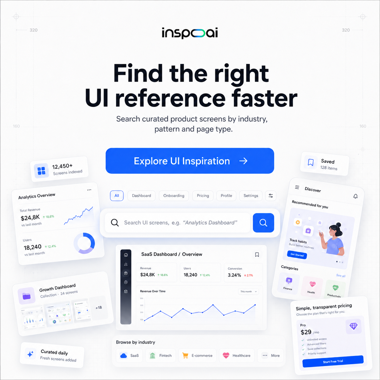
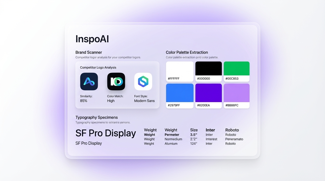
Tools like Inspo AI are built specifically for this use case. The brand scanner feature pulls the visual DNA of any website or product, extracting color systems, font stacks, spacing rhythms, and UI component styles into a structured report. That gives you the raw material for a competitive analysis in minutes, not hours.
AI also enables continuous monitoring. Rather than running a one-time audit every quarter, teams can set up recurring scans that flag when a competitor makes a significant visual update, keeping your competitive intelligence fresh without manual effort.
What Is a Step-by-Step 30-Minute AI Competitor UI Research Process?
Here is a repeatable 30-minute workflow for completing a focused competitor UI audit using AI tools.
Minutes 0-5: Define scope. Pick three direct competitors. Choose five to seven screens to analyze for each: homepage, pricing, a core feature page, signup flow, and one empty or onboarding state. Write this list down before you open a single browser tab.
Minutes 5-15: Run brand scanner analysis. Use an AI brand scanner (Inspo AI's brand scanner is built for exactly this) to pull each competitor's visual identity: color palette, typography stack, spacing system, and button styles. Export or screenshot the results for each competitor. This replaces 30+ minutes of manual devtools inspection.
Minutes 15-22: Capture UI screenshots and run AI pattern analysis. Use an AI design search tool to find similar UI patterns in your industry. Note the layout systems, navigation structures, and CTA placements you observe. Look for convergence (where competitors agree) and divergence (where they take different bets).
Minutes 22-27: Run a gap analysis. Compare what you have in your own product or mockups against what you observed. Identify three specific areas where your UI is weaker than the competitive standard, and two areas where you have a clear advantage worth amplifying.
Minutes 27-30: Document findings in a shareable format. Write a three-sentence summary for each competitor covering their design philosophy, strongest UI decision, and biggest weakness. Paste findings into a shared doc or Figma page.
That's it. Thirty minutes, structured, repeatable, and decision-ready.
Which Tools Are Best for Competitor UI Research in 2026?
The most effective competitor UI research stack in 2026 combines a few specialized tools rather than relying on a single platform.
AI brand scanners. Inspo AI's brand scanner is one of the strongest options available. It deconstructs a competitor's visual identity into a structured report covering color, typography, spacing, and component style, giving you raw competitive data in seconds.
AI design search. Tools with large indexed design libraries allow you to search for UI patterns by keyword or visual similarity. This helps contextualize what you observe in competitors against the broader design landscape.
Browser devtools. Still useful for verifying specific CSS values, font weights, and animation timing. Not replaceable by AI, but can be used in seconds once AI has pointed you to what to investigate.
Figma or FigJam. For organizing and sharing findings with your team. AI-generated insights are only useful if they're accessible to the people making decisions.
Review platforms. G2, Capterra, and App Store reviews for competitor products are an underused research source. User language in reviews often describes specific UI frustrations, giving you qualitative context for the visual patterns you observe.
The right combination of these tools makes competitor UI research a routine 30-minute task rather than a quarterly project.
How Do You Turn Competitor UI Insights Into Actionable Design Decisions?
Research that doesn't change decisions is theater. The goal of competitor UI research is to produce specific, prioritized design changes or experiments.
Start by grouping your findings into three buckets: table stakes (UI patterns every competitor uses that you must match to meet user expectations), differentiators (areas where you can diverge meaningfully to stand out), and learning opportunities (patterns a competitor uses that are worth testing but haven't been validated for your audience).
Table stakes items go straight to the backlog as low-debate fixes. If every competitor in your space has inline form validation and you don't, that's a table stakes gap. Ship it.
Differentiators require a hypothesis. Before changing something for differentiation's sake, define what outcome you expect and how you'll measure it. Button copy changes, layout experiments, and onboarding flow redesigns should each have a clear success metric.
Learning opportunities are best handled as quick A/B tests or moderated usability sessions. You're borrowing a hypothesis from a competitor and validating whether it holds for your specific user base.
Document this bucketed analysis and review it with your product team within 48 hours of completing the audit, while findings are fresh. Competitor UI research compounds in value when it becomes a recurring practice, not a one-off exercise.
Conclusion
Competitor UI research used to require days of manual work before you could extract a usable insight. AI has compressed that timeline to 30 minutes while improving both the consistency and depth of the findings.
The key is a structured process: define your scope, use AI tools to automate the extraction of visual patterns and brand systems, run a disciplined gap analysis, and convert findings into bucketed, prioritized design actions.
If you're not already running regular competitor UI audits, now is the time to build the habit. The teams that design with the most context win.
Ready to run your first AI-powered competitor UI audit? Start with Inspo AI and use the brand scanner to pull your first competitive analysis in under two minutes.
 Brand Scanner UI">
InspoAI's brand scanner extracts a competitor's full visual identity system in seconds.
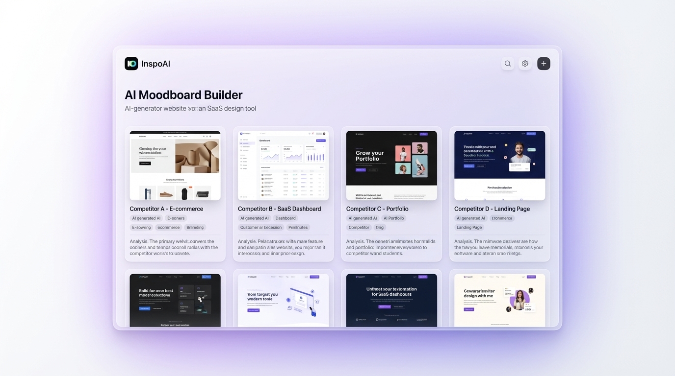
Organize competitor UI captures into structured moodboards to share findings with your team.
Last updated: April 2026