
Competitor brand analysis reveals the visual patterns, color strategies, and typography choices your rivals use to win attention, giving you the intelligence to differentiate and outposition them. Learn the step-by-step process and the best tools for analyzing a competitor's visual identity quickly.
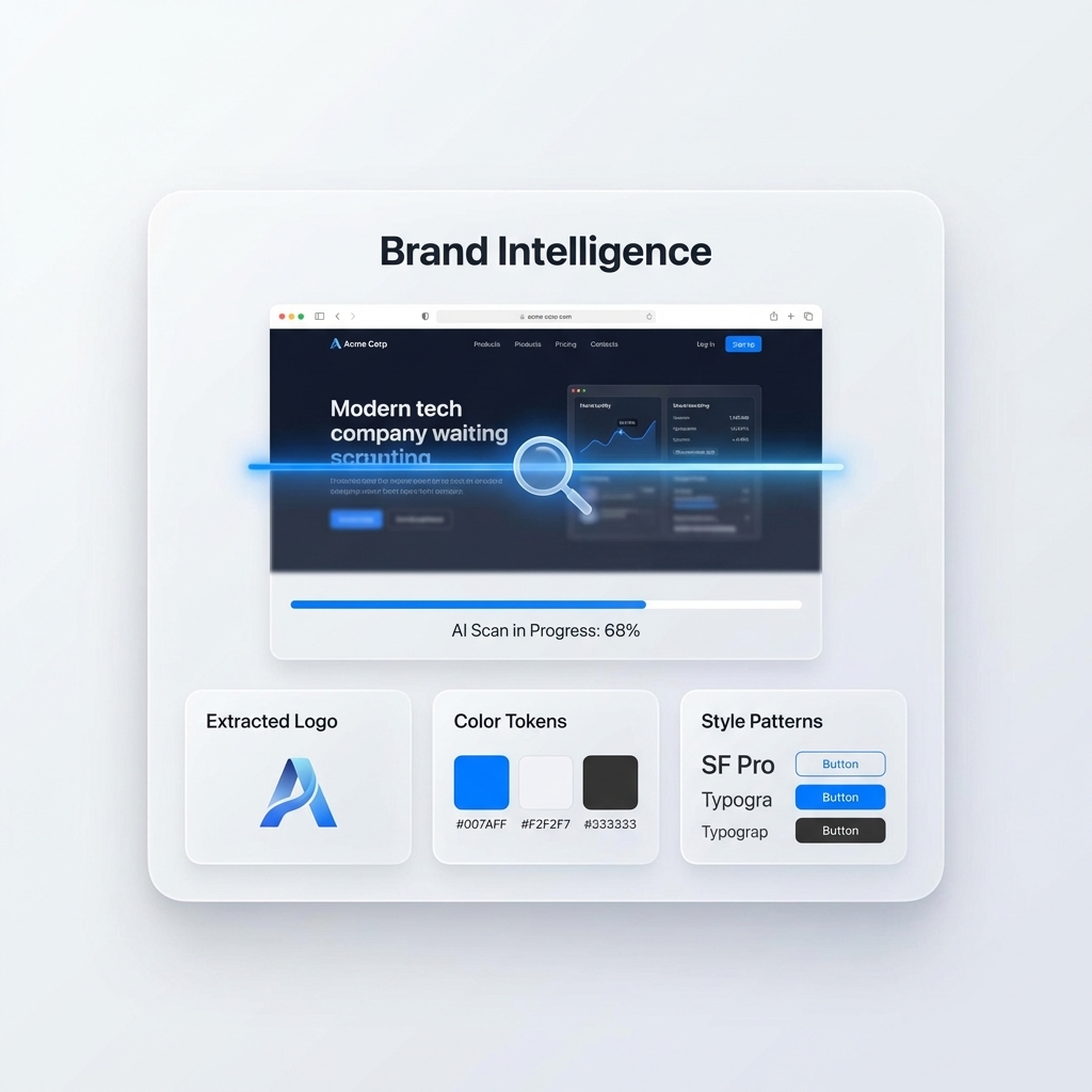
TLDR Analyzing a competitor's visual identity means extracting and evaluating their color palette, typography, logo system, imagery style, and UI patterns. Done well, it reveals positioning gaps you can own and design patterns you should deliberately avoid to stand out. The fastest way to conduct competitor visual research is with a dedicated tool that automates extraction and puts the results side by side with your own brand. Inspo AI's brand scanner feature makes this process a matter of minutes rather than hours.
Introduction
Most brands do competitive research on pricing, features, and messaging. Very few do it on visual identity, and that is a mistake. Visual identity is how brands stake out territory in a crowded market. It is the first impression a prospect forms before reading a single word of copy. If your color palette looks identical to your top three competitors, you are fighting for attention with your hands behind your back.

Competitor brand analysis is the practice of systematically studying a rival's visual design system: their colors, type choices, logo treatment, photography style, and overall aesthetic personality. The goal is not imitation. It is differentiation. You want to understand the visual conventions of your category well enough to make deliberate choices about where to conform and where to break rank.
This guide covers the full process of competitor visual identity analysis, from the elements to examine to the tools that make research fast, and how to turn raw findings into actionable design decisions.

What is competitor brand analysis?
Competitor brand analysis is a structured review of how rival brands present themselves visually and verbally across their digital and physical touchpoints. In the context of design and visual identity, it focuses on the aesthetic choices that shape how a brand is perceived: what it looks like, what it feels like, and what emotions it triggers in its target audience.
According to Ramotion's brand competitive analysis guide, with approximately 500,000 brands operating globally across 2,000 product categories, differentiation is one of the most critical strategic assets a brand can develop. Competitive visual analysis is the research foundation that makes real differentiation possible.
A complete competitor brand analysis covers three dimensions:
Visual identity elements. Colors, typography, logo, imagery, and iconography.
Design system patterns. Layout conventions, component styles, spacing philosophy, and interaction patterns on digital products.
Brand personality signals. The emotional register the design communicates: premium vs. accessible, playful vs. serious, cutting-edge vs. established.
The output of a good analysis is a competitive map that shows where each competitor sits on key visual axes, and where white space exists for your brand to occupy a distinct position.
Why is visual identity important in competitor research?
Visual identity is the layer of brand communication that operates before language. A user forms an impression of a website within 50 milliseconds of landing on it, according to research published in Behaviour and Information Technology. That impression is entirely visual. Words have not been read. Value propositions have not been processed. The color, spacing, and typographic weight have already done their work.
This is why visual identity deserves the same rigorous competitive analysis that messaging and positioning receive. If every company in your category uses deep navy and clean sans-serif fonts, a user who visits your site gets a visual signal that you belong to that same category, even if your product is functionally superior.
According to OneNine's competitor visual branding analysis, brands that analyze competitor visual strategies and deliberately differentiate their aesthetic outperform category averages in brand recall and initial conversion rates. The mechanism is simple: the brain notices what is different. Conformity to visual category conventions creates forgettable familiarity.
Analyzing competitor visual identity also protects you from accidental convergence. Without deliberate research, brand evolution tends to drift toward industry norms because designers are exposed to the same references and trends. Knowing what competitors look like helps you make conscious decisions about which conventions to embrace and which to subvert.
What elements make up a competitor's visual identity?
A competitor's visual identity consists of six auditable elements:
Color palette. The primary brand color and its supporting palette. Note not just the hues but the values (light vs. dark), saturation levels, and how many colors the brand deploys actively.
Typography system. The headline font and its personality (humanist, geometric, transitional, display), the body font, and the relationship between them. Does the brand use system fonts or custom typefaces?
Logo and mark. Wordmark, symbol, or combination? Geometric or organic? How does it behave at small sizes and on dark backgrounds?
Photography and imagery style. Is the photography lifestyle-driven or product-focused? Warm or cool tones? High contrast or flat? Human-forward or object-forward?
UI patterns and component style. On digital products: button styles, card treatments, navigation patterns, and spacing density. Does the product feel tight and data-dense, or open and editorial?
Iconography. Line vs. filled, thick vs. thin stroke, rounded vs. sharp corners. Icon style signals technical sophistication and brand personality simultaneously.
According to Kadence's visual brand analysis guide, imagery alone can account for the majority of a brand's first-impression perception. It is often the most underanalyzed element in competitive research, yet the most immediately felt.
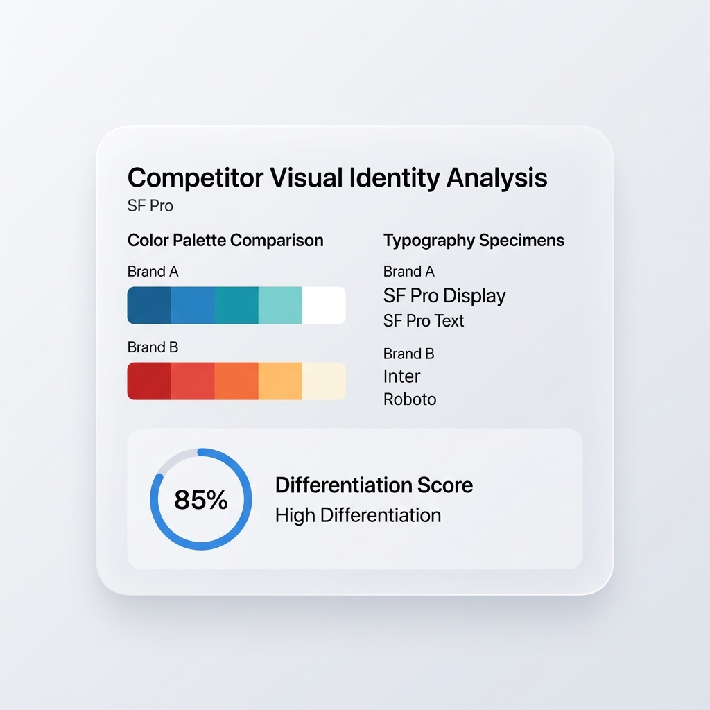
How do you analyze a competitor's color palette?
Color palette analysis follows a three-step process:
Step 1: Extract the colors. Use a browser extension or a dedicated tool to extract hex values from the competitor's website. Focus on the most frequently used colors across the header, primary CTAs, and key UI elements. Ignore background whites and near-neutral grays unless they are a deliberate brand signature.
Step 2: Map the palette to emotional territory. Each hue family carries established associations. Blues signal trust and professionalism. Greens communicate growth, health, or sustainability. Saturated, high-contrast palettes signal energy and confidence. Muted, desaturated palettes signal restraint and sophistication.
Step 3: Identify the category convention. Look at five or more competitors and note which colors dominate. If four out of five use a cool blue as their primary, that is the category default. You can now make an informed decision: own that convention for trust signaling, or break from it for differentiation.
Tools like Inspo AI automate step one entirely. Its brand scanner extracts color palettes from competitor websites in seconds, so the analysis jumps directly to strategic interpretation without manual extraction work.
What tools do designers use for competitor visual research?
The most effective workflow combines several tool types:
Brand scanner tools automate the extraction of visual identity elements from competitor websites. Inspo AI's brand scanner pulls color palettes, typography specs, and style classifications from any URL in seconds. This replaces the manual eyedropper and browser inspector workflow.
Color extraction tools like Adobe Color and Coolors allow manual palette building from uploaded images. Useful for analyzing competitor print materials or social media assets.
SEO and content tools like Semrush and Ahrefs reveal which visual assets competitors use in paid campaigns, what imagery performs best in their ad creative, and which design patterns appear in their top-converting landing pages.
Social listening tools like Sprout Social and Brandwatch show how competitor brand visuals perform across social platforms, which content formats get the highest engagement, and how audiences respond emotionally to their aesthetic.
Manual screenshot analysis remains valuable for iconography and UI pattern research. A simple folder of competitor screenshots organized by element type (headers, CTAs, pricing pages) provides a fast visual comparison reference.
Sprout Social's competitor analysis tools guide recommends combining multiple tool types rather than relying on a single platform, since different tools capture different dimensions of competitor brand behavior.
How often should you analyze competitors' branding?
Competitor visual analysis is not a one-time activity. Brands evolve, markets shift, and new entrants bring fresh visual conventions. A practical cadence:
Annual deep analysis. A full audit of all key competitors across all visual identity elements. This is your baseline and your competitive map update.
Quarterly monitoring. A lighter review of competitor website homepages, social feeds, and any major campaign creative. Note any meaningful visual changes: a rebrand, a new color system, a shift in photography style.
Triggered analysis. Whenever a competitor launches a major rebrand, a new product, or an aggressive campaign, conduct an immediate analysis of the new visual direction. Does it close the gap with your brand's differentiation? Does it open new opportunities?
According to Brandwatch's competitive intelligence guide, the teams that get the most value from competitive research are those that treat it as a continuous intelligence function rather than a one-time project deliverable. The same principle applies to visual brand research.
How do you use competitor visual insights to improve your own brand?
Competitor visual research should produce three actionable outputs:
A differentiation decision. For each visual element (color, type, imagery), decide whether to conform to the category convention (for trust and familiarity) or diverge from it (for memorability and distinctiveness). Both decisions are valid: the key is making them consciously.
A visual gap map. Plot all key competitors on a two-by-two matrix using the most important visual axes for your category (e.g., minimal vs. bold, corporate vs. human). Find the quadrant with the fewest occupants and assess whether your brand can credibly own it.
A reference brief for the design team. Compile the competitor analysis into a brief that shows what to avoid and what conventions your category expects. This becomes a guardrail during design exploration.
Twogether Digital's competitor brand analysis guide emphasizes that the goal is never to copy a competitor's visual approach, but to understand the market well enough to position yourself within the gaps they leave open.
Conclusion
Competitor visual identity analysis is one of the highest-leverage activities in brand design. It takes less time than most design work and protects every creative decision that follows. Without it, differentiation is accidental. With it, it is strategic.
The full process, extracting competitor brand elements, mapping them to emotional territory, identifying category conventions, and locating differentiation opportunities, is faster than ever with modern tooling. What once required a full day of manual research now takes under an hour with the right platform.
Inspo AI makes competitor brand analysis part of a seamless design workflow. Use the brand scanner to extract competitor visual identities in seconds, then use the AI-powered design search and 150,000+ asset library to build a differentiated direction immediately. Trusted by 180+ teams, rated 4.2 on Trustpilot.
Start your competitive visual research at inspoai.io today.