If you are looking for mood board examples that feel current in 2026 (and not like a generic Pinterest collage), this guide is built for you. You will find category-specific examples, quick templates, and a 5-minute workflow you can reuse on every project.
What Is a Mood Board?
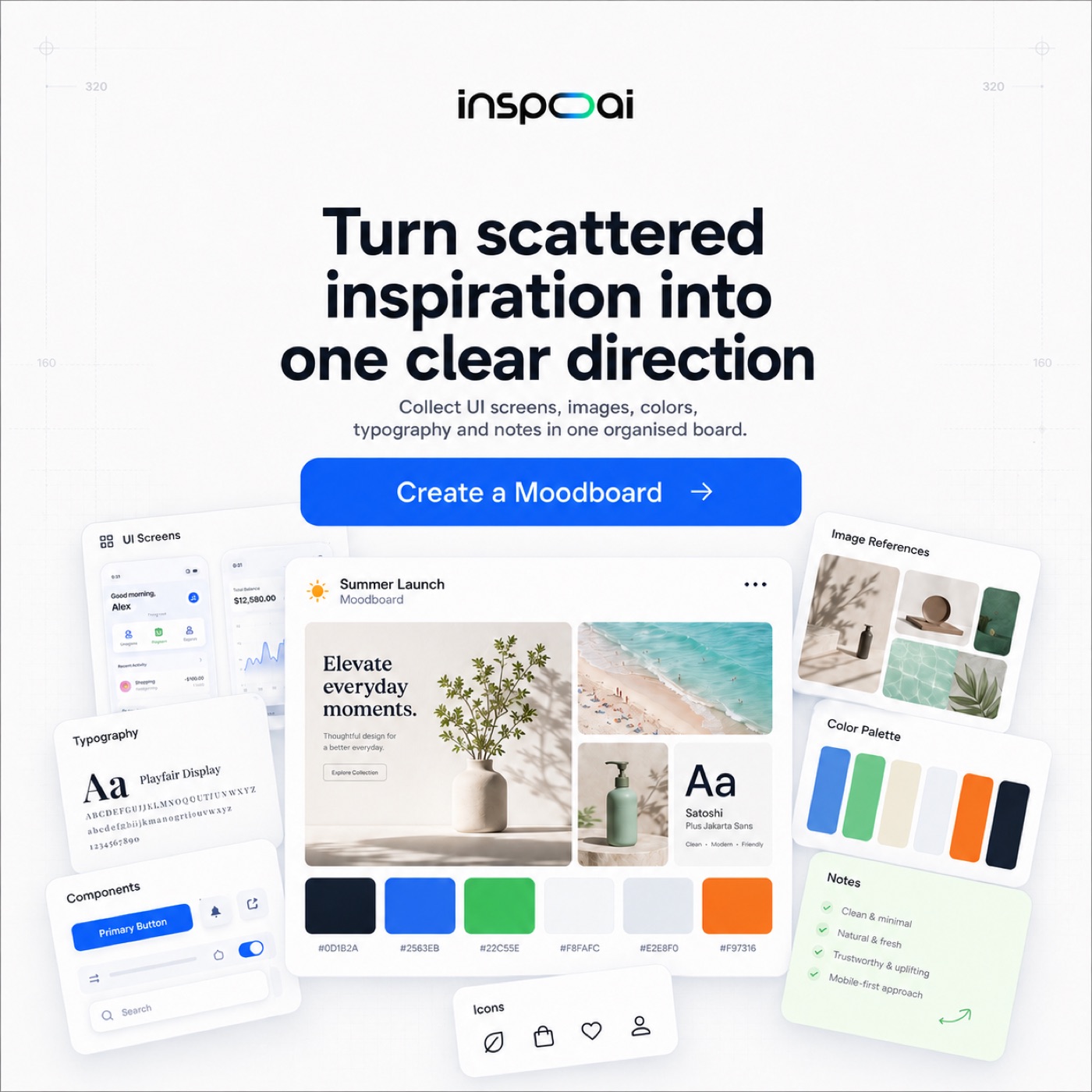
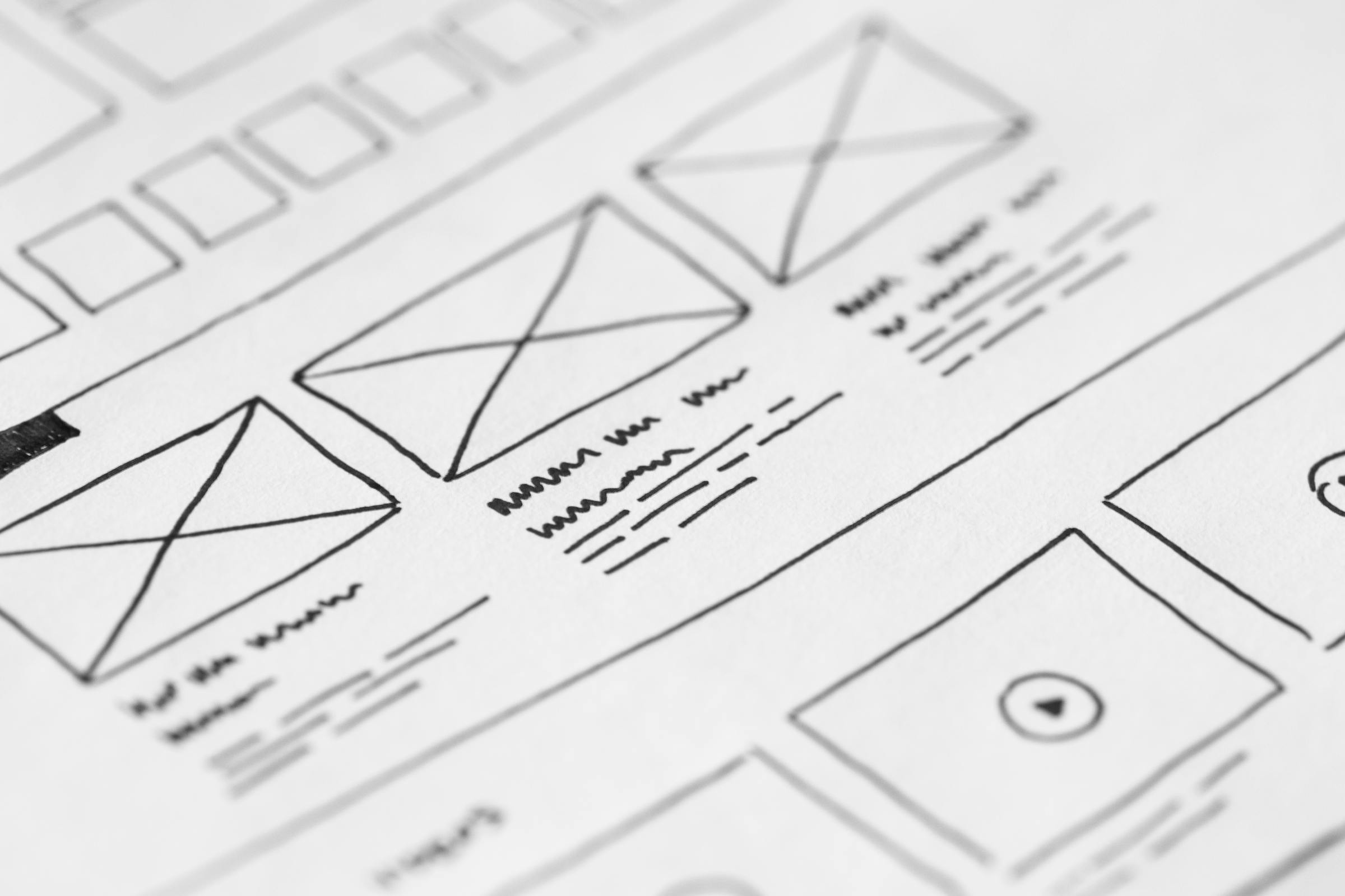
A mood board is a curated collection of visual references that defines a design direction. It aligns color, typography, imagery, and layout choices before production starts. Designers use it to save time, reduce subjective feedback, and get faster approvals.
Why Mood Boards Matter in the Design Process
A mood board matters because it turns a fuzzy idea into a shared visual language. It gives clients and teammates something concrete to react to, which reduces the classic feedback loop of “make it more modern” with no examples.
Mood boards also protect your time. Once a direction is approved, you can design faster because your palette, type direction, and reference patterns are already decided.
In 2026, the fastest designers are not the ones who push pixels the quickest, they are the ones who align early. A good board does that alignment in a single link.
Mood Board Examples by Design Category
A useful mood board example is specific: it has a clear palette, typography direction, imagery style, and a reason each reference is on the board. Use the examples below as patterns, not as designs to copy.
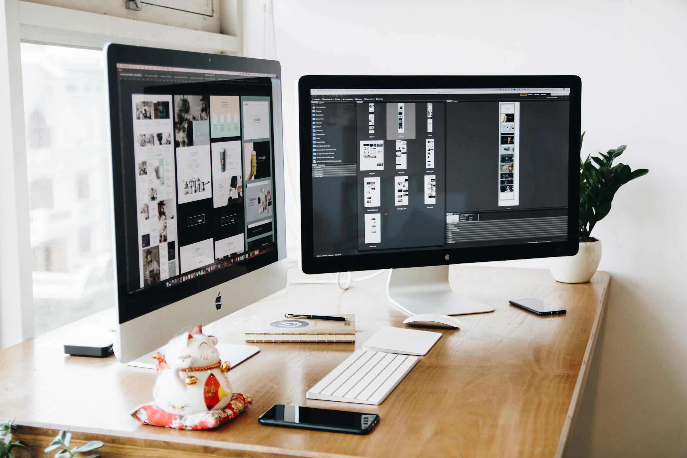
UI/UX Design Mood Board Examples (8-10 examples)
A UI/UX mood board example should highlight component patterns, spacing, typography scale, and interaction feel. In 2026, common UI directions include bento grids, soft depth shadows, high-contrast dark UIs, and calm “editorial SaaS” layouts.
- Calm Dashboard Minimal: cool grays, low-saturation accents, 12–16px radius cards, light borders, tight type scale.
- Glass + Neon Dark UI: deep blacks, neon greens/blues, blur layers, bright focus rings, generous spacing to avoid noise.
- Editorial Product Marketing: serif headline + mono labels, big whitespace, asymmetric hero, rich photography, minimal UI chrome.
- Fintech Precision: blue/teal palette, numeric typography, grid-heavy layout, clean charts, disciplined iconography.
- Mobile Onboarding Warmth: warm neutrals, friendly illustrations, large type, micro-interaction cues, rounded components.
- Utility-first Brutal UI: harsh contrast, mono type, minimal decoration, strong dividers, “tool” aesthetics.
- Playful Consumer App: bold gradients, sticker icons, soft shadows, chunky buttons, high-energy motion.
- Health + Calm: mint palette, airy layouts, soft imagery, accessible contrast, reassuring typography.
Brand Identity Mood Board Examples (8-10 examples)
A brand identity mood board example should define tone: typography, imagery rules, icon style, spacing, and how the brand “speaks” visually. In 2026, identity systems tend to be simpler, more modular, and designed to scale across motion and product UI.
- Luxury Minimal: high-contrast serif, monochrome palette, tight tracking, negative space, refined photography.
- Tech Startup Clean: geometric sans, bright accent, simple shapes, confident tone, friendly illustrations.
- Food & Beverage Tactile: warm palette, texture, hand-drawn elements, candid photography, packaging cues.
- Fashion Editorial: bold type hierarchy, black/white base, strong grids, dramatic imagery, minimal UI.
- Fintech Trust: blues, stable grids, crisp icons, conservative typography, subtle gradients.
- Playful DTC: bright colors, rounded type, bold patterns, sticker-like icons, energetic photography.
- Eco / Organic: earthy neutrals, paper textures, simple line icons, natural imagery, calm tone.
- Medical / Clinical: cool neutrals, high readability, clean iconography, precise layout rules.
Web Design Mood Board Examples (8-10 examples)
A web design mood board example should capture layout patterns, hero structure, type scale, and how content is organized. In 2026, standout web directions include bento grids, “magazine” typography, and motion-led storytelling.
- SaaS Bento Grid: modular cards, clear hierarchy, strong headings, subtle gradients, crisp iconography.
- Portfolio Bold Type: oversized headlines, brutal spacing, sharp contrast, minimal navigation.
- E-commerce Premium: large product photography, calm palette, refined typography, confident whitespace.
- Editorial Story: serif headlines, column layouts, textured images, strong rhythm.
- Cyber Neon: black base, neon accents, glow, kinetic shapes, high-energy motion.
- Soft Organic: warm neutrals, blobs and curves, gentle shadows, friendly icons.
- Brutalist Modern: raw grids, sharp borders, mono captions, utilitarian feel.
- Finserv Trust: stable layouts, readable type, subtle brand gradients, calm icons.
Interior Design Mood Board Examples (5-6 examples)
An interior design mood board example should define materials, textures, lighting, and the emotional feel of a space. The best boards show a small set of repeating cues instead of random rooms.
- Minimalist: warm whites, natural wood, black accents, simple forms.
- Bohemian: layered textiles, earthy palette, handmade patterns, plants.
- Industrial: concrete, metal, exposed structure, dark neutrals.
- Scandinavian: light woods, soft neutrals, cozy textures, clean lines.
- Japandi: minimal silhouettes, warm neutrals, tactile materials, calm light.
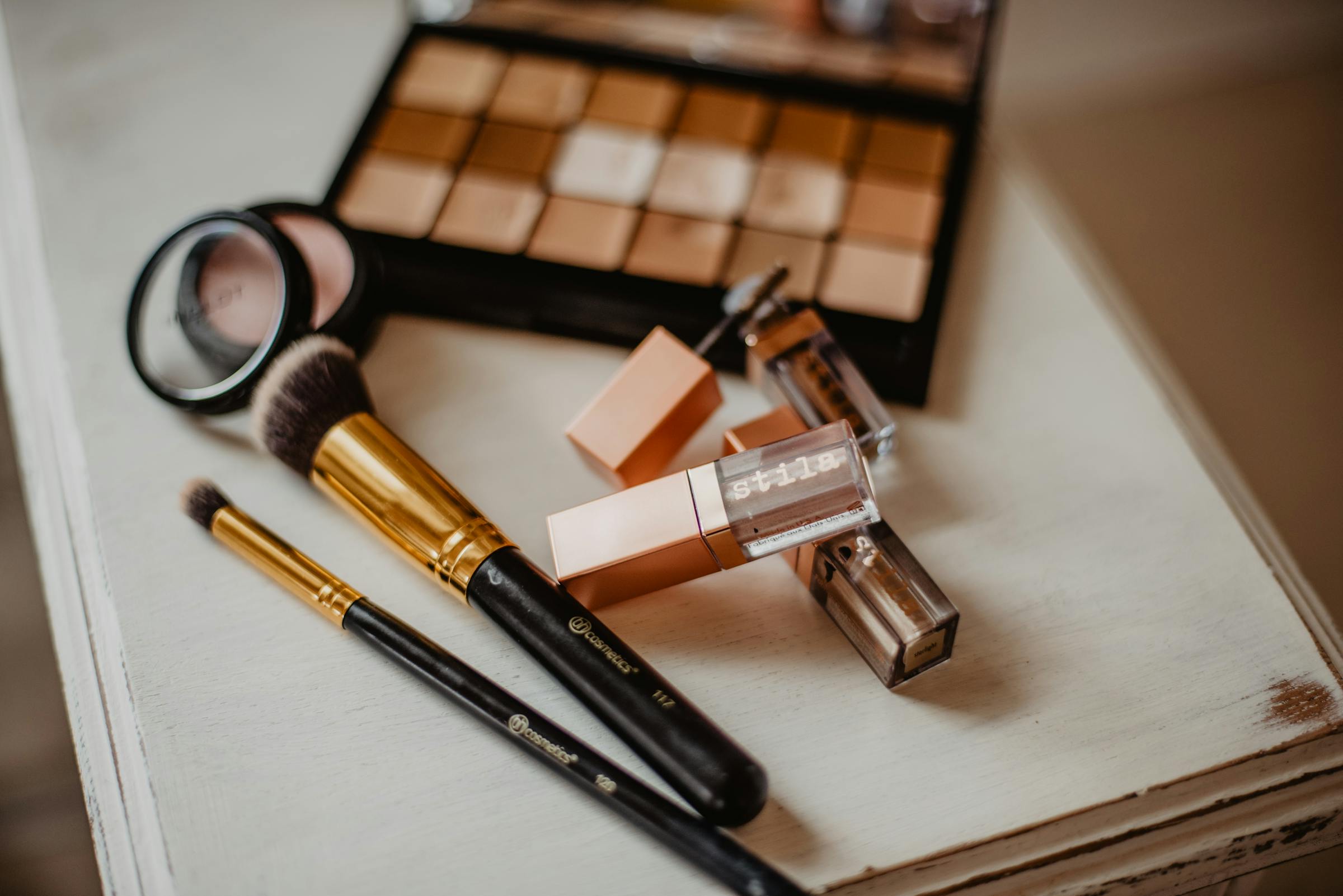
Fashion & Styling Mood Board Examples (5-6 examples)
A fashion mood board example should define silhouette, texture, color story, and styling references. Keep it consistent: one palette, one lighting feel, one attitude.
- Minimal Tailoring: black/white base, crisp shapes, matte textures.
- Streetwear Utility: technical fabrics, bold typography, functional details.
- Soft Romantic: pastels, delicate fabrics, gentle light, subtle accessories.
- Retro 90s: denim, muted tones, sporty elements, film grain.
- High Fashion Drama: sharp contrast, sculptural forms, editorial lighting.
Photography & Art Direction Mood Board Examples (5-6 examples)
A photography art direction mood board example should define light, lens feel, composition patterns, and color grade. Great boards remove ambiguity for the whole shoot.
- Cinematic Low Key: deep shadows, controlled highlights, moody grade.
- Bright Studio: clean whites, soft shadows, product clarity.
- Film Grain Nostalgia: warm tones, halation, imperfect textures.
- High Contrast B/W: sharp shapes, dramatic light, editorial framing.
- Natural Documentary: candid moments, ambient light, honest color.
Aesthetic Mood Board Examples (Minimalist, Y2K, Dark Mode & More) (5-6 examples)
An aesthetic moodboard example focuses on a single vibe and repeats it across palette, type, imagery, and UI references. In 2026, “aesthetic boards” are often used as quick style targets for creators and teams.
- Minimalist: soft neutrals, clean grids, gentle type, calm imagery.
- Y2K: chrome, bubble type, iridescent gradients, early-internet nostalgia.
- Dark Mode: deep blacks, neon accents, cinematic lighting, high contrast.
- Earthy Organic: terracotta, paper textures, natural photography, warm light.
- Maximalist: bold patterns, layered textures, clashing colors, playful type.
How to Create Your Own Mood Board in 5 Minutes
To create a mood board fast, you only need a clear goal, 15–25 strong references, and a layout that makes the direction obvious. Use this 5-step HowTo.
- Step 1: Define your project goal. Write one sentence: audience + vibe + constraints.
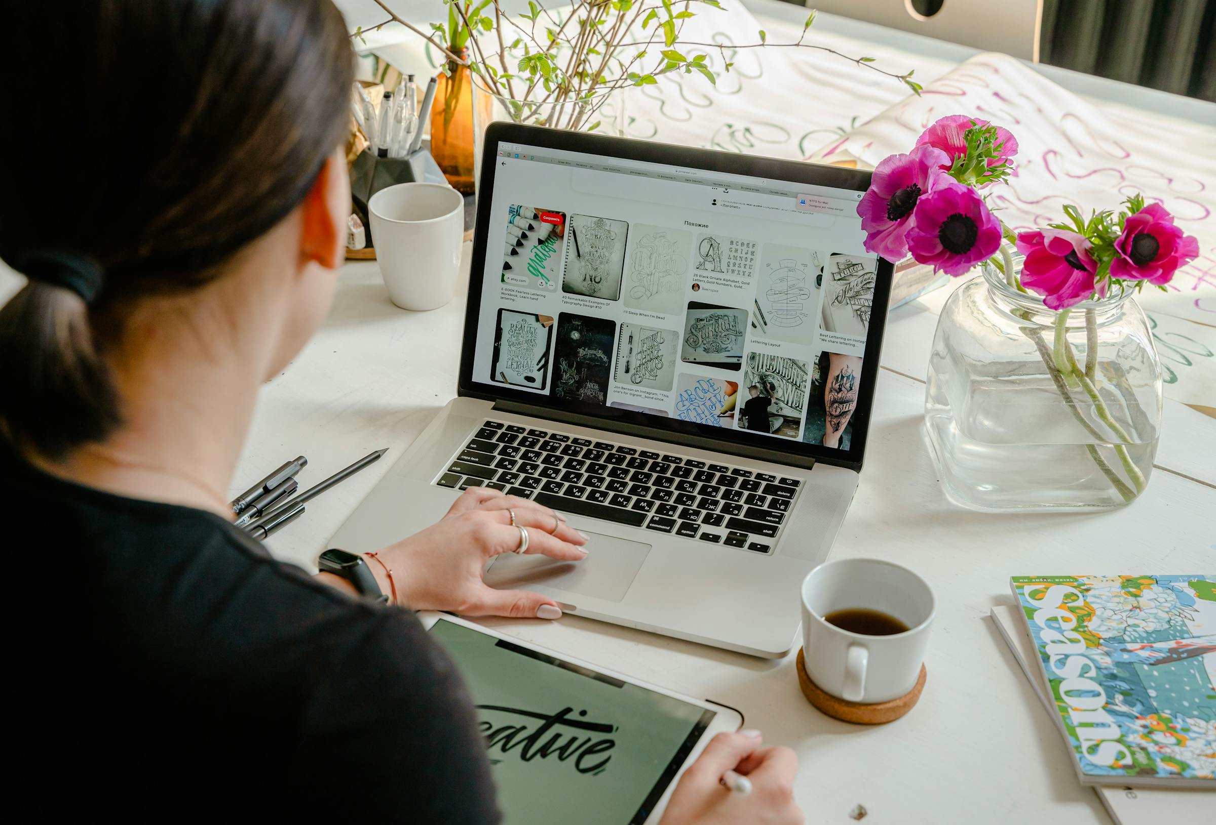
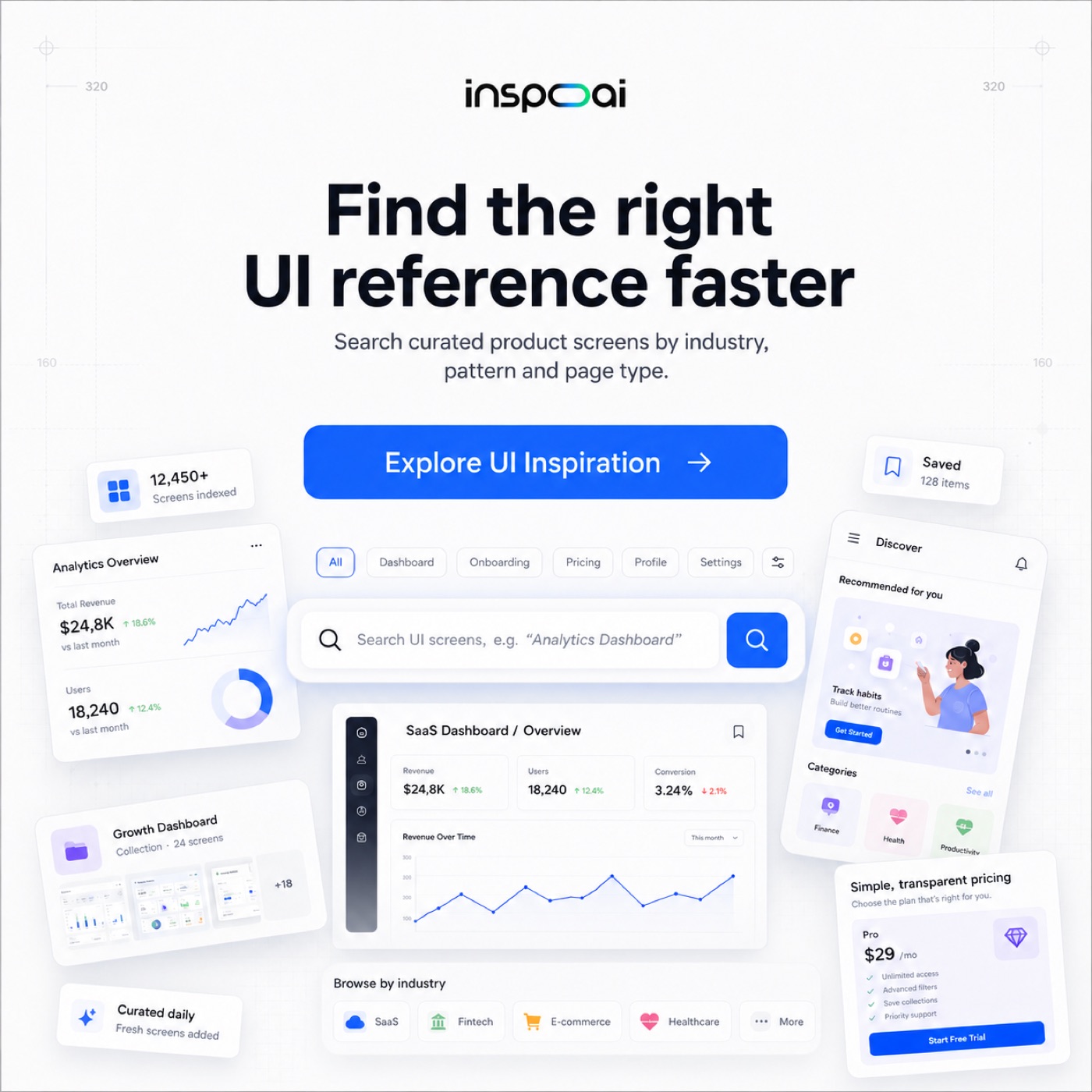
- Step 2: Gather visual references. Use InspoAI to search real-world designs, then save the best ones to a board.
- Step 3: Choose a layout tool. Pick a grid (structured) or freeform (collage).
- Step 4: Arrange and curate. Group references by theme and remove anything off-direction.
- Step 5: Share with your team. Align on the direction before designing screens.
Best Tools for Creating Mood Boards in 2026
The best mood board tools are the ones that match how you work: quick layout, easy sharing, and reliable reference gathering. Here is a practical comparison.
| Tool | Best For | Price |
|---|---|---|
| InspoAI | AI-powered design search + moodboards for real-world references | Free + paid plans |
| Canva | Quick templates and drag-and-drop for non-designers | Free + paid |
| Figma | Teams already in Figma who want boards near their UI work | Free + paid |
| Milanote | Visual project planning and collaborative boards | Free + paid |
| Broad discovery (but not design-specific filtering) | Free |
Mood Board Templates You Can Use Right Now
A moodboard template is useful when it gives structure: palette, typography, imagery, and a space for notes. These template layouts cover most design projects.
- Grid template: clean, predictable, best for UI/UX and brand systems.
- Freeform collage: overlapping references, best for art direction and fashion.
- Column-based directions: compare 2–3 styles side-by-side for stakeholders.
- Storytelling template: left-to-right narrative, best for campaigns and landing pages.

Mood Board vs. Style Guide vs. Brand Board — What's the Difference?
A mood board is for direction, a style guide is for rules, and a brand board is a one-page summary. Use this quick comparison to pick the right artifact.
| Artifact | Best For | What It Contains |
|---|---|---|
| Mood board | Exploring and aligning on a direction | References, palette cues, type direction, imagery style |
| Brand board | Sharing a quick identity snapshot | Logo, colors, type, imagery style, key examples |
| Style guide | Consistency at scale | Rules: usage, spacing, typography scales, components, do/don’t |
FAQ
What should a mood board include?
A strong mood board includes a color palette, typography direction, imagery style, and 10–25 references that show the visual language. It should also include a short sentence describing the intended vibe and audience.
How many images should be on a mood board?
Most design mood boards work best with 15–25 images. Fewer can feel vague; more can become noisy and harder to align on.
Can I use a mood board for a client presentation?
Yes. A mood board is a fast way to confirm tone, style, and references before you spend time designing. Present 1–3 clear directions and explain what each one communicates.
What is the difference between a mood board and a vision board?
A mood board is a design tool used to define a visual direction for a project. A vision board is usually personal and goal-focused, often mixing lifestyle aspirations with imagery.
What are the best free mood board tools?
The best free mood board tools depend on your workflow, but Canva, Figma, Milanote, and Pinterest all have free tiers. For design-specific inspiration search plus boards, InspoAI is built for finding real-world design references quickly.